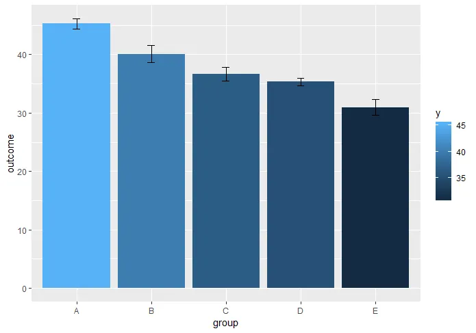
我有一个数据集,例如:
outcome <- c(rnorm(500, 45, 10), rnorm(250, 40, 12), rnorm(150, 38, 7), rnorm(1000, 35, 10), rnorm(100, 30, 7))
group <- c(rep("A", 500), rep("B", 250), rep("C", 150), rep("D", 1000), rep("E", 100))
reprex <- data.frame(outcome, group)
我可以使用以下方法绘制“炸药杆图”:
graph <- ggplot(reprex, aes(x=group, y=outcome, fill=..y..)) +
  stat_summary(geom = "bar", fun.y = mean) +
  stat_summary(geom = "errorbar", fun.data = mean_cl_normal, width = 0.1)
给定:
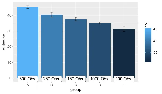
我还想在每一列下面添加一个标签,指定该组中有多少观察值。但是我不知道如何实现。我尝试了:
graph + geom_label (aes(label=paste(..count.., "Obs.", sep=" ")), y=-0.75, size=3.5, color="black", fontface="bold")
该函数返回
Error in paste(count, "Obs.", sep = " ") :
  cannot coerce type 'closure' to vector of type 'character'
我也尝试过
graph + stat_summary(aes(label=paste(..y.., "Obs.", sep=" ")), fun.y=count, geom="label")
但是这返回:
Error: stat_summary requires the following missing aesthetics: y
我知道如果我首先创建一个摘要统计量的数据帧,就可以做到这一点,但这将导致每次需要绘制图形时都创建一个新的数据帧,因此我最好能够使用原始数据集中的stat_summary()绘制图形。
有人知道怎么做吗?
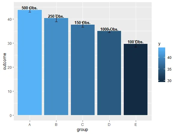
graph + geom_label(aes(label=stat(y), group = group), stat = "summary", fun.y = mean)将数值放置在条形图的顶部,但这只是一个开始。 - Bas