Python Matplotlib:如何在基础图表上找到给定y值所对应的x值

7

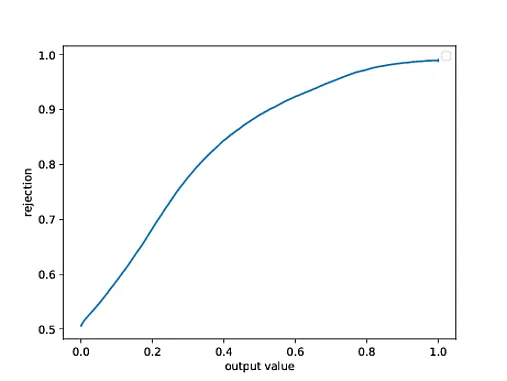
我有一个使用Matplotlib生成的图表(原本是直方图的精度-召回曲线),我需要计算与y = 0.9对应的正确x值。数据从文本文件中加载,这些文件存在列中。以下是用于创建图表的代码:

import numpy as np
import matplotlib.pyplot as plt
import pylab
from sklearn import metrics

data1 = np.loadtxt('text1.txt')
data2 = np.loadtxt('text2.txt')

background = 1 - (1 + y) / 2.
signal = 1 - (1 + x) / 2.

classifier_output = np.concatenate([background,signal])
true_value = np.concatenate([np.zeros_like(background, dtype=int), np.ones_like(signal,  dtype=int)])

precision, recall, threshold = metrics.precision_recall_curve(true_value, classifier_output)
plt.plot(threshold, precision[:-1])
plt.savefig('Plot.pdf', dpi = 2000)
plt.show()

有没有一种方法可以计算出对应于 y = 0.9 的 x 轴上的正确值? enter image description here

你可以使用这篇帖子中的
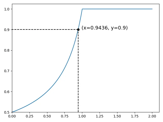
find_roots函数。z = find_roots(threshold, precision[:-1] - 0.9) - JohanC
你正在绘制一个函数,因此你应该能够通过y值得到x值。 - rgralma
3
如果需要的话,numpy.interp(0.9, y, x)会返回在y=0.9处的x值。 - ImportanceOfBeingErnest
1个回答

1
参考:https://numpy.org/doc/stable/reference/generated/numpy.interp.html 您可以使用np.interp(),格式为x_interp = np.interp(y_val, y, x),来解释一个x值。
如果您想解释一个y值,需要切换到y_interp = np.interp(x_val, x, y)
我还在图表中添加了虚线和注释,以更好地可视化结果。由于数据未提供,我编造了数据以进行演示。
import numpy as np
import matplotlib.pyplot as plt
from sklearn import metrics

# make up some data
background = np.linspace(0, 1, 400)
signal = np.linspace(0, 2, 400)

classifier_output = np.concatenate([background, signal])
true_value = np.concatenate([np.zeros_like(background, dtype=int), np.ones_like(signal, dtype=int)])

fig, ax = plt.subplots()
precision, recall, threshold = metrics.precision_recall_curve(true_value, classifier_output)
plt.plot(threshold, precision[:-1])

# interpreting x value based on y value
y_val = 0.9
x_interp = round(np.interp(y_val, precision[:-1], threshold), 4)  # x_interp = np.interp(y_vals, y, x)

# place a marker on point (x_interp, y_val)
plt.plot(x_interp, y_val, 'o', color='k')

# draw dash lines
plt.plot([x_interp, threshold[0]], [y_val, y_val], '--', color='k')
plt.plot([x_interp, x_interp], [precision[:-1][0], y_val], '--', color='k')

# add annotation on point (x_interp, y_val)
ax.annotate(f'(x={x_interp}, y={y_val})', (x_interp, y_val), size=14, xytext=(x_interp * 1.05, y_val))

# remove the margin around the starting point (depending on the data's lower bound, adjust or remove if necessary)
ax.set_xlim(threshold[0])
ax.set_ylim(precision[:-1][0])
plt.tight_layout()
print(f'y = {y_val}, x = {x_interp}')
plt.show()

结果:

在此输入图片描述

这是一张图片,无法提供更多信息。

网页内容由stack overflow 提供, 点击上面的
可以查看英文原文,
原文链接