在R中的ggplot2中将光栅图层叠加到地图上?

5
我正在尝试在ggplot中将栅格层叠加到地图上。栅格层包含来自卫星标记的每个时间点的可能性表面。我还想在栅格层上设置累积概率(95%、75%、50%)。
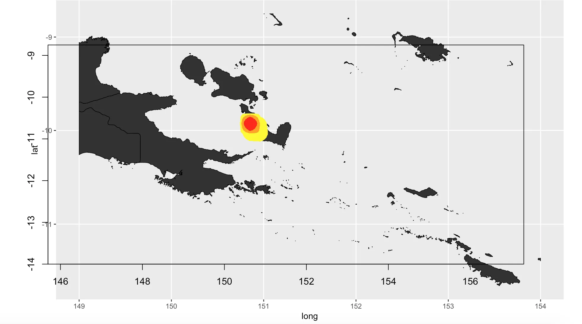
我已经找出了如何在ggplot地图上显示栅格层,但是坐标不相互对齐。我尝试让它们都具有相同的投影,但似乎没有奏效... 我希望它们都适配我的模型边界(xmin = 149,xmax = 154,ymin = -14,ymax = -8.75)
附上我的r代码和结果图:
#load data
ncname <- "152724-13-GPE3"
ncfname <- paste(ncname, ".nc", sep = "")
ncin <- nc_open(ncfname)

StackedObject<-stack("152724-13-GPE3.nc", varname = "monthly_residency_distributions")
MergedObject<-overlay(StackedObject,fun=mean ) 
MergedObject[is.na(MergedObject)]<-0 
Boundaries<-extent(c(149, 154, -14, -8.75)) 
ExtendedObject<-extend(MergedObject, Boundaries) 
Raster.big<-raster(ncol=1200,nrow=900,ext=Boundaries) 
Raster.HR<-resample(x=ExtendedObject, y=Raster.big, method="bilinear") 
Raster.HR@data@values<- Raster.HR@data@values/sum(Raster.HR@data@values) 
RasterVals<-sort(Raster.HR@data@values)
Raster.breaks <- c(RasterVals[max(which(cumsum(RasterVals)<= 0.05 ))], RasterVals[max(which(cumsum(RasterVals)<= 0.25 ))], RasterVals[max(which(cumsum(RasterVals)<= 0.50 ))], 1)
Raster.cols<-colorRampPalette(c("yellow","orange","red"))
RasterCols<- c(Raster.cols(3))

#Create Map
shape2 <- readOGR(dsn = "/Users/shannonmurphy/Desktop/PNG_adm/PNG_adm1.shp", layer = "PNG_adm1")
map<- crop(shape2, extent(149, 154, -14, -8.75))
projection(map)<- CRS("+proj=longlat +ellps=WGS84 +datum=WGS84 +no_defs")

p <- ggplot() + geom_polygon(data = map, aes(x = long, y = lat, group = group), color = "black", size = 0.25) + coord_map()

projection(Raster.HR)<- CRS("+proj=longlat +ellps=WGS84 +datum=WGS84 +no_defs")

#plot raster and ggplot 

par(mfrow=c(1,1))
plot(p)
par(mfrow=c(1,1), new = TRUE)
plot(Raster.HR, col=RasterCols, breaks=Raster.breaks, legend = NULL, bbox(map)) 

enter image description here

请告诉我是否有其他包/代码行可用于完成此操作!感谢任何帮助


嗨,我刚刚注意到您拒绝了我的编辑。唯一的更改是将该图像内联。当前状态对您来说还可以吗? - yacc
嗨@yacc,抱歉我读错了,我以为你在说要删除它。请随意再次编辑,对此我很抱歉。 - Shannon Murphy
没关系。像那样编辑问题很常见,因为1)新用户没有内联图像的特权(有趣,但我认为这是一种防止垃圾邮件的措施),2)编辑改进帖子会得到一定的奖励。例如,我正在争取 Strunk-and-White 奖章。这意味着需要进行80次编辑才能获得银牌。:) 这些奖章的有趣之处在于,我不知道为什么,但它很有趣。好的,那就这样吧。 - yacc
你可以使用 rasterVis::gplot 直接在 ggplot 中添加栅格图。 - Sébastien Rochette
@SébastienRochette 我尝试过了,但是我很难添加其他光栅参数,比如50、75、95%的可能性和相应的颜色方案。我也不太清楚从rasterVis包中使用哪个函数将这个光栅层添加到ggplot中。 - Shannon Murphy
1个回答

12

好的,我理解了。您想在ggplot上绘制多个栅格图层或者想要将栅格对象覆盖在背景多边形对象之上。使用rasterVis::gplot的问题是它直接绘制栅格图并且不允许添加另一个栅格图层。您提醒了我,我已经有这个需求并修改了函数gplot以将数据作为tibble检索出来,这样您就可以使用dplyr和ggplot2进行任意操作。感谢您的提醒,我已将其添加到我的当前Github库中以备后用!
让我们使用可重复性示例展示此函数:

创建数据集

  • 创建地图作为背景栅格地图
  • 创建数据栅格,例如来自点的距离(仅限最大距离)

代码:

library(raster)

# Get world map
library(maptools)
data(wrld_simpl)
# Transform World as raster
r <- raster(wrld_simpl, res = 1)
wrld_r <- rasterize(wrld_simpl, r)

# Lets create a raster of data
pt1 <- matrix(c(100,0), ncol = 2)
dist1 <- distanceFromPoints(r, pt1)
values(dist1)[values(dist1) > 5e6] <- NA
plot(dist1)

# Plot both
plot(wrld_r, col = "grey")
plot(dist1, add = TRUE)

在经典绘图上的栅格数据

提取(部分)栅格值并转换为tibble的函数

#' Transform raster as data.frame to be later used with ggplot
#' Modified from rasterVis::gplot
#'
#' @param x A Raster* object
#' @param maxpixels Maximum number of pixels to use
#'
#' @details rasterVis::gplot is nice to plot a raster in a ggplot but
#' if you want to plot different rasters on the same plot, you are stuck.
#' If you want to add other information or transform your raster as a
#' category raster, you can not do it. With `SDMSelect::gplot_data`, you retrieve your
#' raster as a tibble that can be modified as wanted using `dplyr` and
#' then plot in `ggplot` using `geom_tile`.
#' If Raster has levels, they will be joined to the final tibble.
#'
#' @export

gplot_data <- function(x, maxpixels = 50000)  {
  x <- raster::sampleRegular(x, maxpixels, asRaster = TRUE)
  coords <- raster::xyFromCell(x, seq_len(raster::ncell(x)))
  ## Extract values
  dat <- utils::stack(as.data.frame(raster::getValues(x))) 
  names(dat) <- c('value', 'variable')

  dat <- dplyr::as.tbl(data.frame(coords, dat))

  if (!is.null(levels(x))) {
    dat <- dplyr::left_join(dat, levels(x)[[1]], 
                            by = c("value" = "ID"))
  }
  dat
}

在ggplot中绘制多个栅格图

您可以使用gplot_data将任何栅格图转换为数据框。然后,您可以使用dplyr进行修改,并使用geom_tileggplot上绘图。有趣之处在于,只要fill选项是可比较的,就可以使用geom_tile多次使用不同的栅格数据。否则,您可以使用下面的技巧在背景栅格地图中删除NA值并使用唯一的fill颜色。

# With gplot_data
library(ggplot2)

# Transform rasters as data frame 
gplot_wrld_r <- gplot_data(wrld_r)
gplot_dist1 <- gplot_data(dist1)

# To define a unique fill colour for the world map,
# you need to remove NA values in gplot_wrld_r which 
# can be done with dplyr::filter
ggplot() +
  geom_tile(data = dplyr::filter(gplot_wrld_r, !is.na(value)), 
            aes(x = x, y = y), fill = "grey20") +
  geom_tile(data = gplot_dist1, 
            aes(x = x, y = y, fill = value)) +
  scale_fill_gradient("Distance",
                      low = 'yellow', high = 'blue',
                      na.value = NA) +
  coord_quickmap()

在多边形上绘制栅格图

当然,如果你有一个背景地图作为多边形对象,这个技巧也可以让你将栅格图覆盖在上面:

Multiple raster on the same ggplot

wrld_simpl_sf <- sf::st_as_sf(wrld_simpl)

ggplot() +
  geom_sf(data = wrld_simpl_sf, fill = "grey20",
          colour = "white", size = 0.2) +
  geom_tile(data = gplot_dist1, 
            aes(x = x, y = y, fill = value)) +
  scale_fill_gradient("Distance",
                      low = 'yellow', high = 'blue',
                      na.value = NA)

ggplot中的多边形栅格

编辑:现在可以在这个简单的R包中找到gplot_datahttps://github.com/statnmap/cartomisc


网页内容由stack overflow 提供, 点击上面的
可以查看英文原文,
原文链接