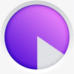
我正在尝试从一个圆形中切出一个部分,但这比我最初预期的要困难...... 最好不要使用Google Charts和其他类似工具,因为我需要尽可能多地控制这个圆形的样式(最终结果是一个加载环)。我还需要能够使用jQuery或CSS来动画显示切片的大小。请原谅我,但我并没有做得很远,这就是我拥有的全部内容:JSFiddle。 我关心的圆圈是#layer_2和#layer_3。这里是仅涉及此圆形的代码:
我希望最终结果看起来与这个类似:
#layer_2 {
  border-radius: 50%;
  width: 212px;
  height: 212px;
  margin: 14px;
  background: #5c00d2;
  background: -moz-linear-gradient(45deg, #5c00d2 0%, #d586f4 100%);
  background: -webkit-gradient(linear, left bottom, right top, color-stop(0%, #5c00d2), color-stop(100%, #d586f4));
  background: -webkit-linear-gradient(45deg, #5c00d2 0%, #d586f4 100%);
  background: -o-linear-gradient(45deg, #5c00d2 0%, #d586f4 100%);
  background: -ms-linear-gradient(45deg, #5c00d2 0%, #d586f4 100%);
  background: linear-gradient(45deg, #5c00d2 0%, #d586f4 100%);
  filter: progid: DXImageTransform.Microsoft.gradient(startColorstr='#5c00d2', endColorstr='#d586f4', GradientType=1);
  -webkit-box-shadow: inset 0px 0px 5px 3px rgba(5, 71, 110, 0.5);
  -moz-box-shadow: inset 0px 0px 5px 3px rgba(5, 71, 110, 0.5);
  box-shadow: inset 0px 0px 5px 3px rgba(5, 71, 110, 0.5);
}
#layer_3 {
  border-radius: 50%;
  width: 212px;
  height: 212px;
  margin: 0;
  background: transparent;
  -webkit-box-shadow: inset 0px 0px 30px 0px rgba(0, 0, 0, 0.3);
  -moz-box-shadow: inset 0px 0px 30px 0px rgba(0, 0, 0, 0.3);
  box-shadow: inset 0px 0px 30px 0px rgba(0, 0, 0, 0.3);
}<div id="layer_2">
<div id="layer_3"></div>
</div>