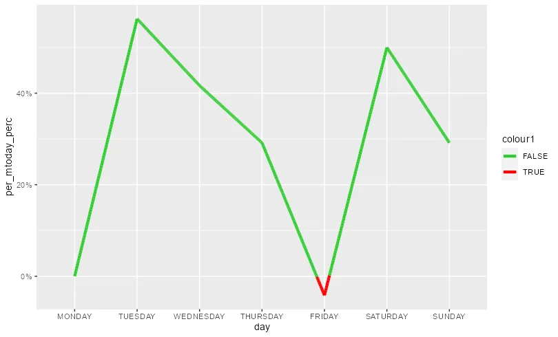
我希望在图表中,当线条低于0时为红色,高于0时为绿色。我尝试自己解决这个问题,但是代码给我整个星期五到星期六的颜色(因为它低于0),而我只需要这种颜色在y=0以下。
a<-structure(list(group = c("Total", "Total", "Total", "Total",
"Total", "Total", "Total"), measure = c("sales", "sales", "sales",
"sales", "sales", "sales", "sales"), day = structure(1:7, .Label = c("MONDAY",
"TUESDAY", "WEDNESDAY", "THURSDAY", "FRIDAY", "SATURDAY", "SUNDAY"
), class = "factor"), variable = structure(c(1L, 1L, 1L, 1L,
1L, 1L, 1L), .Label = c("ALL", "DE", "BE", "NL", "AUS", "ES",
"IT", "FR", "PO"), class = "factor"), value = c(2400000, 3750000,
3400000, 3100000, 2300000, 3600000, 3100000), per_mtoday = c(2400000,
2400000, 2400000, 2400000, 2400000, 2400000, 2400000), per_mtoday_perc = c(0,
0.5625, 0.416666666666667, 0.291666666666667, -0.0416666666666667,
0.5, 0.291666666666667), colour1 = c("green", "green", "green",
"green", "red", "green", "green")), row.names = c(1L, 15L, 29L,
43L, 57L, 71L, 85L), class = "data.frame")


ggplot(a, aes(x=day, y=per_mtoday_perc,fill = colour1, color= colour1,group = 1)) +
  geom_line(lwd=1.5)+
  scale_y_continuous(labels = scales::percent)
scale_colour_steps*。请参考help("scale_colour_stepsn")中的示例。 - Oliverscale_color_manual就足够了。问题在于楼主首先需要插值处理数值。 - Konrad Rudolph