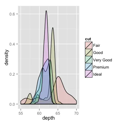
已经有很好的答案了,但是我想再补充一点。对我来说看起来不错。
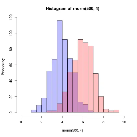
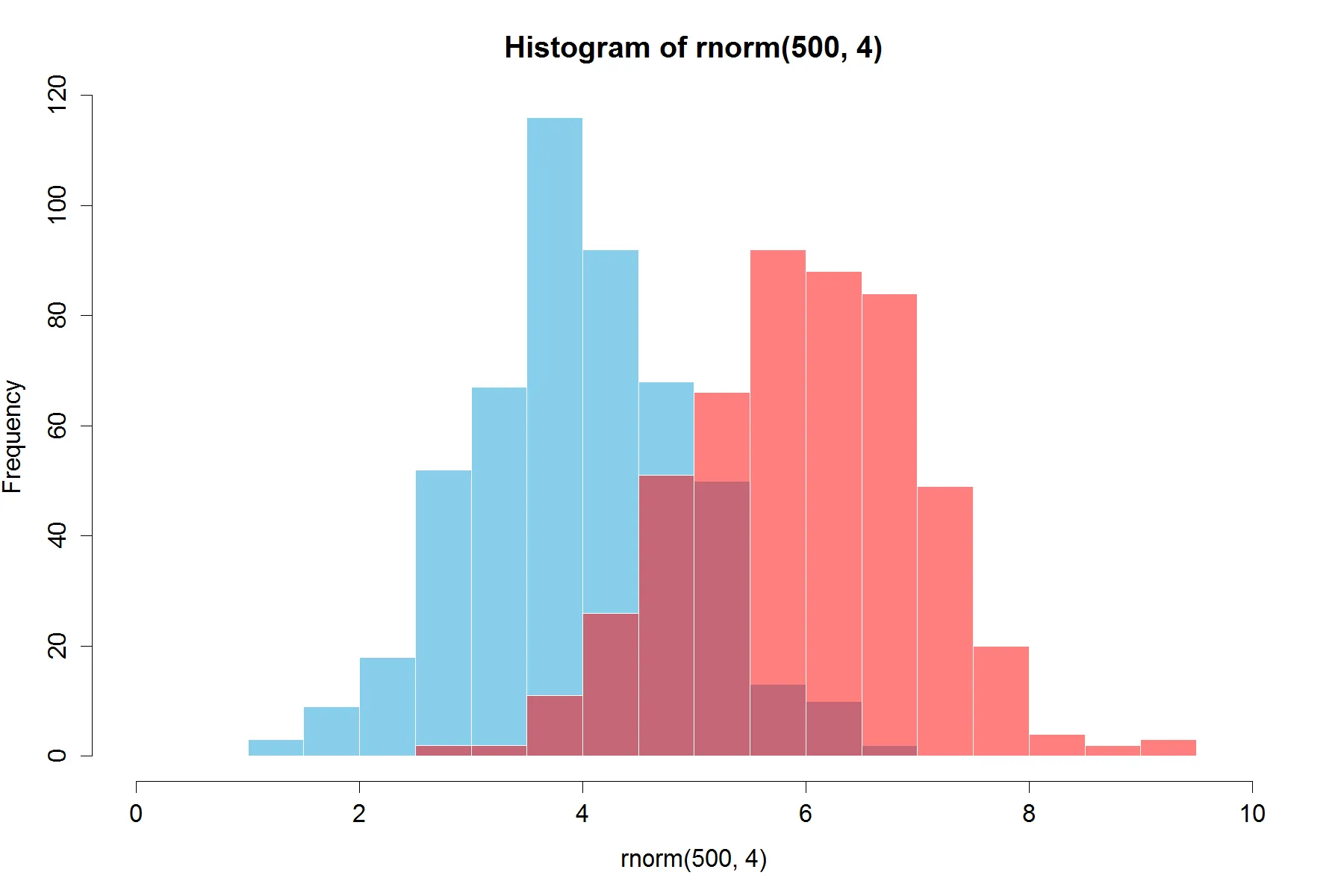
(从@Dirk中复制了随机数)。需要使用library(scales)
set.seed(42)
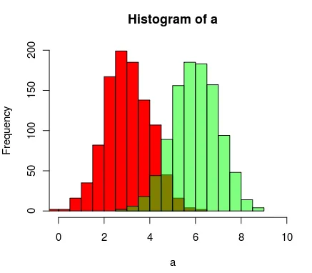
hist(rnorm(500,4),xlim=c(0,10),col='skyblue',border=F)
hist(rnorm(500,6),add=T,col=scales::alpha('red',.5),border=F)
结果是...
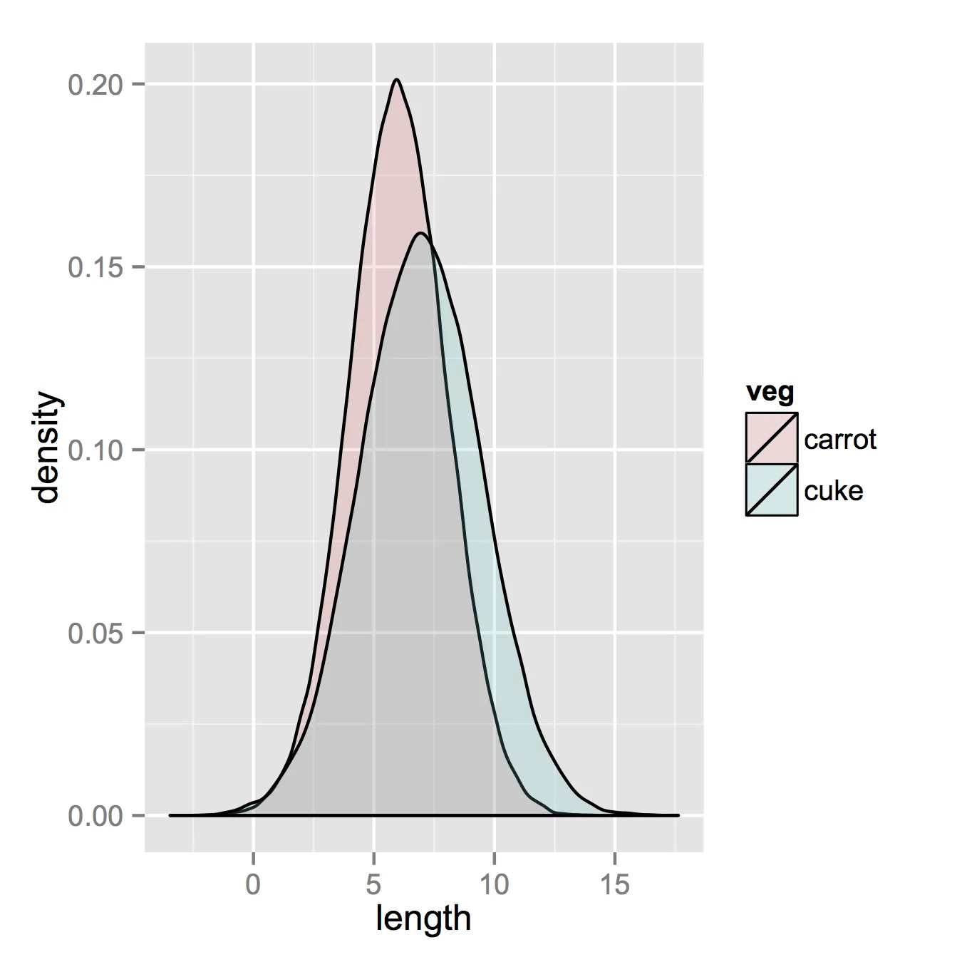
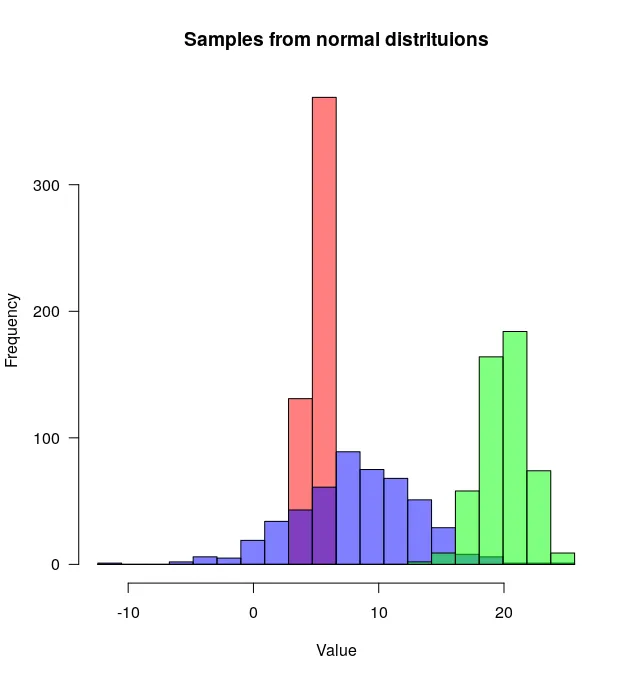
更新:这个“重叠”函数对某些人也可能有用。
hist0 <- function(...,col='skyblue',border=T) hist(...,col=col,border=border)
我认为
hist0的结果比
hist更美观。
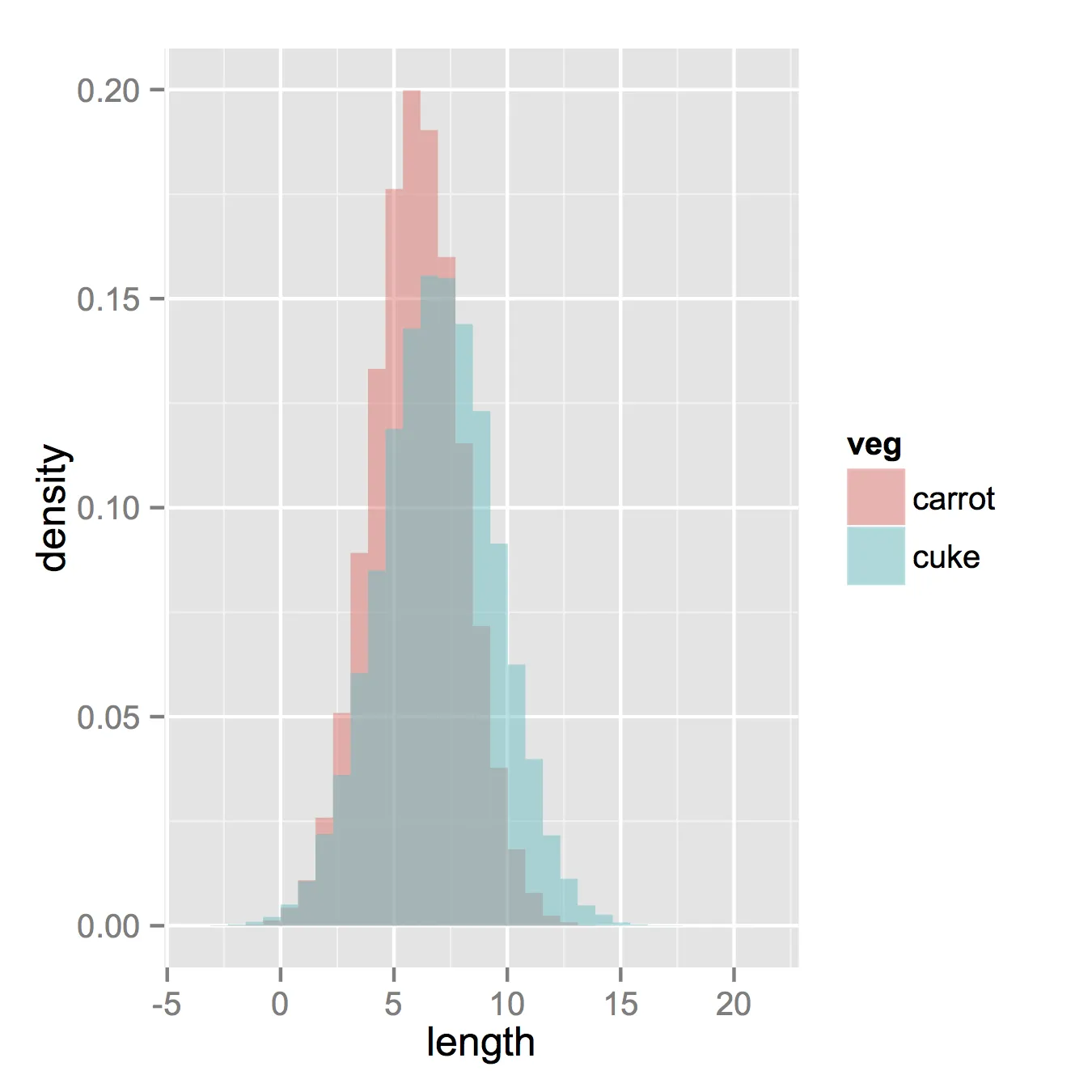
hist2 <- function(var1, var2,name1='',name2='',
              breaks = min(max(length(var1), length(var2)),20),
              main0 = "", alpha0 = 0.5,grey=0,border=F,...) {

library(scales)
  colh <- c(rgb(0, 1, 0, alpha0), rgb(1, 0, 0, alpha0))
  if(grey) colh <- c(alpha(grey(0.1,alpha0)), alpha(grey(0.9,alpha0)))

  max0 = max(var1, var2)
  min0 = min(var1, var2)

  den1_max <- hist(var1, breaks = breaks, plot = F)$density %>% max
  den2_max <- hist(var2, breaks = breaks, plot = F)$density %>% max
  den_max <- max(den2_max, den1_max)*1.2
  var1 %>% hist0(xlim = c(min0 , max0) , breaks = breaks,
                 freq = F, col = colh[1], ylim = c(0, den_max), main = main0,border=border,...)
  var2 %>% hist0(xlim = c(min0 , max0),  breaks = breaks,
                 freq = F, col = colh[2], ylim = c(0, den_max), add = T,border=border,...)
  legend(min0,den_max, legend = c(
    ifelse(nchar(name1)==0,substitute(var1) %>% deparse,name1),
    ifelse(nchar(name2)==0,substitute(var2) %>% deparse,name2),
    "Overlap"), fill = c('white','white', colh[1]), bty = "n", cex=1,ncol=3)

  legend(min0,den_max, legend = c(
    ifelse(nchar(name1)==0,substitute(var1) %>% deparse,name1),
    ifelse(nchar(name2)==0,substitute(var2) %>% deparse,name2),
    "Overlap"), fill = c(colh, colh[2]), bty = "n", cex=1,ncol=3) }
的结果
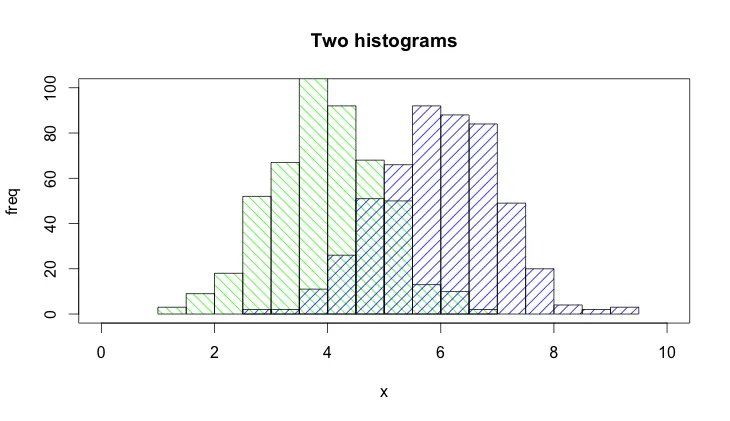
par(mar=c(3, 4, 3, 2) + 0.1)
set.seed(100)
hist2(rnorm(10000,2),rnorm(10000,3),breaks = 50)
这是一张图片,无法翻译。