我该如何在R中用ggplot2绘制“阶梯式”直方图?类似于下面的图片:
 每条水平线的宽度表示x轴值的区间宽度,高度表示该区间内数据的占比(注意不是概率密度,而是占比)。是否可以使用
每条水平线的宽度表示x轴值的区间宽度,高度表示该区间内数据的占比(注意不是概率密度,而是占比)。是否可以使用geom_histogram来实现这个效果?geom_step生成一些数据:
foo <- data.frame(bar=rnorm(100))
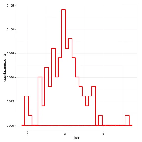
使用分步几何和y轴计数的直方图:
ggplot(foo,aes(x=bar)) + stat_bin(geom="step")
使用步幅几何图形和密度函数表示的直方图,y轴表示密度:
ggplot(foo,aes(x=bar)) + stat_bin(aes(y=..density..),geom="step")
并且涉及到“落入该区间的数据部分”:
ggplot(foo,aes(x=bar)) + stat_bin(aes(y=..count../sum(..count..)),geom="step")
foo <- data.frame(bar = rnorm(100)) + theme_bw()
p <- ggplot(data = foo, aes(x = bar, y = ..count../sum(..count..))) ## or aes(x = bar, y = ..density..) if you want that
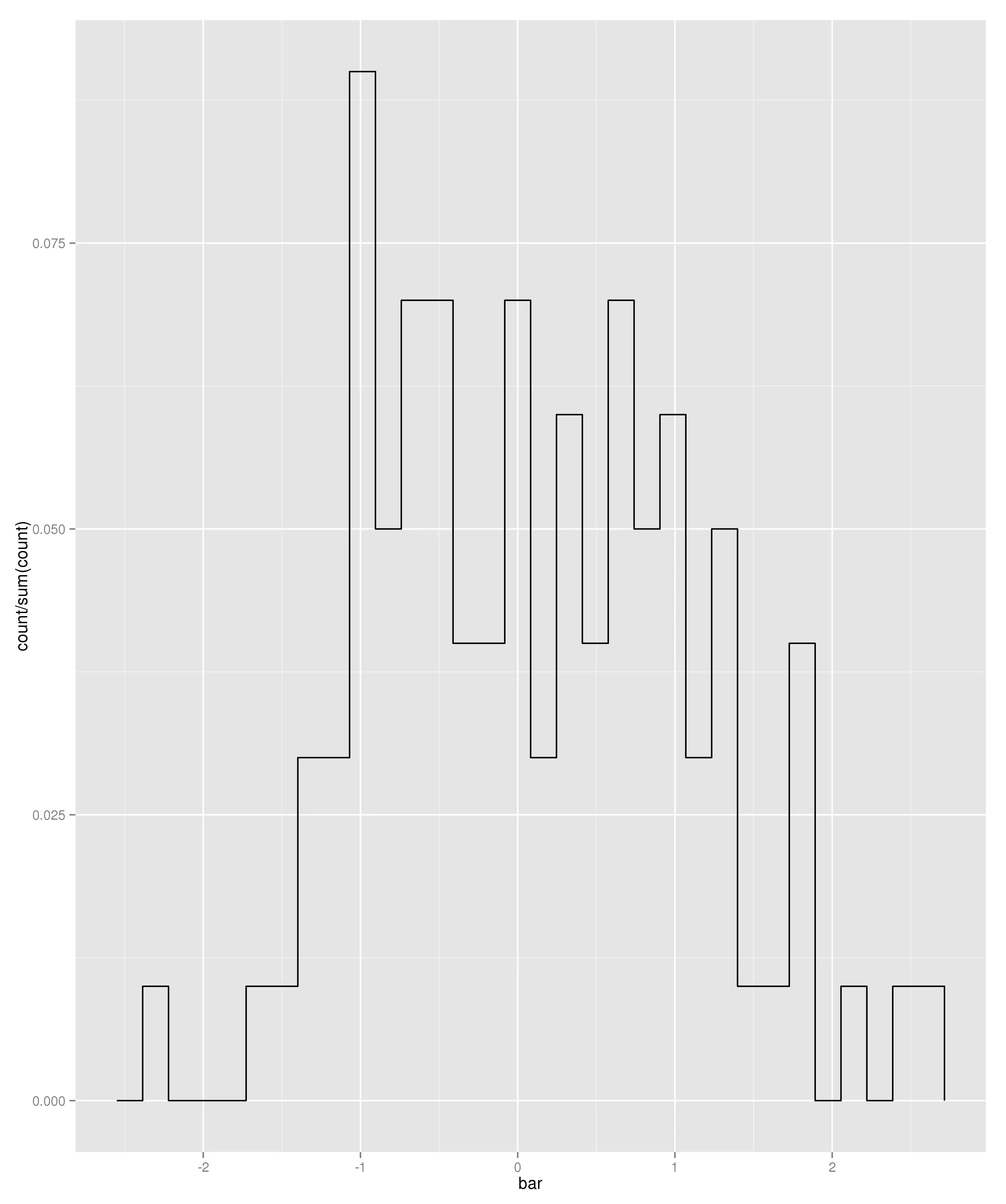
p + geom_histogram(size = 2, colour = "red", fill = "white") + geom_histogram(colour = "transparent", fill = "white")
编辑:
geom_histogram(size = 2, colour = "red", fill = "white") 创建了以下内容: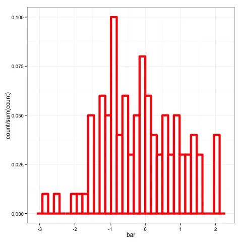
我将轮廓线的宽度编辑为size = 2,以使最终输出结果更美观。但在这个阶段看起来很糟糕。为了移除内部线条,您可以添加geom_histogram(colour = "transparent", fill = "white"),这会在顶部绘制另一个直方图,覆盖内部线条(以及一些轮廓线,这就是我认为size = 2看起来不错的原因)。
geom_density可以正确地得到多条彩色线,但形状不对,所以不确定答案是什么。 - user248237geom_density?我的解决方案使用了geom_step(这正是你所要求的),而Jake的解决方案则使用了geom_histogram。 - ziggystar