R或Matlab中使用的双变量分布的三维图

15
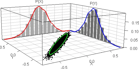
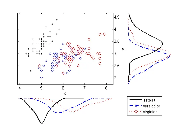
我想知道有没有人能告诉我如何绘制类似于下图中的内容: enter image description here 
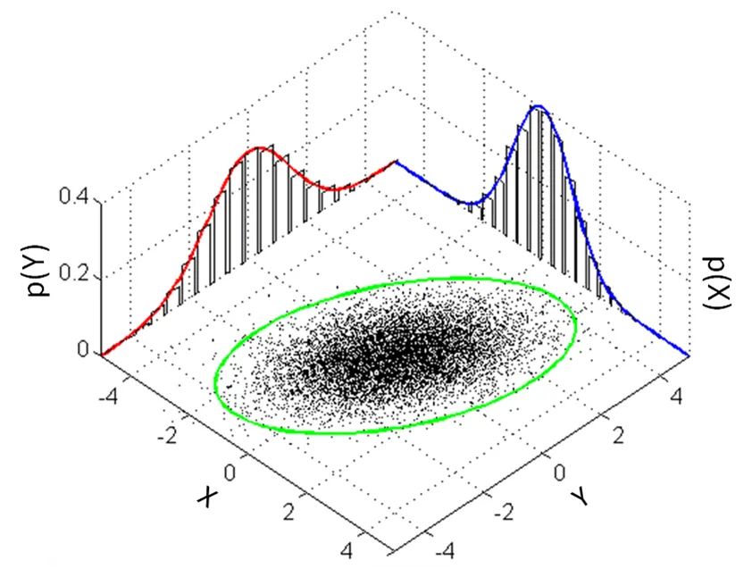
在两条曲线下面使用样本生成的直方图,使用R或者Matlab,但最好使用R。
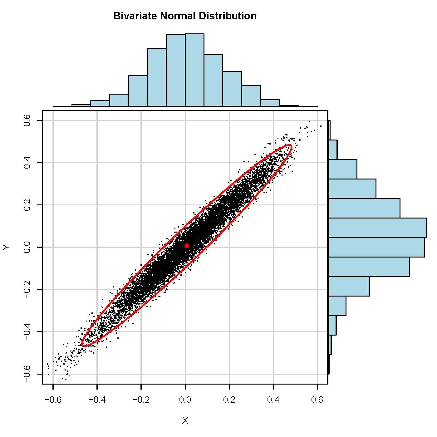
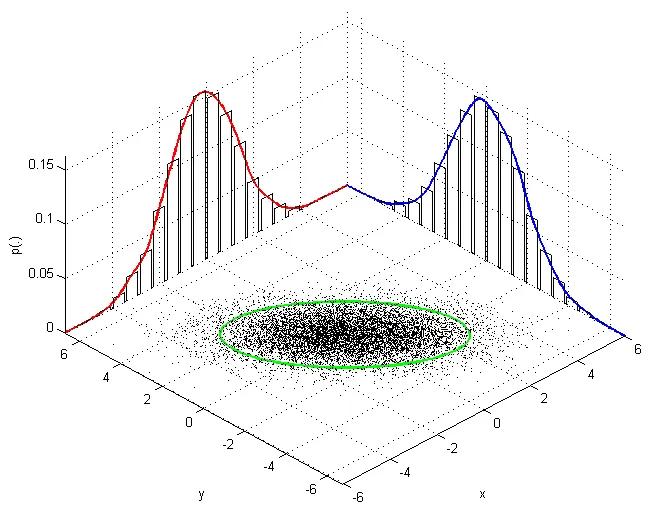
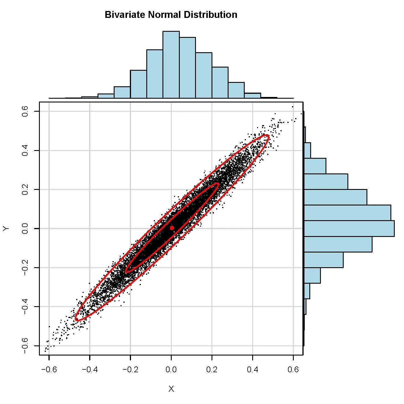
# bivariate normal with a gibbs sampler...

gibbs<-function (n, rho) 
{
  mat <- matrix(ncol = 2, nrow = n)
  x <- 0
  y <- 0
  mat[1, ] <- c(x, y)
  for (i in 2:n) {
    x <- rnorm(1, rho * y, (1 - rho^2))
    y <- rnorm(1, rho * x,(1 - rho^2))
    mat[i, ] <- c(x, y)
  }
  mat
}


bvn<-gibbs(10000,0.98)
par(mfrow=c(3,2))
plot(bvn,col=1:10000,main="bivariate normal distribution",xlab="X",ylab="Y")
plot(bvn,type="l",main="bivariate normal distribution",xlab="X",ylab="Y")

hist(bvn[,1],40,main="bivariate normal distribution",xlab="X",ylab="")
hist(bvn[,2],40,main="bivariate normal distribution",xlab="Y",ylab="")
par(mfrow=c(1,1))`

提前致谢。

最好的问候,

JC T.


1
原始的Matlab代码位于Wikimedia上原始文件的旁边。https://commons.wikimedia.org/wiki/File:MultivariateNormal.png (来源:我创建了这张图) - bscan
6个回答

16
你可以在Matlab中以编程的方式完成它。
这是结果: Matlab plot 代码:
% Generate some data.
data = randn(10000, 2);

% Scale and rotate the data (for demonstration purposes).
data(:,1) = data(:,1) * 2;
theta = deg2rad(130);
data = ([cos(theta) -sin(theta); sin(theta) cos(theta)] * data')';

% Get some info.
m = mean(data);
s = std(data);
axisMin = m - 4 * s;
axisMax = m + 4 * s;

% Plot data points on (X=data(x), Y=data(y), Z=0)
plot3(data(:,1), data(:,2), zeros(size(data,1),1), 'k.', 'MarkerSize', 1);

% Turn on hold to allow subsequent plots.
hold on

% Plot the ellipse using Eigenvectors and Eigenvalues.
data_zeroMean = bsxfun(@minus, data, m);
[V,D] = eig(data_zeroMean' * data_zeroMean / (size(data_zeroMean, 1)));
[D, order] = sort(diag(D), 'descend');
D = diag(D);
V = V(:, order);
V = V * sqrt(D);
t = linspace(0, 2 * pi);
e = bsxfun(@plus, 2*V * [cos(t); sin(t)], m');
plot3(...
    e(1,:), e(2,:), ...
    zeros(1, nPointsEllipse), 'g-', 'LineWidth', 2);

maxP = 0;
for side = 1:2
    % Calculate the histogram.
    p = [0 hist(data(:,side), 20) 0];
    p = p / sum(p);
    maxP = max([maxP p]);
    dx = (axisMax(side) - axisMin(side)) / numel(p) / 2.3;
    p2 = [zeros(1,numel(p)); p; p; zeros(1,numel(p))]; p2 = p2(:);
    x = linspace(axisMin(side), axisMax(side), numel(p));
    x2 = [x-dx; x-dx; x+dx; x+dx]; x2 = max(min(x2(:), axisMax(side)), axisMin(side));

    % Calculate the curve.
    nPtsCurve = numel(p) * 10;
    xx = linspace(axisMin(side), axisMax(side), nPtsCurve);

    % Plot the curve and the histogram.
    if side == 1
        plot3(xx, ones(1, nPtsCurve) * axisMax(3 - side), spline(x,p,xx), 'r-', 'LineWidth', 2);
        plot3(x2, ones(numel(p2), 1) * axisMax(3 - side), p2, 'k-', 'LineWidth', 1);
    else
        plot3(ones(1, nPtsCurve) * axisMax(3 - side), xx, spline(x,p,xx), 'b-', 'LineWidth', 2);
        plot3(ones(numel(p2), 1) * axisMax(3 - side), x2, p2, 'k-', 'LineWidth', 1);
    end

end

% Turn off hold.
hold off

% Axis labels.
xlabel('x');
ylabel('y');
zlabel('p(.)');

axis([axisMin(1) axisMax(1) axisMin(2) axisMax(2) 0 maxP * 1.05]);
grid on;

14

我必须承认,我接受了这个挑战是因为我正在寻找展示其他数据集的不同方法。以往我通常会做一些类似于其他答案中所示的scatterhist 2D图表,但我想尝试一下rgl

我使用你的函数生成数据。

gibbs<-function (n, rho) {
    mat <- matrix(ncol = 2, nrow = n)
    x <- 0
    y <- 0
    mat[1, ] <- c(x, y)
    for (i in 2:n) {
        x <- rnorm(1, rho * y, (1 - rho^2))
        y <- rnorm(1, rho * x, (1 - rho^2))
        mat[i, ] <- c(x, y)
    }
    mat
}
bvn <- gibbs(10000, 0.98)

设置

我使用rgl进行繁重的工作,但我不知道如何在不使用car的情况下获得置信椭圆。我猜想还有其他方法可以解决这个问题。

library(rgl) # plot3d, quads3d, lines3d, grid3d, par3d, axes3d, box3d, mtext3d
library(car) # dataEllipse

处理数据

获取直方图数据但不绘图,然后提取密度并将其标准化为概率。 *max 变量是为了简化未来的绘图。

hx <- hist(bvn[,2], plot=FALSE)
hxs <- hx$density / sum(hx$density)
hy <- hist(bvn[,1], plot=FALSE)
hys <- hy$density / sum(hy$density)

## [xy]max: so that there's no overlap in the adjoining corner
xmax <- tail(hx$breaks, n=1) + diff(tail(hx$breaks, n=2))
ymax <- tail(hy$breaks, n=1) + diff(tail(hy$breaks, n=2))
zmax <- max(hxs, hys)

在底部绘制基本散点图

根据分布情况设置合适的比例尺。诚然,X轴和Y轴标签的位置不够美观,但这应该很容易根据数据重新定位。

## the base scatterplot
plot3d(bvn[,2], bvn[,1], 0, zlim=c(0, zmax), pch='.',
       xlab='X', ylab='Y', zlab='', axes=FALSE)
par3d(scale=c(1,1,3))

后墙上的直方图

我不知道如何让它们在整体 3D 渲染平面上自动绘制,所以我不得不手动制作每个矩形。

## manually create each histogram
for (ii in seq_along(hx$counts)) {
    quads3d(hx$breaks[ii]*c(.9,.9,.1,.1) + hx$breaks[ii+1]*c(.1,.1,.9,.9),
            rep(ymax, 4),
            hxs[ii]*c(0,1,1,0), color='gray80')
}
for (ii in seq_along(hy$counts)) {
    quads3d(rep(xmax, 4),
            hy$breaks[ii]*c(.9,.9,.1,.1) + hy$breaks[ii+1]*c(.1,.1,.9,.9),
            hys[ii]*c(0,1,1,0), color='gray80')
}

概述

## I use these to ensure the lines are plotted "in front of" the
## respective dot/hist
bb <- par3d('bbox')
inset <- 0.02 # percent off of the floor/wall for lines
x1 <- bb[1] + (1-inset)*diff(bb[1:2])
y1 <- bb[3] + (1-inset)*diff(bb[3:4])
z1 <- bb[5] + inset*diff(bb[5:6])

## even with draw=FALSE, dataEllipse still pops up a dev, so I create
## a dummy dev and destroy it ... better way to do this?
dev.new()
de <- dataEllipse(bvn[,1], bvn[,2], draw=FALSE, levels=0.95)
dev.off()

## the ellipse
lines3d(de[,2], de[,1], z1, color='green', lwd=3)

## the two density curves, probability-style
denx <- density(bvn[,2])
lines3d(denx$x, rep(y1, length(denx$x)), denx$y / sum(hx$density), col='red', lwd=3)
deny <- density(bvn[,1])
lines3d(rep(x1, length(deny$x)), deny$x, deny$y / sum(hy$density), col='blue', lwd=3)

美化

grid3d(c('x+', 'y+', 'z-'), n=10)
box3d()
axes3d(edges=c('x-', 'y-', 'z+'))
outset <- 1.2 # place text outside of bbox *this* percentage
mtext3d('P(X)', edge='x+', pos=c(0, ymax, outset * zmax))
mtext3d('P(Y)', edge='y+', pos=c(xmax, 0, outset * zmax))

最终产品

使用rgl的一个优点是可以用鼠标将其旋转并找到最佳视角。虽然没有为此SO页面制作动画,但完成上述所有操作应该允许您拥有足够的播放时间。(如果旋转它,您将能够看到线条略微在直方图前面,并且略高于散点图;否则我会发现相交,因此在某些地方看起来不连续。)

3D bivariate scatter/hist

最后,我认为这有点分散注意力(2D变体已经足够了):显示z轴意味着数据有第三个维度;特别是Tufte反对这种行为(Tufte,“Envisioning Information”,1990年)。但是,随着维数的增加,使用RGL的这种技术将允许更深入地了解模式。

(记录一下,Win7 x64,在32位和64位R-3.0.3上进行了测试,rgl v0.93.996,car v2.0-19。)


10

使用 bvn <- as.data.frame(gibbs(10000,0.98)) 创建数据框。在 R 中有几个2D解决方案:


1: 使用 psych 包的快速且简单的解决方案:

library(psych)
scatter.hist(x=bvn$V1, y=bvn$V2, density=TRUE, ellipse=TRUE)

这将导致: < p > < img alt="enter image description here" src="https://istack.dev59.com/C3Ue8.webp"/>


2: 使用ggplot2的一个漂亮而简洁的解决方案:
library(ggplot2)
library(gridExtra)
library(devtools)
source_url("https://raw.github.com/low-decarie/FAAV/master/r/stat-ellipse.R") # needed to create the 95% confidence ellipse

htop <- ggplot(data=bvn, aes(x=V1)) + 
  geom_histogram(aes(y=..density..), fill = "white", color = "black", binwidth = 2) + 
  stat_density(colour = "blue", geom="line", size = 1.5, position="identity", show_guide=FALSE) +
  scale_x_continuous("V1", limits = c(-40,40), breaks = c(-40,-20,0,20,40)) + 
  scale_y_continuous("Count", breaks=c(0.0,0.01,0.02,0.03,0.04), labels=c(0,100,200,300,400)) + 
  theme_bw() + theme(axis.title.x = element_blank())

blank <- ggplot() + geom_point(aes(1,1), colour="white") +
  theme(axis.ticks=element_blank(), panel.background=element_blank(), panel.grid=element_blank(),
        axis.text.x=element_blank(), axis.text.y=element_blank(), axis.title.x=element_blank(), axis.title.y=element_blank())

scatter <- ggplot(data=bvn, aes(x=V1, y=V2)) + 
  geom_point(size = 0.6) + stat_ellipse(level = 0.95, size = 1, color="green") +
  scale_x_continuous("label V1", limits = c(-40,40), breaks = c(-40,-20,0,20,40)) + 
  scale_y_continuous("label V2", limits = c(-20,20), breaks = c(-20,-10,0,10,20)) + 
  theme_bw()

hright <- ggplot(data=bvn, aes(x=V2)) + 
  geom_histogram(aes(y=..density..), fill = "white", color = "black", binwidth = 1) + 
  stat_density(colour = "red", geom="line", size = 1, position="identity", show_guide=FALSE) +
  scale_x_continuous("V2", limits = c(-20,20), breaks = c(-20,-10,0,10,20)) + 
  scale_y_continuous("Count", breaks=c(0.0,0.02,0.04,0.06,0.08), labels=c(0,200,400,600,800)) + 
  coord_flip() + theme_bw() + theme(axis.title.y = element_blank())

grid.arrange(htop, blank, scatter, hright, ncol=2, nrow=2, widths=c(4, 1), heights=c(1, 4))

这将导致:

enter image description here


3: 使用ggplot2的简洁解决方案:

library(ggplot2)
library(devtools)
source_url("https://raw.github.com/low-decarie/FAAV/master/r/stat-ellipse.R") # needed to create the 95% confidence ellipse

ggplot(data=bvn, aes(x=V1, y=V2)) + 
  geom_point(size = 0.6) + 
  geom_rug(sides="t", size=0.05, col=rgb(.8,0,0,alpha=.3)) + 
  geom_rug(sides="r", size=0.05, col=rgb(0,0,.8,alpha=.3)) + 
  stat_ellipse(level = 0.95, size = 1, color="green") +
  scale_x_continuous("label V1", limits = c(-40,40), breaks = c(-40,-20,0,20,40)) + 
  scale_y_continuous("label V2", limits = c(-20,20), breaks = c(-20,-10,0,10,20)) + 
  theme_bw()

这将导致:

enter image description here


4
Matlab的实现被称为scatterhist,需要使用统计工具箱。不幸的是,它不是3D图形,而是扩展的2D图形。
% some example data
x = randn(1000,1);
y = randn(1000,1);

h = scatterhist(x,y,'Location','SouthEast',...
                'Direction','out',...
                'Color','k',...
                'Marker','o',...
                'MarkerSize',4);

legend('data')
legend boxoff
grid on

enter image description here

它还允许数据集的分组:
load fisheriris.mat;
x = meas(:,1);        %// x-data
y = meas(:,2);        %// y-data
gnames = species;     %// assigning of names to certain elements of x and y


scatterhist(x,y,'Group',gnames,'Location','SouthEast',...
            'Direction','out',...
            'Color','kbr',...
            'LineStyle',{'-','-.',':'},...
            'LineWidth',[2,2,2],...
            'Marker','+od',...
            'MarkerSize',[4,5,6]);

enter image description here


4

R实现

加载库“car”。我们仅使用dataEllipse函数根据数据百分比(0.95表示95%的数据落在椭圆内)绘制椭圆。

library("car")

gibbs<-function (n, rho) 
 {
   mat <- matrix(ncol = 2, nrow = n)
   x <- 0
   y <- 0
   mat[1, ] <- c(x, y)
   for (i in 2:n) {
   x <- rnorm(1, rho * y, (1 - rho^2))
   y <- rnorm(1, rho * x,(1 - rho^2))
   mat[i, ] <- c(x, y)
   }
   mat
 }

bvn<-gibbs(10000,0.98)

打开PDF设备:

OUTFILE <- "bivar_dist.pdf"

pdf(OUTFILE)

首先设置布局

layout(matrix(c(2,0,1,3),2,2,byrow=TRUE), widths=c(3,1), heights=c(1,3), TRUE)

制作散点图
par(mar=c(5.1,4.1,0.1,0))

注释掉的代码行可以用来绘制散点图,无需使用“car”包,我们可以使用dataEllipse函数。
# plot(bvn[,2], bvn[,1], 
#      pch=".",cex = 1, col=1:length(bvn[,2]),
#      xlim=c(-0.6, 0.6),
#      ylim=c(-0.6,0.6),
#      xlab="X",
#      ylab="Y")
# 
# grid(NULL, NULL, lwd = 2)


dataEllipse(bvn[,2], bvn[,1],
        levels = c(0.95),
        pch=".",
        col=1:length(bvn[,2]),
        xlim=c(-0.6, 0.6),
        ylim=c(-0.6,0.6),
        xlab="X",
        ylab="Y",
        center.cex = 1
        )

在顶部行中绘制X变量的直方图。
     par(mar=c(0,4.1,3,0))

     hist(bvn[,2],
          ann=FALSE,axes=FALSE,
          col="light blue",border="black",
          )
     title(main = "Bivariate Normal Distribution")

在散点图右侧绘制Y变量的直方图

     yhist <- hist(bvn[,1],
                   plot=FALSE
                  )

     par(mar=c(5.1,0,0.1,1))

     barplot(yhist$density,
             horiz=TRUE,
             space=0,
             axes=FALSE,
             col="light blue",
             border="black"
             )

 dev.off(which = dev.cur())

Image Output is Below

select 50 and 95 % data within ellipses

      dataEllipse(bvn[,2], bvn[,1],
                  levels = c(0.5, 0.95),
                  pch=".",
                  col= 1:length(bvn[,2]),
                  xlim=c(-0.6, 0.6),
                  ylim=c(-0.6,0.6),
                  xlab="X",
                  ylab="Y",
                  center.cex = 1
                 )

使用“scatterplot3d”包绘制三维散点图。#scatterplot3d(y = bvn[,1], x=bvn[,2], xlab="X", ylab="p(Y)", zlab="Z", axis = T, angle=-80, pch = 21, z.ticklabs=NULL) - Sathish

3
我使用了@jaap上面的代码,并将其转化为一个稍微更加通用的函数。该代码可以从此处获取。注意:我没有在@jaap的代码中添加任何新内容,只做了一些小的改动并将其封装成一个函数。希望这对您有所帮助。
density.hist <- function(df, x=NULL, y=NULL) {

require(ggplot2)
require(gridExtra)
require(devtools)

htop <- ggplot(data=df, aes_string(x=x)) + 
  geom_histogram(aes(y=..density..), fill = "white", color = "black", bins=100) + 
  stat_density(colour = "blue", geom="line", size = 1, position="identity", show.legend=FALSE) +
  theme_bw() + theme(axis.title.x = element_blank())

blank <- ggplot() + geom_point(aes(1,1), colour="white") +
  theme(axis.ticks=element_blank(), panel.background=element_blank(), panel.grid=element_blank(),
  axis.text.x=element_blank(), axis.text.y=element_blank(), axis.title.x=element_blank(), 
  axis.title.y=element_blank())

scatter <- ggplot(data=df, aes_string(x=x, y=y)) + 
  geom_point(size = 0.6) + stat_ellipse(type = "norm", linetype = 2, color="green",size=1) +
  stat_ellipse(type = "t",color="green",size=1) +
  theme_bw() + labs(x=x, y=y)

hright <- ggplot(data=df, aes_string(x=x)) + 
  geom_histogram(aes(y=..density..), fill = "white", color = "black", bins=100) + 
  stat_density(colour = "red", geom="line", size = 1, position="identity", show.legend=FALSE) +
  coord_flip() + theme_bw() + theme(axis.title.y = element_blank())

grid.arrange(htop, blank, scatter, hright, ncol=2, nrow=2, widths=c(4, 1), heights=c(1, 4))

}

output of scatter.hist function


网页内容由stack overflow 提供, 点击上面的
可以查看英文原文,
原文链接