制作像素化的边框半径。

4

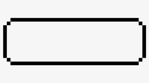
我有一个游戏,看起来有点像1980年的游戏。我有这个对话框:

#firstPageText {
            width: 300px;
            min-height: 100px;
            border: 2px solid;
            padding: 1em;
            margin: 0;
            position: absolute;
            bottom: 50px;
            left: 50%;
            -ms-transform: translate(-50%, 0%);
            transform: translate(-50%, 0%);
            font-family: 'Press Start 2P', cursive;
            border-radius: 5px;
        }
<link rel="preconnect" href="https://fonts.googleapis.com">
    <link rel="preconnect" href="https://fonts.gstatic.com" crossorigin>
    <link href="https://fonts.googleapis.com/css2?family=Press+Start+2P&display=swap" rel="stylesheet">

<p id="firstPageText">
  This is a test text.
</p>

我想给这个对话框添加一个类似于pokemon的边框半径:

有没有办法实现像素化的边框半径,而不是圆角边框半径?


对于一个通用情况(任何半径)还是你正在展示的特定情况? - Temani Afif
@TemaniAfif 实际上,我需要一个看起来与图片完全相同的。但是你有什么想法吗?我很想看看它。 - user16262715
@TemaniAfif 顺便说一下,我在你的个人资料中找到了电子邮件(号码):D - user16262715
很好,但不要破坏它 ;) - Temani Afif
@TemaniAfif 当然哈哈哈 :) - user16262715
2个回答

2

我会考虑使用多个背景:

#firstPageText {
  --b:5px;  /* the thickness */
  --c:#000; /* the color */
  width: 300px;
  min-height: 100px;
  font-family: 'Press Start 2P', cursive;
  padding:calc(5*var(--b));
  position:relative;
}
  
#firstPageText::before,
#firstPageText::after { 
  content:"";
  position:absolute;
  inset:0 0 50% 0;
  background:
    linear-gradient(var(--c) 0 0) 50%   0  /calc(100% - 4*var(--b)) var(--b),
    linear-gradient(var(--c) 0 0) 0%   100%/var(--b) calc(100% - 2*var(--b)),
    linear-gradient(var(--c) 0 0) 100% 100%/var(--b) calc(100% - 2*var(--b)),
    conic-gradient(from  90deg,var(--c) 90deg,#0000 0) 0    0/calc(2*var(--b)) calc(2*var(--b)),
    conic-gradient(from 180deg,var(--c) 90deg,#0000 0) 100% 0/calc(2*var(--b)) calc(2*var(--b));
  background-repeat:no-repeat;
}
#firstPageText::after {
  transform-origin:bottom;
  transform:scaleY(-1);
}
<p id="firstPageText">
  This is a test text.
</p>

应用不同的颜色来理解谜题:

#firstPageText {
  --b:10px; /* adjust this */
  width: 300px;
  min-height: 100px;
  font-family: 'Press Start 2P', cursive;
  padding:calc(5*var(--b));
  position:relative;
}
  
#firstPageText::before,
#firstPageText::after { 
  content:"";
  position:absolute;
  inset:0 0 50% 0;
  background:
    linear-gradient(red 0 0) 50%   0  /calc(100% - 4*var(--b)) var(--b),
    linear-gradient(blue 0 0) 0%   100%/var(--b) calc(100% - 2*var(--b)),
    linear-gradient(green 0 0) 100% 100%/var(--b) calc(100% - 2*var(--b)),
    conic-gradient(from  90deg,orange 90deg,lightblue 0) 0    0/calc(2*var(--b)) calc(2*var(--b)),
    conic-gradient(from 180deg,purple 90deg,lightblue 0) 100% 0/calc(2*var(--b)) calc(2*var(--b));
  background-repeat:no-repeat;
}
#firstPageText::after {
  transform-origin:bottom;
  transform:scaleY(-1);
  filter:hue-rotate(180deg);
}
<p id="firstPageText">
  This is a test text.
</p>


嗨Temani,你能帮忙看一下这个问题吗?https://dev59.com/acHqa4cB1Zd3GeqP57vh。作为一个CSS黑客,你可能有一个简洁的解决方案:o - user16262715

0
从我所看到的来看,我认为这不是普通的边框半径甚至不是SVG,我认为这些是设计成这种方式的多个元素。
<!DOCTYPE html>
 <html>
 <head>
     <title></title>
     <meta charset="utf-8" />
     <style>
        .box {
            width: 230px;
            min-height: 100px;
            margin: 25px auto;
            position: relative;
        }
        .top {
            height: 10px;
            background: #000;
            width: 85%;
            position: absolute;
            top: 0;
            left: 50%;
            transform: translateX(-50%);
        }
        .right {
            height: 65%;
            background: #000;
            width: 10px;
            position: absolute;
            right: 0;
            top: 50%;
            transform: translateY(-50%);
            z-index: 1;
        }
        .bottom {
            height: 10px;
            background: #000;
            width: 85%;
            position: absolute;
            bottom: 0;
            left: 50%;
            transform: translateX(-50%);
        }
        .left {
            height: 65%;
            background: #000;
            width: 10px;
            position: absolute;
            left: 0;
            top: 50%;
            transform: translateY(-50%);
        }
        /*                  Squares                 */
        .top:before {
            content: "";
            height: 80%;
            background: #000;
            width: 8px;
            position: absolute;
            right:0;
            bottom: -40%;
            z-index: 99;
            transform: translate(85%, 50%)
        }
        .right:before {
            content: "";
            height: 8px;
            background: #000;
            width: 80%;
            position: absolute;
            right:0;
            bottom: -40%;
            z-index: 99;
            transform: translate(-100%, -230%)
        }
        
        .bottom:before {
            content: "";
            height: 80%;
            background: #000;
            width: 8px;
            position: absolute;
            left:0;
            bottom: -40%;
            z-index: 99;
            transform: translate(-90%, -170%)
        }
        
        .left:before {
            content: "";
            height: 8px;
            background: #000;
            width: 80%;
            position: absolute;
            right:0;
            top: -40%;
            z-index: 99;
            transform: translate(100%, 230%)
        }
     </style>
 </head>
     <body>
    <div class="box">
        <div class="top"></div>
        <div class="right"></div>
        <div class="bottom"></div>
        <div class="left"></div>
    </div>
     </body>
 </html>
  • 这不是一个可扩展的框,它是一个具有静态宽度的框,当改变宽度时,您需要处理正方形以使其与新宽度相容。

非常感谢您的努力。不幸的是,我需要的是它通常会改变高度,而在您的例子中它并不合适。无论如何感谢您的努力,您的努力值得肯定。 - user16262715

网页内容由stack overflow 提供, 点击上面的
可以查看英文原文,
原文链接