我有一份智利地图(http://labgeo.ufro.cl/fichas/chile_geo/ficha_cl_geo.html 第一个链接写着“智利大陆”),我想绘制它并在其中添加一些中心点,这些中心点的纬度和经度数据已知。
我是geopandas和matplotlib的新手,但我成功地使用这篇文章中matplotlib的建议答案将地图与不同颜色的点作为中心绘制出来:Color by Column Values in Matplotlib
以下是我的代码:
#Loading data, since I am making the coordinates up they won´t fit the map nicely but you will get the idea
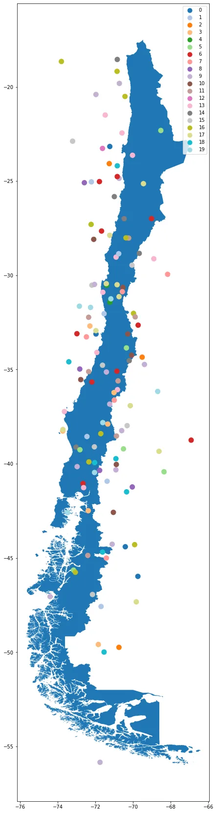
map_= gpd.read_file("cl_continental_geo.shp")
geo_df_ = pd.DataFrame({"id":np.random.randint(20, size=133) ,"Latitude": np.random.normal(-34.406922,7.819504, 133), "Longitud": np.random.normal(-71.243350,1.254126, 133)})
geometry =[Point(xy) for xy in zip( geo_df_["Longitud"],geo_df_["Latitude"])]
geo_df_ =gpd.GeoDataFrame(geo_df_, crs={"init":"epsg:4326"},geometry= geometry)
# creating color map for categories
categories = np.unique(geo_df_["id"])
colors = np.linspace(0, 1, len(categories))
colordict = dict(zip(categories, colors))
#matching it to the geopandas df
geo_df_["Color"] = geo_df_["id"].apply(lambda x: colordict[x])
#plotting
geo_df_.plot(ax=map_.plot(figsize=(40, 30)), marker='o', c =geo_df_.Color, markersize=100)
我试图尝试不同的方法,但无法使图例显示出来。
- 我尝试添加legend=True。 - 我尝试通过首先定义ax,但我无法正确地传递数据来创建图表,最终什么也没有。 - 尝试了这个解决方案,但是我的shp文件只有一行多边形信息,我不知道如何创建所建议的交叉数据框 Generating Legend for geopandas plot 到目前为止,我唯一做到的是显示带有颜色编号的ID字典,通过在结尾处添加 .legend() 来实现此操作:
geo_df_.plot(ax=map_.plot(figsize=(40,30)), marker='o', c=geo_df_.Color, markersize=100).legend()。 但我会收到以下错误:No handles with labels found to put in legend.
但当我将颜色字典作为参数传递时,它会显示一个点在图例中。
我想要实现的是像这个帖子中的图例:
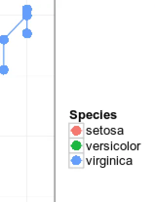 取自此帖子:Control ggplot2 legend look without affecting the plot。
我的理想图例将是在侧面有一个带有所有彩色点的正方形,通过它们所代表的中心标识。因此,例如黄点:(中心)5,紫点:8等。
我已经做到的只是一个点,显示整个字典,如下所示:
plt.legend()会发生什么? - Juan C