ggplot:按组自动化生成百分位数线

5

我发现dplyr%>%操作符对于简单的ggplot2转换非常有帮助(无需使用ggproto,这是扩展ggplot2的必备工具),例如:

library(ggplot2)
library(scales)
library(dplyr)

gg.histo.pct.by.group <- function(g, ...) {
  g + 
    geom_histogram(aes(y=unlist(lapply(unique(..group..), function(grp) ..count..[..group..==grp] / sum(..count..[..group..==grp])))), ...) +
    scale_y_continuous(labels = percent) + 
    ylab("% of total count by group")
}

data = diamonds %>% select(carat, color) %>% filter(color %in% c('H', 'D'))

g = ggplot(data, aes(carat, fill=color)) %>% 
  gg.histo.pct.by.group(binwidth=0.5, position="dodge")

在这些类型的图表中,通常会添加带标签的百分位线,例如:

R plot

实现此功能的一种简单方法是复制并粘贴以下代码:

facts = data %>% 
  group_by(color) %>% 
  summarize(
    p50=quantile(carat, 0.5, na.rm=T), 
    p90=quantile(carat, 0.9, na.rm=T)
  )

ymax = ggplot_build(g)$panel$ranges[[1]]$y.range[2]

g +
  geom_vline(data=facts, aes(xintercept=p50, color=color), linetype="dashed", size=1) +
  geom_vline(data=facts, aes(xintercept=p90, color=color), linetype="dashed", size=1) +
  geom_text(data=facts, aes(x=p50, label=paste("p50=", p50), y=ymax, color=color), vjust=1.5, hjust=1, size=4, angle=90) +
  geom_text(data=facts, aes(x=p90, label=paste("p90=", p90), y=ymax, color=color), vjust=1.5, hjust=1, size=4, angle=90)

我希望将这个封装成像 g %>% gg.percentile.x(c(.5, .9)) 这样的东西,但我还没有找到一个好的方法来结合使用 aes_aes_string 以及在图形对象中发现分组列,以便正确计算百分位数。我需要一些帮助。

2个回答

11

我认为创建所需图形的最有效方法包括三个步骤:

  1. 编写两个独立的简单统计量(参见https://cran.r-project.org/web/packages/ggplot2/vignettes/extending-ggplot2.html中的Creating a new stat部分):一个用于在百分位数位置添加垂直线,另一个用于添加文本标签;
  2. 将刚刚编写的两个统计量组合成所需的统计量,并根据需要设置参数;
  3. 使用工作结果。

因此,答案也由3部分组成。

第1部分。用于在百分位数位置添加垂直线的统计量应基于x轴的数据计算这些值,并以适当的格式返回结果。以下是代码:

library(ggplot2)

StatPercentileX <- ggproto("StatPercentileX", Stat,
  compute_group = function(data, scales, probs) {
    percentiles <- quantile(data$x, probs=probs)
    data.frame(xintercept=percentiles)
    },
  required_aes = c("x")
)

stat_percentile_x <- function(mapping = NULL, data = NULL, geom = "vline",
                              position = "identity", na.rm = FALSE,
                              show.legend = NA, inherit.aes = TRUE, ...) {
  layer(
    stat = StatPercentileX, data = data, mapping = mapping, geom = geom, 
    position = position, show.legend = show.legend, inherit.aes = inherit.aes,
    params = list(na.rm = na.rm, ...)
  )
}

添加文本标签的统计数据也是一样的(默认位置在图形顶部):

StatPercentileXLabels <- ggproto("StatPercentileXLabels", Stat,
  compute_group = function(data, scales, probs) {
    percentiles <- quantile(data$x, probs=probs)
    data.frame(x=percentiles, y=Inf,
               label=paste0("p", probs*100, ": ",
                            round(percentiles, digits=3)))
    },
  required_aes = c("x")
)

stat_percentile_xlab <- function(mapping = NULL, data = NULL, geom = "text",
                                     position = "identity", na.rm = FALSE,
                                     show.legend = NA, inherit.aes = TRUE, ...) {
  layer(
    stat = StatPercentileXLabels, data = data, mapping = mapping, geom = geom, 
    position = position, show.legend = show.legend, inherit.aes = inherit.aes,
    params = list(na.rm = na.rm, ...)
  )
}

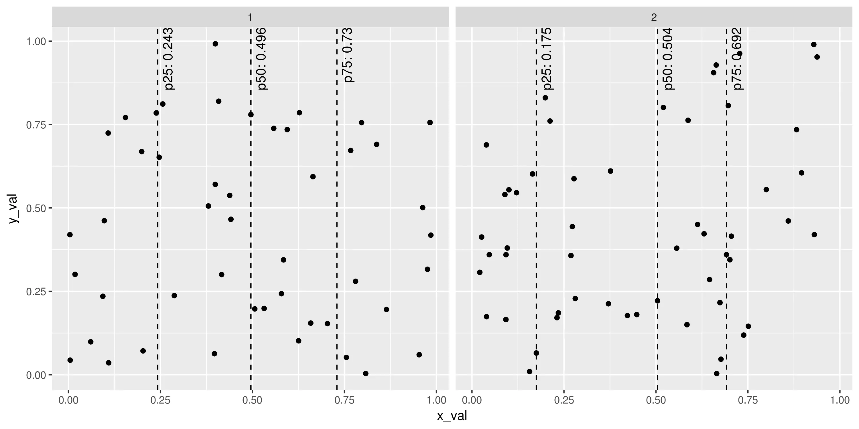
我们已经拥有相当强大的工具,可以以任何方式使用ggplot2提供的功能(着色、分组、拆分等)。例如:

set.seed(1401)
plot_points <- data.frame(x_val=runif(100), y_val=runif(100),
                          g=sample(1:2, 100, replace=TRUE))
ggplot(plot_points, aes(x=x_val, y=y_val)) +
  geom_point() +
  stat_percentile_x(probs=c(0.25, 0.5, 0.75), linetype=2) +
  stat_percentile_xlab(probs=c(0.25, 0.5, 0.75), hjust=1, vjust=1.5, angle=90) +
  facet_wrap(~g)
# ggsave("Example_stat_percentile.png", width=10, height=5, units="in")

输入图像描述

第二部分 虽然对于保持线和文本标签的分离,似乎很自然(尽管要计算百分位数两次会略微影响计算效率),但每次添加两个图层实在是太冗长了。特别是对于 ggplot2来说,有一个简单的方式可以合并图层:将它们放在函数调用的列表中。代码如下:

stat_percentile_x_wlabels <- function(probs=c(0.25, 0.5, 0.75)) {
  list(
    stat_percentile_x(probs=probs, linetype=2),
    stat_percentile_xlab(probs=probs, hjust=1, vjust=1.5, angle=90)
  )
}

通过以下命令可以使用此函数重现先前的示例:

ggplot(plot_points, aes(x=x_val, y=y_val)) +
  geom_point() +
  stat_percentile_x_wlabels() +
  facet_wrap(~g)

注意stat_percentile_x_wlabels需要期望百分位数的概率值,然后将其传递给quantile函数。这是指定它们的地方。

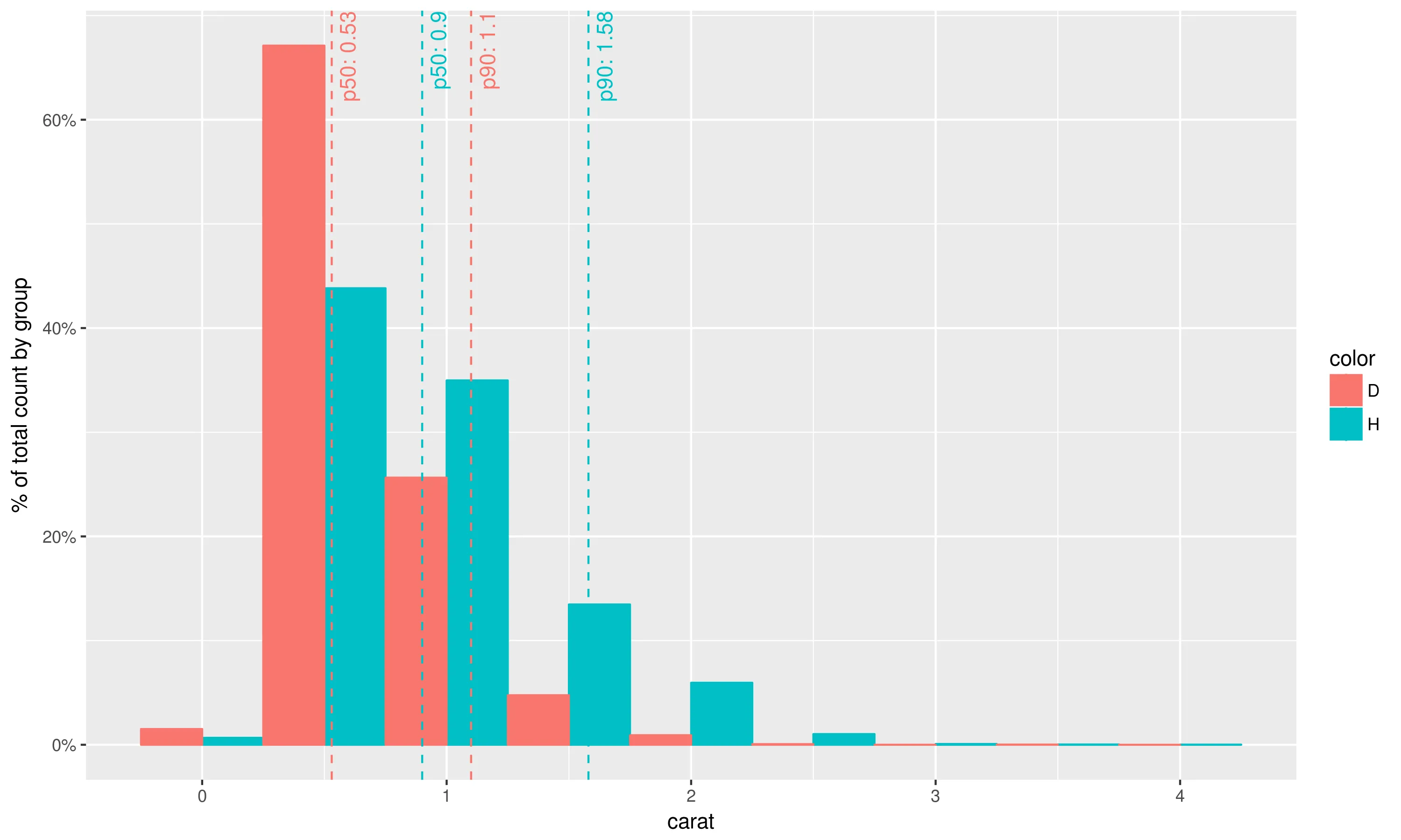
第三步再次使用图层组合的思想,可以按以下方式重现您问题中的绘图:

library(scales)
library(dplyr)

geom_histo_pct_by_group <- function() {
  list(geom_histogram(aes(y=unlist(lapply(unique(..group..),
                                          function(grp) {
                                            ..count..[..group..==grp] /
                                              sum(..count..[..group..==grp])
                                            }))),
                      binwidth=0.5, position="dodge"),
         scale_y_continuous(labels = percent),
         ylab("% of total count by group")
       )
}

data = diamonds %>% select(carat, color) %>% filter(color %in% c('H', 'D'))

ggplot(data, aes(carat, fill=color, colour=color)) +
  geom_histo_pct_by_group() +
  stat_percentile_x_wlabels(probs=c(0.5, 0.9))
# ggsave("Question_plot.png", width=10, height=6, unit="in")

enter image description here

备注

  1. 这种问题的解决方式可以构建更复杂的图形,包括百分位线和标签;

  2. 通过将x更改为y(反之亦然),将vline更改为hline,在适当的位置将xintercept更改为yintercept,可以为来自y轴的数据定义相同的统计信息;

  3. 当然,如果你喜欢使用%>% 而不是ggplot2+,你可以像在问题帖子中一样将定义的统计信息封装到函数中。个人不建议这样做,因为它违反了ggplot2的标准用法。


非常好的回答。我不知道list()的能力。 - Sim

1
我将你的示例放入一个函数中。您可以在fact数据帧中解析非标准评估。(注意:我不喜欢将数据框命名为data,所以在示例中更改为mydata)。
mydata = diamonds %>% select(carat, color) %>% filter(color %in% c('H', 'D'))

myFun <- function(df, X, col, bw, ...) {

  facts <- df %>% 
    group_by_(col) %>% 
    summarize_(
      p50= lazyeval::interp(~ quantile(var, 0.5, na.rm=TRUE), var = as.name(X)),
      p90= lazyeval::interp(~ quantile(var, 0.9, na.rm=TRUE), var = as.name(X))
    )

  gp <- ggplot(df, aes_string(x = X, fill = col)) + 
          geom_histogram( position="dodge", binwidth = bw, aes(y=unlist(lapply(unique(..group..), function(grp) ..count..[..group..==grp] / sum(..count..[..group..==grp])))), ...) +
          scale_y_continuous(labels = percent) + ylab("% of total count by group")

#  ymax = ggplot_build(g)$panel$ranges[[1]]$y.range[2] #doesnt work
  ymax = max(ggplot_build(g)$data[[1]]$ymax)

  gp + aes_string(color = col) +
    geom_vline(data=facts, aes_string(xintercept="p50", color = col), linetype="dashed", size=1) +
    geom_vline(data=facts, aes_string(xintercept="p90", color = col), linetype="dashed", size=1) +
    geom_text(data=facts, aes(x=p50, label=paste("p50=", p50), y=ymax), vjust=1.5, hjust=1, size=4, angle=90) +
    geom_text(data=facts, aes(x=p90, label=paste("p90=", p90), y=ymax), vjust=1.5, hjust=1, size=4, angle=90)
}

myFun(df = mydata, X = "carat", col = "color", bw = 0.5)

geom_histogram with NSE

如果你不想在函数调用时在变量周围加上引号,另一个技巧是通过这个答案在函数开始时设置变量。

myOtherFun <- function(data, var1, var2, ...) { 
  #Value instead of string
  internal.var1 <- eval(substitute(var1), data, parent.frame()) 
  internal.var2 <- eval(substitute(var2), data, parent.frame())
  ggplot(data, aes(x = internal.var1, y = internal.var2)) + geom_point()
}

myOtherFun(mtcars, mpg, hp)   #note: mpg and hp aren't in quotes
ggplot(mtcars, aes(x = mpg, y = hp)) + geom_point()  #same result

网页内容由stack overflow 提供, 点击上面的
可以查看英文原文,
原文链接