我正在尝试学习Flexbox,并且我正在努力创建以下布局。
在移动端,我有以下布局: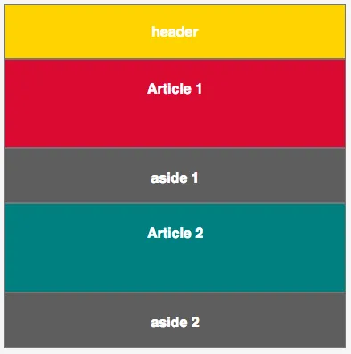 在桌面上是否可能得到以下布局?
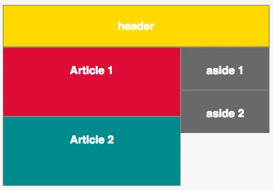
 代码:
代码:
在移动端,我有以下布局:
在桌面上是否可能得到以下布局?
代码:
.wrapper {
  display: flex;
  flex-flow: row wrap;
}
.wrapper > * {
  padding: 10px;
  flex: 1 100%;
  border: 1px solid grey;
}
@media all and (min-width: 600px) {
  .wrapper > article {
    flex: 3 66%;
  }
  .wrapper > aside {
    flex: 1 33%;
  }
}


/* rest of styling */
* {
  box-sizing: border-box;
}
h1 {
  color: #FFF;
  font-size: 16px;
  font-family: sans-serif;
  text-align: center;
}
article {
  height: 100px;
}
aside {
  height: 62px;
}

.article1 {
  background-color: Crimson;
}
.article2 {
  background-color: DarkCyan;
}
aside {
  background-color: DimGray;
}
header {
  background-color: gold;
}<div class="wrapper">
<header>
<h1>header</h1>
</header>
<article class="article1">
<h1>Article 1</h1>
</article>
<aside class="aside1">
<h1>aside 1</h1>
</aside>
<article class="article2">
<h1>Article 2</h1>
</article>
<aside class="aside2">
<h1>aside 2</h1>
</aside>
</div>
我应该将两个旁边的flex项目分组吗?(这是否可能?)还是应该使用列而不是行?