我有以下代码:
.wrapper {
  display: flex;
  flex-direction: column;
  flex-wrap: wrap;
}

.a {
  background-color: red;
  width: 65%;
}

.b {
  background-color: green;
  width: 35%;
}

.c {
  background-color: blue;
  width: 65%;
  height: 100px;
}

.d {
  background-color: orange;
  width: 35%;
}

.e {
  background-color: teal;
  width: 65%;
}

.f {
  background-color: purple;
  width: 35%;
}<div class="wrapper container">
<div class="a">A</div>
<div class="b">B</div>
<div class="c">C</div>
<div class="d">D</div>
<div class="e">E</div>
<div class="f">F</div>
</div>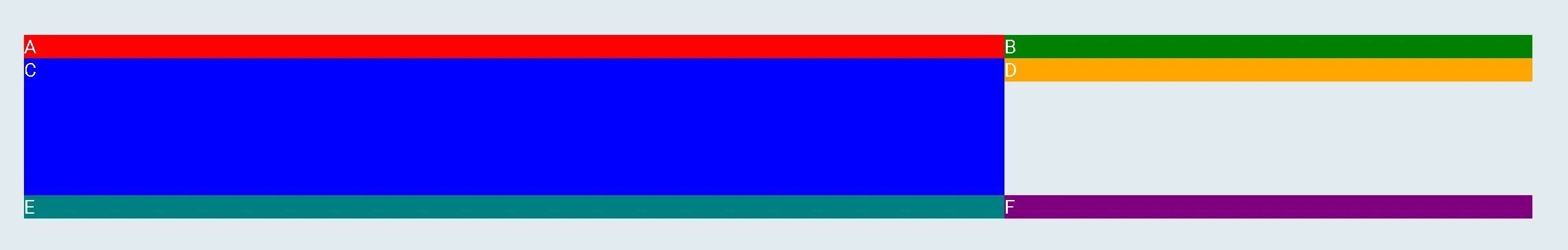
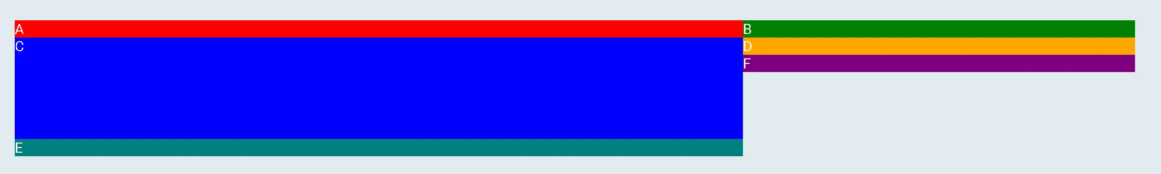
order 在移动端后期排列这些列。在Flexbox中是否有可能实现这一点,或者还有其他更好的方式吗?