给CSS边框箭头只在1侧添加边框

8

我希望有人能帮我找到一种优美的方式,在CSS箭头边框上加边框。
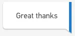
我正在尝试创建这个:

enter image description here

这是我的代码:

HTML

<div class="message-container customer">
    <p class="message">Great thanks</p>
</div>

CSS(层叠样式表)
.message {
    width: auto;
    max-width: 66%;
    padding: 12px 30px;
    box-sizing: border-box;
    background: #ffffff;
    box-shadow: 0 2px 0 2px rgba(177, 177, 177, .07), 0 2px 0 0 rgba(0, 0, 0, .1);
    margin: 4px 0 0 0;
    position: relative;
    float: right;
    border-right: 4px solid #0892cb;
    border-radius: 5px 0 0 5px;
}

.message:after {
    top: 100%;
    right: 0;
    border: solid transparent;
    content: " ";
    height: 0;
    width: 0;
    position: absolute;
    pointer-events: none;
    border-color: rgba(255, 255, 255, 0);
    border-bottom-color: #FFFFFF;
    border-width: 10px;
    margin-right: -14px;
    margin-top: -10px;
    transform: rotate(45deg);
    box-shadow: 0 2px 0 2px rgba(177, 177, 177, .07), 0 2px 0 0 rgba(0, 0, 0, .1);
}

这里有一个工作中的JS fiddle https://jsfiddle.net/kdeo3wpg/

正如您所看到的,我在主消息右侧有一个蓝色边框,但是我无法找到在箭头上也显示蓝色边框的方法。如果可能的话,我真的很想避免使用图片。希望能够找到纯CSS的解决方案。

我曾考虑过尝试使用 :before 伪元素,但是我无法获取所需的完全控制权。

任何帮助将不胜感激。

更新

我已经找到了一个解决方案,但说实话,它并不是非常干净。

https://jsfiddle.net/kdeo3wpg/1/

我所做的是添加一个新元素,它是边框的宽度,并具有相同的背景颜色。然后,我将高度设置为略小于CSS箭头的高度。接下来,我给我的新元素一个CSS箭头,其背景颜色为边框的颜色。
以下是新代码: HTML
<div class="message-container customer">
    <p class="message">
        Great thanks
        <span class="arrow-border"></span>
    </p>
</div>

CSS(层叠样式表)
.message {
  width: auto;
  max-width: 66%;
  padding: 12px 30px;
  box-sizing: border-box;
  background: #ffffff;
  box-shadow: 0 2px 0 2px rgba(177, 177, 177, .07), 0 2px 0 0 rgba(0, 0, 0, .1);
  margin: 4px 0 0 0;
  position: relative;
  float: right;
  border-right: 4px solid #0892cb;
  border-radius: 5px 0 0 5px;
}

.message:after {
    top: 100%;
    right: 0;
    border: solid transparent;
    content: " ";
    height: 0;
    width: 0;
    position: absolute;
    pointer-events: none;
    border-color: rgba(255, 255, 255, 0);
    border-bottom-color: #FFFFFF;
    border-width: 10px;
    margin-right: -14px;
    margin-top: -10px;
    transform: rotate(45deg);
    box-shadow: 0 2px 0 2px rgba(177, 177, 177, .07), 0 2px 0 0 rgba(0, 0, 0, .1);
  }

.arrow-border {
    position: absolute;
    background: #0892cb;
    width: 4px;
    height: 9px;
    bottom: -9px;
    right: -4px;
    z-index: 1;
}

.arrow-border:after {
    top: 100%;
    right: 0;
    border: solid transparent;
    content: " ";
    height: 0;
    width: 0;
    position: absolute;
    pointer-events: none;
    border-color: rgba(255, 255, 255, 0);
    border-bottom-color: #0892cb;
    border-width: 3px;
    margin-right: -3px;
    margin-top: -3px;
    transform: rotate(45deg);
    box-shadow: 0 2px 0 2px rgba(177, 177, 177, .07), 0 2px 0 0 rgba(0, 0, 0, .1);
}

虽然这个解决方案可行,但我觉得可能还有更好、更干净的选项,因此我仍然愿意听取建议。


有趣的是,说实话,现在我会使用SVG。 - Paulie_D
我已经破解了它:https://jsfiddle.net/kdeo3wpg/1/ - lukehillonline
@Paulie_D 你会如何使用SVG实现这个效果?你会为箭头还是整个对话框创建一个SVG呢? - lukehillonline
整个气泡.SVG非常可扩展。 - Paulie_D
@Paulie_D,您能否提供一个使用SVG的示例?您不需要将实际箭头创建为SVG,只需为了举例而创建一个框即可。 - lukehillonline
4个回答

5

使用 svg,您可以创建文本气泡并对其应用 linearGradient

body {
  background: #eee;
}
<svg width="100" height="50" preserveAspectRatio="none" viewBox="-1 -1 102 52">
  <defs>
    <linearGradient id="grad">
      <stop offset="97%" stop-color="#fff" />
      <stop offset="97%" stop-color="#237ACB" />
    </linearGradient>
  </defs>
  <path d="M0,5 a5,5 0 0,1 5,-5 h95 v45 l-10,-10 h-85 a5,5 0 0,1 -5,-5" fill="url(#grad)" />
  <text x="50%" y="40%" text-anchor="middle" font-size="10">Great Thanks</text>
</svg>


为了使文本气泡具有动态文本,您需要使用三角形作为svg。文本将位于svg之外。

body {
  background: #eee;
}
#container {
  position: relative;
  display: table;
}
#text {
  position: relative;
  max-width: 200px;
  padding: 10px;
  box-sizing: border-box;
  background: linear-gradient(to right, #fff calc(100% - 3px), #237ACB calc(100% - 3px));
  border-top-left-radius: 5px;
  border-bottom-left-radius: 5px;
}
#tri {
  position: absolute;
  z-index: 1;
  top: calc(100% - 1px);
  right: 0;
}
<div id="container">
  <svg id="tri" width="15" height="15" preserveAspectRatio="none" viewBox="0 0 15 15">
    <defs>
      <linearGradient id="grad">
        <stop offset="79%" stop-color="#fff" />
        <stop offset="79%" stop-color="#237ACB" />
      </linearGradient>
    </defs>
    <path d="M0,0 h15 v15 l-15,-15" fill="url(#grad)" />
  </svg>
  <div id="text">Text bubble that will change its width to <code>max-width</code>(200px) and height to contain the dynamic text</div>
</div>

应用box-shadow

要为svg添加box-shadow,您需要在路径上应用svg filter。通过CSS实现无法正常工作,因为CSS看不到实际路径。

feFuncA元素的slope属性控制阴影的不透明度,feOffset则是自我解释的。

body {
  background: #eee;
}
#container {
  position: relative;
  display: table;
}
#text {
  width: auto;
  max-width: 66%;
  padding: 12px 30px;
  box-sizing: border-box;
  background: #ffffff;
  box-shadow: 0 2px 0 2px rgba(177, 177, 177, .07), 0 2px 0 0 rgba(0, 0, 0, .1);
  margin: 4px 0 0 0;
  position: relative;
  float: right;
  border-right: 5px solid #0892cb;
  border-radius: 5px 0 0 5px;
}
#tri {
  position: absolute;
  z-index: 1;
  top: calc(100% - 1px);
  right: 0;
}
<div id="container">
  <svg id="tri" width="15" height="18" preserveAspectRatio="none" viewBox="0 0 15 18">
    <defs>
      <linearGradient id="grad">
        <stop offset="70%" stop-color="#fff" />
        <stop offset="70%" stop-color="#0892cb" />
      </linearGradient>
      <filter id="shadow" height="130%">
        <feOffset dx="0" dy="2" in="SourceAlpha" result="offout" />
        <feComponentTransfer>
          <feFuncA type="linear" slope="0.1" />
        </feComponentTransfer>
        <feMerge>
          <feMergeNode/>
          <feMergeNode in="SourceGraphic" />
        </feMerge>
      </filter>
    </defs>
    <path d="M0,0 h15 v15 l-15,-15" filter="url(#shadow)" fill="url(#grad)" />
  </svg>
  <div id="text">Text bubble that will change its width to <code>max-width</code>(200px) and height to contain the dynamic text</div>
</div>


重复使用 svg:

要多次使用相同的 svg path,可以在 defs 元素中定义 path 元素,并使用 use 元素多次使用,如下面的示例所示。

body {
  background: #eee;
}
.containerIn, .containerOut {
  position: relative;
  display: table;
  margin: 4px 0 15px;
}
.text {
  width: auto;
  max-width: 66%;
  padding: 12px 30px;
  box-sizing: border-box;
  background: #ffffff;
  box-shadow: 0 2px 0 2px rgba(177, 177, 177, .07), 0 2px 0 0 rgba(0, 0, 0, .1);
  margin: 4px 0 0 0;
  position: relative;
  float: right;
  border-right: 5px solid #0892cb;
  border-radius: 5px 0 0 5px;
}
.containerIn .text {
  border: 0;
  border-left: 5px solid #689F38;
  border-radius: 0 5px 5px 0;
  float: left;
}

.tri {
  position: absolute;
  z-index: 1;
  top: calc(100% - 1px);
  right: 0;
}
.containerIn .tri {
  left: 0;
}
<svg width="15" height="18" preserveAspectRatio="none" viewBox="0 0 15 18">
  <defs>
    <linearGradient id="gradRight">
      <stop offset="70%" stop-color="#fff" />
      <stop offset="70%" stop-color="#0892cb" />
    </linearGradient>
    <linearGradient id="gradLeft">
      <stop offset="31%" stop-color="#689F38" />
      <stop offset="31%" stop-color="#fff" />
    </linearGradient>
    <filter id="shadow" height="130%">
      <feOffset dx="0" dy="2" in="SourceAlpha" result="offout" />
      <feComponentTransfer>
        <feFuncA type="linear" slope="0.1" />
      </feComponentTransfer>
      <feMerge>
        <feMergeNode/>
        <feMergeNode in="SourceGraphic" />
      </feMerge>
    </filter>
    <path id="triRight" d="M0,0 h15 v15z" filter="url(#shadow)" fill="url(#gradRight)" />
    <path id="triLeft" d="M0,0 v15 l15,-15z" filter="url(#shadow)" fill="url(#gradLeft)" />
  </defs>
</svg>

<div class="containerOut">
  <svg class="tri" width="15" height="18" preserveAspectRatio="none" viewBox="0 0 15 18">
    <use xlink:href="#triRight" x="0" y="0" />
  </svg>
  <div class="text">Text bubble that will change its width to <code>max-width</code>(200px) and height to contain the dynamic text</div>
</div>

<div class="containerIn">
  <svg class="tri" width="15" height="18" preserveAspectRatio="none" viewBox="0 0 15 18">
    <use xlink:href="#triLeft" x="0" y="0" />
  </svg>
  <div class="text">Text bubble that will change its width to <code>max-width</code>(200px) and height to contain the dynamic text</div>
</div>

<div class="containerOut">
  <svg class="tri" width="15" height="18" preserveAspectRatio="none" viewBox="0 0 15 18">
    <use xlink:href="#triRight" x="0" y="0" />
  </svg>
  <div class="text">Text bubble that will change its width to <code>max-width</code>(200px) and height to contain the dynamic text</div>
</div>


这看起来不错。我应该提到的是,这是为一个实时消息应用程序设计的,需要高度适用于屏幕阅读器等辅助工具。我认为将文本放在SVG元素中会在这里引起问题。此外,当显示新消息时,它会增加复杂性。 - lukehillonline
我看了一下你的新解决方案,我喜欢你所做的事情,但是阴影存在问题,我创建了一个演示来展示 https://jsfiddle.net/aapyjrjn/ - lukehillonline
@lukehillonline - 要在svg元素上应用box-shadow,必须定义一个内联的filter元素。我已经添加了一个示例。 - Weafs.py
1
非常好,只需要做出一点改变,你就可以让它看起来像一个真正的消息应用程序 https://jsfiddle.net/aapyjrjn/1/ - Andrew Bone
1
@AndrewBone - 当然 :) 顺便说一下,有一种干净的方法可以重复使用 svg,我会在我的帖子中添加一个示例。 - Weafs.py

2
如果你想让边框比元素更大,可以使用 span 而不是在 p 元素上使用边框来实现。此外,你需要调整位置。

这仅适用于白色背景。

* {
  box-sizing: border-box;
}
body {
  background: white;
}
.message {
  width: auto;
  max-width: 66%;
  padding: 12px 30px;
  box-sizing: border-box;
  background: #ffffff;
  box-shadow: 0 2px 0 2px rgba(177, 177, 177, .07), 0 2px 0 0 rgba(0, 0, 0, .1);
  margin: 4px 0 0 0;
  position: relative;
  float: right;
  border-radius: 5px 0 0 5px;
  margin: 10px;
}
.message:after {
  bottom: -9px;
  right: -5px;
  border: solid transparent;
  content: " ";
  height: 0;
  width: 0;
  position: absolute;
  pointer-events: none;
  border-color: rgba(255, 255, 255, 0);
  border-bottom-color: #FFFFFF;
  border-width: 10px;
  transform: rotate(45deg);
  box-shadow: 0 2px 0 2px rgba(177, 177, 177, .07), 0 2px 0 0 rgba(0, 0, 0, .1);
}
span {
  content: '';
  right: 0;
  top: 0;
  position: absolute;
  height: calc(100% + 18px);
  border-right: 5px solid #0892cb;
  display: inline-block;
}
span:after {
  content: '';
  width: 11px;
  height: 11px;
  background: white;
  position: absolute;
  bottom: -7px;
  right: -3px;
  transform: rotate(50deg);
}
<div class="message-container customer">
  <p class="message">Great thanks <span></span>
  </p>
</div>

您还可以使用SVG

body {
  background: #F4F4F3;
}
.st0 {
  fill: #B2B3B3;
}
.st1 {
  font-size: 30px;
}
.st2 {
  fill: #FFFFFF;
}
.st3 {
  fill: none;
}
.st4 {
  fill: #3079BE;
}
.st5 {
  font-size: 20;
}
<svg version="1.1" id="Layer_1" xmlns="http://www.w3.org/2000/svg" xmlns:xlink="http://www.w3.org/1999/xlink" x="0px" y="0px" width="260.5px" height="120.5px" viewBox="0 0 260.5 120.5" style="enable-background:new 0 0 260.5 120.5;" xml:space="preserve">

  <path class="st0" d="M256.016,20.217l0.961,97.533l-22.195-22L24.75,96.167c-6.653,0-11.417-5.834-11.917-10.972V20.217
 c0-6.429,5.389-11.637,12.042-11.637h219.099c3.51,0,12.041,0,12.041,0S256.016,17.182,256.016,20.217z" />
  <g>
    <path class="st2" d="M256.018,15.976v99.42l-21.16-20.42H25.688c-6.63,0-12-5.38-12-12v-67c0-6.63,5.37-12,12-12h218.33
  c3.499,0,12,0,12,0S256.018,12.845,256.018,15.976z" />
    <polygon class="st4" points="256.5,116.524 249.813,110.064 249.813,4.493 256.643,4.493  " />
  </g>
  <rect x="84.5" y="36" class="st3" width="109.5" height="19.75" />
  <text x="50%" y="60px" text-anchor="middle" class="st1 st5">Great thanks</text>
  <path class="st0" d="M234.448,97.333" />
</svg>


@nenard 差不多了,但是蓝色边框需要在箭头内结束。因此边框的末端也将成为一个箭头。 - lukehillonline
我更新了我的答案,但是这只适用于白色背景,因为你基本上使用伪元素遮盖了边框的一部分。 - Nenad Vracar
@NenadVracar,你的更新更好了,但是白色三角形挡住了阴影。 - lukehillonline

1
如果您想使用单个元素创建此设计,则可以使用伪元素来利用倾斜来创建底部三角形,以及在这些元素上使用border-right来创建蓝色部分。
以下是一个快速演示:

.message{
  display:inline-block;
  min-width:100px;
  position:relative;
  padding:10px;
  padding-right:30px;
  background:lightgray;
  border-radius:10px 0 0 10px;
  box-shadow: 0 2px 2px #222;
  }
.message:before,.message:after{
  content:"";
  position:absolute;
  top:0;right:0;
  height:100%;
  width:20px;
  background:inherit;
  border-right:5px solid cornflowerblue;
  }
.message:before{
  height:50%;top:50%;
  width:10px;
  box-shadow:inherit;
  transform:skewY(45deg);
  transform-origin:top left;
  }
<div class="message">I'm Doing Well Thanks</div>


0

已经有答案了,但是通过一个单元素和一个伪类+渐变,可以做到非常相似。

body {
  background: #F4F4F3;
}

span {
  display: inline-block;
  position: relative;
  padding: 1em;
  margin: 0 1em;
  border-radius: 5px 0 0 5px;
  box-shadow: -2px 2px 3px -2px gray;
  background: #FFFFFF;
  font-size: 18px;
}

span:after {
  content: '';
  position: absolute;
  top:0;
  /* from here it is a matter of tunning */
  bottom:-10px;
  width:4.5em;/* see this to increase/decrease angle */
  background:linear-gradient(230deg, #237ACB 50%,transparent 50% ) no-repeat top right,/* degrees to follow width/angle set earlier */
    linear-gradient(to bottom left, #FFFFFF 50%, gray calc(50% + 1px) , transparent calc(50% + 2px)  );/* about blending bg and drawing the the slant bottom shadow */
  background-size:5px 197%, auto auto;/* about to draw the blue line just as big as it needs */
  z-index:-1;
  right:-11px;/* tune about width /angle given earlier */
}
<span> Great thanks</span>

http://codepen.io/gc-nomade/pen/qNyAVa


看起来不错,但蓝色边框的角度稍微有点偏了,我尝试调整过,但无法使其看起来正确。 - lukehillonline
1
@lukehillonline,使用transform:scale属性可能更容易看出是否可以进行调整:我更新了http://codepen.io/gc-nomade/pen/qNyAVa(包括transform、阴影、度数和背景大小等)。这仅仅是一个提示 :) - G-Cyrillus

网页内容由stack overflow 提供, 点击上面的
可以查看英文原文,
原文链接