d3js 矩形条形计量图

3

enter image description here

如何将当前代码转换为类似于这个压力图的形式 - 矩形按弧形排列 - 然后突出显示最佳情况刻度以表示数值。
因此,我们将添加矩形并在创建骨架时更改角度。
我有一个演示,可以创建一系列矩形并更改角度 - 但我不确定如何稳定这个演示并从左侧创建弧形 - https://jsfiddle.net/smo6kqzw/3/
var svg = d3.select('body').append('svg').attr("height", 500).attr("width", 500).attr("class", "svger")


var rectbuf = 50;

var padd = 1;

  
for (let i = 0; i < 20; i++) {

svg.append("rect")
  .attr("width", 30)
  .attr("height", 20)
  .attr("fill", "red")
  .attr("y", 20)
  .attr("x", rectbuf * 5)
  .attr("transform", "rotate("+((5+padd) *i)+")")

}
  

// create svg element:
var svg = d3.select("#rect").append("svg").attr("width", 800).attr("height", 200)

// Add the path using this helper function
svg.append('rect')
  .attr('x', 10)
  .attr('y', 120)
  .attr('width', 600)
  .attr('height', 40)
  .attr('stroke', 'black')
  .attr('fill', '#69a3b2');
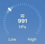
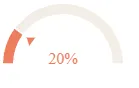
我目前有一个看起来像这样的拨号图表 输入图像描述
import React from 'react'
import * as d3 from 'd3'

class GaugeChart extends React.Component {
  constructor(props) {
    super(props)
    this.myRef = React.createRef()
    this.state = {
      data: [],
      theme: this.props.theme
        ? this.props.theme
        : ['#bde0fe', '#2698f9', '#71bcfd', '#f1f8fe'],
    }
  }

  componentDidMount() {
    var $this = this.myRef.current

    d3.select($this).selectAll('svg').remove()

    const value = this.props.value
    const data = [
      {
        label: 'Completed',
        value: value,
      },
      {
        label: 'Remaining',
        value: 100 - value,
      },
    ]

    const width = parseInt(this.props.width, 10),
      height = parseInt(this.props.height, 10),
      radius = parseInt(this.props.r, 10),
      innerradius = parseInt(this.props.ir, 10)

    var color = d3.scaleOrdinal().range(this.state.theme)

    var arc = d3.arc().outerRadius(radius).innerRadius(innerradius)

    data.forEach(function (d) {
      d.total = +d.value
    })

    var pie = d3
      .pie()
      .startAngle(-90 * (Math.PI / 180))
      .endAngle(90 * (Math.PI / 180))
      .padAngle(0.02) // some space between slices
      .sort(null)
      .value(function (d) {
        return d.total
      })

    var svg = d3
      .select($this)
      .append('svg')
      .attr('width', width)
      .attr('height', height + 5)
      .append('g')
      .attr('class', 'piechart')
      .attr('transform', 'translate(' + width / 2 + ',' + height + ')')

    var segments = svg.append('g').attr('class', 'segments')

    var slices = segments
      .selectAll('.arc')
      .data(pie(data))
      .enter()
      .append('g')
      .attr('class', 'arc')

    slices
      .append('path')
      .attr('d', arc)
      .attr('fill', function (d, i) {
        return color(i)
      })
    /*.transition()
          .attrTween('d', function(d) {
            var i = d3.interpolate(d.startAngle + 0.1, d.endAngle);
            return function(t) {
              d.endAngle = i(t);
              return arc(d);
            }
          } )*/

    var arrow = svg.append('g').attr('transform', 'rotate( 0  )')

    arrow
      .append('path')
      .attr('fill', '#ef7e60')
      .attr(
        'd',
        `M -${innerradius - 5},0 -${innerradius - 12},-5 -${
          innerradius - 12
        },5`,
      ) // draw triangle

    var text = svg
      .append('text')
      .attr('text-anchor', 'middle')
      .attr('dy', 0)
      .attr('fill', '#ef7e60')

    function update(data) {
      text.text(`${Math.round(data[0].value)}%`) // set % text

      arrow.transition().attr('transform', `rotate( ${data[0].value * 1.8}  )`) //rotate to desired qantity ( i put to 60% of 180 deg )
    }
    update(data)
  }

  render() {
    return <div ref={this.myRef} className="GaugeChart" />
  }
}
export default GaugeChart

-- 最新的fiddle是12月2日 https://jsfiddle.net/gp4wL80t/

最新的fiddle是12月3日 https://jsfiddle.net/0k7zvdxn/


@Lars Kotthoff - 有关如何开始做这件事的建议吗? - undefined
1个回答

1
关于您的演示代码...
“我有一个演示代码,它创建了一系列的矩形并改变了角度 - 但我不确定如何稳定它并从左侧创建弧形。”
实际上,您只需要修改起始角度,然后直接沿弧线计算刻度的位置。
编辑:
您可以通过使用“stroke-width”使条形更宽,通过调整弧线的“startAngle”和“endAngle”(以弧度为单位)来更好地绕过边缘。
要突出显示最接近的标记,以近似值,并在中间/底部显示值,就像压力示例一样 - 您只需要根据值计算标记并显示文本等。

const value = Math.floor(Math.random() * 100); // value you want to show, random here just as an example...
const numTicks = 50; // total ticks around the edge
const lineThickness = 3; // width of ticks 
const tickLength = 10; // length of ticks 
const arcRadius = 55; // size of the arc
const startAngle = -220 * (Math.PI / 180); // first tick pos in rad
const endAngle = 40 * (Math.PI / 180); // last tick pos in rad
const centerX = 75;
const centerY = 75;
const width = 150;
const height = 150;

const svg = d3.select('body')
  .append('svg')
  .attr("height", height)
  .attr("width", width)
  .attr("class", "svger");

for (let i = 0; i < numTicks; i++) {
  const angle = startAngle + (i / (numTicks - 1)) * (endAngle - startAngle);
  const isHighlighted = i === Math.round((value / 100) * (numTicks - 1));
  const highlightAmmount = isHighlighted ? 2 : 0; // highlight sizing
  const x1 = centerX + arcRadius * Math.cos(angle);
  const y1 = centerY + arcRadius * Math.sin(angle);
  const x2 = x1 + (tickLength + highlightAmmount) * Math.cos(angle);
  const y2 = y1 + (tickLength + highlightAmmount) * Math.sin(angle);
  const tick = svg.append("line")
    .attr("x1", x1)
    .attr("y1", y1)
    .attr("x2", x2)
    .attr("y2", y2)
    .attr("stroke", isHighlighted ? "#ffffff" : '#6294d5') // highlight colour
    .attr("stroke-linecap", "round")
    .attr("stroke-width", lineThickness + highlightAmmount);
}

svg.append("text")
  .attr("x", centerX)
  .attr("y", centerY)
  .text(value)
  .attr("text-anchor", "middle")
  .attr("alignment-baseline", "middle")
  .attr("font-family", "Arial")
  .attr("font-size", "30px")
  .attr("font-weight", "bold")
  .attr("fill", "#ffffff");

svg.append("text")
  .attr("x", 35)
  .attr("y", height - 15)
  .text("Low")
  .attr("text-anchor", "middle")
  .attr("alignment-baseline", "middle")
  .attr("font-family", "Arial")
  .attr("font-size", "12px")
  .attr("fill", "#ffffff");

svg.append("text")
  .attr("x", width - 35)
  .attr("y", height - 15)
  .text("High")
  .attr("text-anchor", "middle")
  .attr("alignment-baseline", "middle")
  .attr("font-family", "Arial")
  .attr("font-size", "12px")
  .attr("fill", "#ffffff");
.svger {
  background: #4c7dbb;
}
<script src="https://cdnjs.cloudflare.com/ajax/libs/d3/5.7.0/d3.min.js"></script>

我还将其样式设置得更像你的示例。请注意,我显示的值是随机的,只是为了展示高亮的工作原理。即每次你点击“运行代码片段”,都会显示不同的值 :)
我还制作了一个fiddle,如果你想玩一下,可以点击这里 - https://jsfiddle.net/fraser/9nyc5eb1/

这个很不错 - 你怎么能让条形图更粗一些,更贴近边缘 - 同时突出显示最近的标记,以近似值为准 -- 还要像压力示例一样在中间/底部显示数值。 - undefined
@TheOldCounty 当然,看看我的修改... - undefined
@TheOldCounty 显然,你可以随意修改 numTickstickLengtharcRadius 等参数。 - undefined

网页内容由stack overflow 提供, 点击上面的
可以查看英文原文,
原文链接