我想在一张图上比较我的数据中的某些子组,另一些子组则在另一张图上比较。如果我将所有子组都绘制在一张图上,图形会令人不知所措,并且每个单独的比较都变得困难。如果给定的子组在所有图中具有相同的颜色,这将更容易让读者理解。
这是我尝试过但并不完全成功的两件事。它们是我能够创建的最小工作示例!
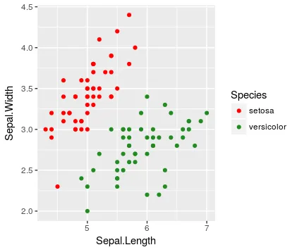
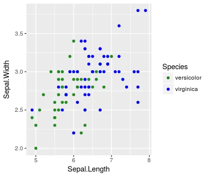
错误的原因在于图例中显示了所有三个级别
library(tidyverse)

# compare first and second species
ggplot(data = iris %>% filter(Species != 'virginica'),
       mapping = aes(x = Sepal.Length,
                     y = Sepal.Width,
                     color = Species)) +
  geom_point() +
  scale_color_discrete(drop = FALSE)


# compare second and third species
ggplot(data = iris %>% filter(Species != 'setosa'),
       mapping = aes(x = Sepal.Length,
                     y = Sepal.Width,
                     color = Species)) +
  geom_point() +
  scale_color_discrete(drop = FALSE)

请注意,未绘制的水平线仍出现在图例中(与 drop = FALSE 的想法一致)。
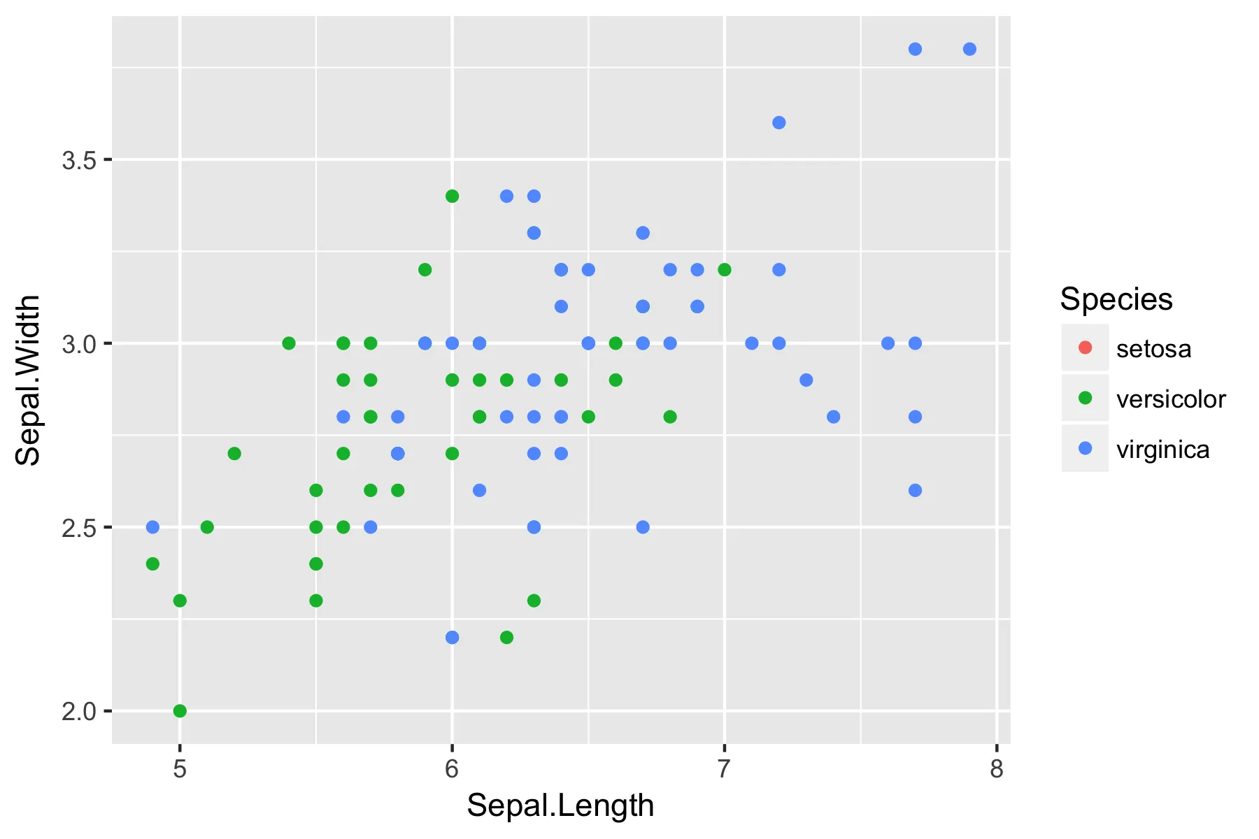
错误的原因是第二个图没有保持第一个图所建立的物种颜色映射关系
# compare first and second species
ggplot(data = iris %>% filter(Species != 'virginica'),
       mapping = aes(x = Sepal.Length,
                     y = Sepal.Width,
                     color = Species)) +
  geom_point() +
  scale_color_manual(values = c('red', 'forestgreen', 'blue'),
                     breaks = unique(iris$Species))


# compare second and third species
ggplot(data = iris %>% filter(Species != 'setosa'),
       mapping = aes(x = Sepal.Length,
                     y = Sepal.Width,
                     color = Species)) +
  geom_point() +
  scale_color_manual(values = c('red', 'forestgreen', 'blue'),
                     breaks = unique(iris$Species))

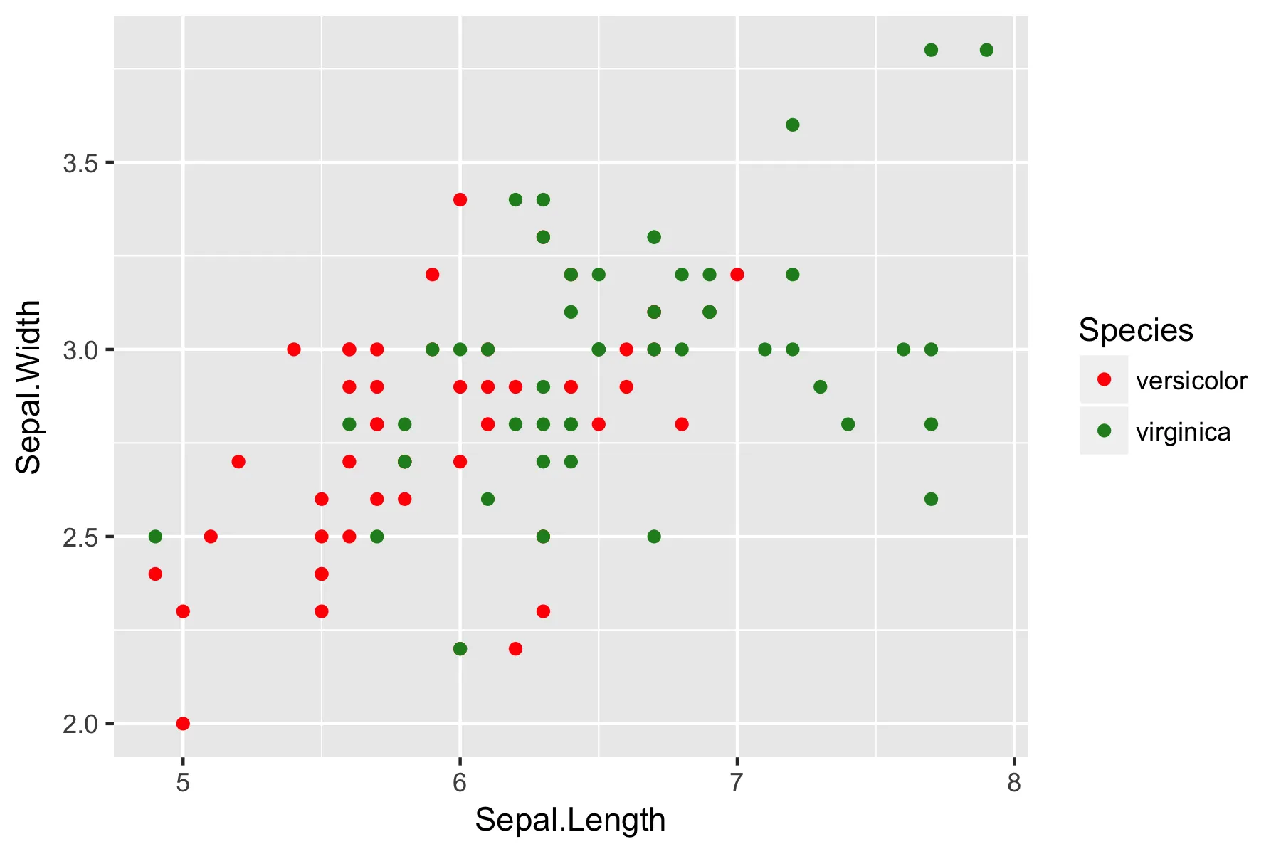
请注意,在左图中,setosa为红色,virginica为绿色,但在右图中,这种映射关系已经改变。