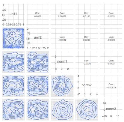
多个分布的两两图形比较

8
这是之前提出问题的编辑版本。
我们有一个 m × n 的表格,其中包含 m 个变量(如基因等)的 n 个观测值(样本),我们希望研究每两个观测值之间变量的行为 - 比如具有最高正相关或负相关的两个观测值。为此,我在 Stadler et.al. 自然杂志论文 (2011) 中看到了一张很棒的图表: 这里可以使用以下示例数据集。
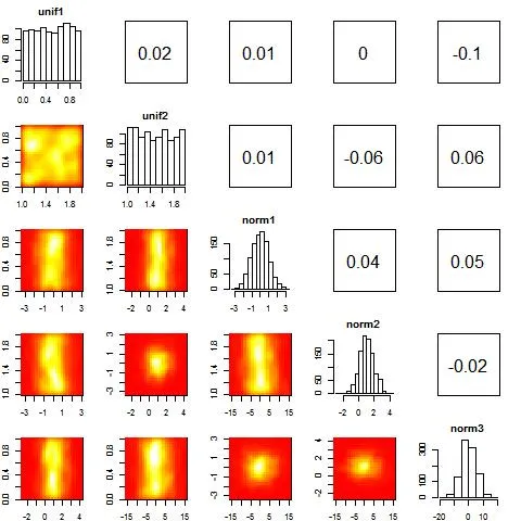
m <- 1000
samples <- data.frame(unif1 = runif(m), unif2 = runif(m, 1, 2), norm1 = rnorm(m), 
                      norm2 = rnorm(m, 1), norm3 = rnorm(m, 0, 5))

我已经测试了包 gpairs 中的 gpairs(samples) 函数,生成了如下的散点矩阵图。这是一个好的开始,但它没有将相关系数放在右上角,也没有在左下角显示密度图:

enter image description here

接下来我使用了 
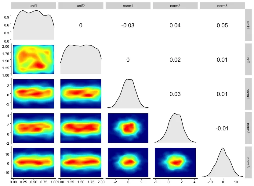
GGally 包中的 ggpairs(samples, lower=list(continuous="density")) 函数(感谢 @LucianoSelzer 的评论)。现在我们在右上角有了相关性信息,在左下角显示了密度图,但我们缺少对角线条形图,而密度图不是热力图形状。

enter image description here

有什么想法可以让它更接近期望的图片(第一张图片)吗?
2个回答

10

你可以尝试结合几种不同的绘图方法并将结果组合起来。以下是一个示例,可以根据需要进行修改:

cors<-round(cor(samples),2) #correlations

# make layout for plot layout
laymat<-diag(1:5) #histograms
laymat[upper.tri(laymat)]<-6:15 #correlations
laymat[lower.tri(laymat)]<-16:25 #heatmaps

layout(laymat) #define layout using laymat

par(mar=c(2,2,2,2)) #define marginals etc.

# Draw histograms, tweak arguments of hist to make nicer figures
for(i in 1:5) 
  hist(samples[,i],main=names(samples)[i])

# Write correlations to upper diagonal part of the graph
# Again, tweak accordingly
for(i in 1:4)
  for(j in (i+1):5){
    plot(-1:1,-1:1, type = "n",xlab="",ylab="",xaxt="n",yaxt="n")
    text(x=0,y=0,labels=paste(cors[i,j]),cex=2)
    }

# Plot heatmaps, here I use kde2d function for density estimation
# image function for generating heatmaps
library(MASS)
for(i in 2:5)
  for(j in 1:(i-1)){
     k <- kde2d(samples[,i],samples[,j])
     image(k,col=heat.colors(1000))
    } 

编辑:在最后一次循环中更正了索引。 成对绘图


哇!太棒了,谢谢。我很好奇是否还有任何简短而伟大的ggplot2答案。 - Ali
我敢打赌一定有办法,我刚开始熟悉ggplot2,所以我决定采用老方法。ggplot2使用网格图形,因此布局思想在那里不起作用。但这可能会有所帮助:http://www.cookbook-r.com/Graphs/Multiple_graphs_on_one_page_%28ggplot2%29/。 - Jouni Helske

2
您可以使用以下三个不同的包和两个不同的函数来执行此操作: cor_fun 用于计算上三角相关性。 my_fn 用于绘制下三角。
您还需要使用 ggpairs
library(GGally)
library(ggplot2)
library(RColorBrewer)

m <- 1000
samples <- data.frame(unif1 = runif(m), unif2 = runif(m, 1, 2), norm1 = rnorm(m), 
                      norm2 = rnorm(m, 1), norm3 = rnorm(m, 0, 5))

cor_fun <- function(data, mapping, method="pearson", ndp=2, sz=5, stars=TRUE){ #ndp is to adjust the number of decimals
  
  x <- eval_data_col(data, mapping$x)
  y <- eval_data_col(data, mapping$y)
  
  corr <- cor.test(x, y, method=method)
  est <- corr$estimate
  lb.size <- sz 
  
  if(stars){
    stars <- c("***", "**", "*", "")[findInterval(corr$p.value, c(0, 0.001, 0.01, 0.05, 1))]
    lbl <- paste0(round(est, ndp), stars)
  }else{
    lbl <- round(est, ndp)
  }
  
  ggplot(data=data, mapping=mapping) +
    annotate("text", x=mean(x, na.rm=TRUE), y=mean(y, na.rm=TRUE), label=lbl, size=lb.size)+
    theme(panel.grid = element_blank(), panel.background=element_rect(fill="snow1")) 
  
}

colfunc<-colorRampPalette(c("darkblue","cyan","yellow","red"))

my_fn <- function(data, mapping){
  p <- ggplot(data = data, mapping = mapping) + 
    stat_density2d(aes(fill=..density..), geom="tile", contour = FALSE) +
    scale_fill_gradientn(colours = colfunc(100)) + theme_classic()
}


ggpairs(samples, columns = c(1,2,3,4,5),
        lower=list(continuous=my_fn),
        diag=list(continuous=wrap("densityDiag", fill="gray92")), #densityDiag is a function
        upper=list(continuous=cor_fun)) + theme(panel.background=element_rect(fill="white")) +
  theme(axis.text.x = element_text(angle = 0, vjust = 1, color = "black")) + 
  theme(axis.text.y = element_text(angle = 0, vjust = 1 , color = "black"))

enter image description here


网页内容由stack overflow 提供, 点击上面的
可以查看英文原文,
原文链接