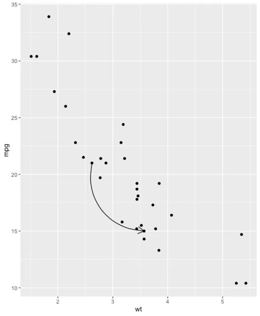
我正在创建一个ggplot图表,希望在两个点之间添加一些箭头。主要任务可以通过 geom_line(arrow = arrow()) 来轻松完成。然而,我想要一些“美丽”的粗箭头。通过size=调整箭头大小并不能帮助我达到预期的效果,因为这样会完全破坏箭头的头部。我将我的问题举例说明:
创建一些示例数据和图表:
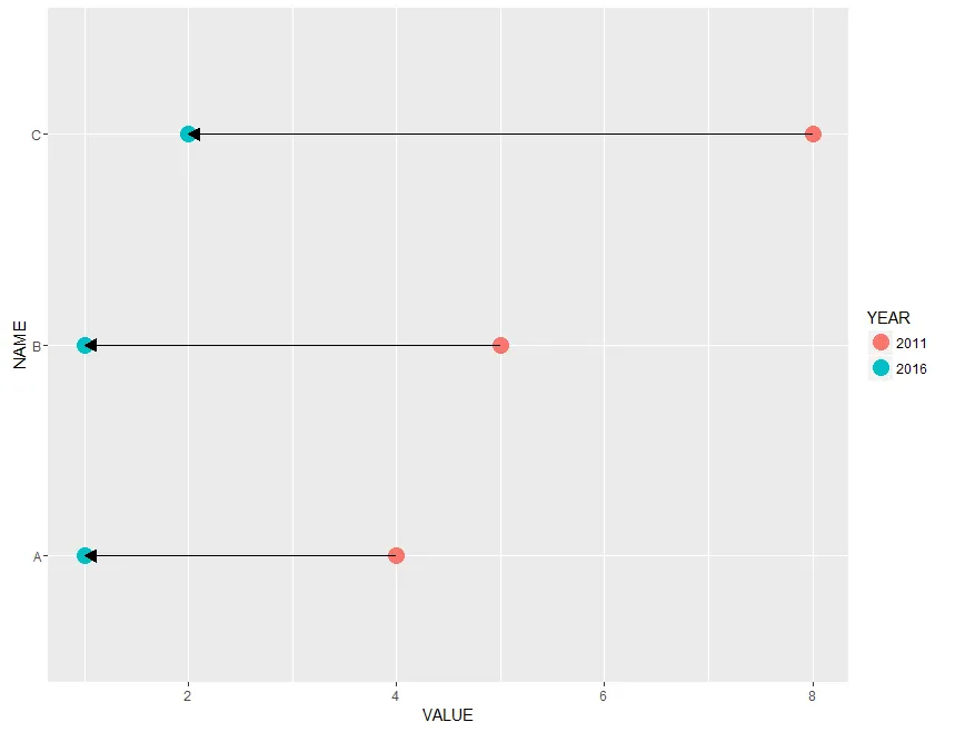
NAME <- c("A", "A", "B", "B", "C", "C")
YEAR <- c(2016, 2011, 2016, 2011, 2016, 2011)
YEAR <- as.factor(YEAR)
VALUE <- c(1, 4, 1, 5, 2, 8)
DATA <- data.frame(NAME, YEAR, VALUE)
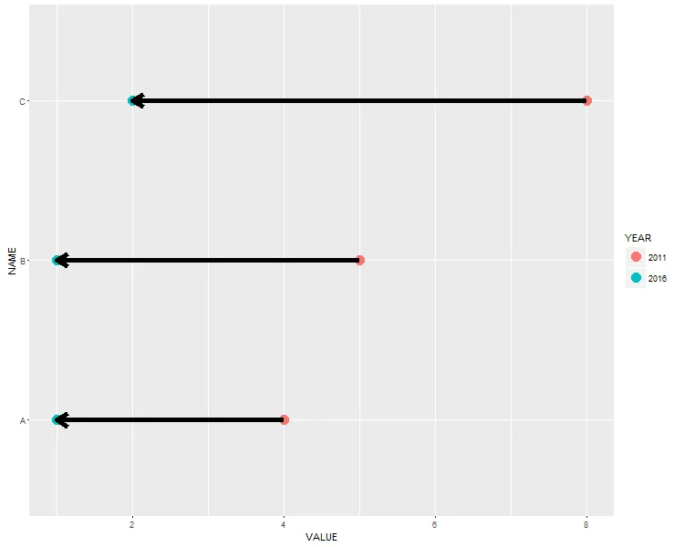
ggplot(DATA, aes(x=VALUE, y=NAME)) +
geom_point(size=5, aes(colour=YEAR)) +
geom_line(arrow = arrow(length=unit(0.30,"cm"), ends="first", type = "closed"))
最终的图表如下所示:
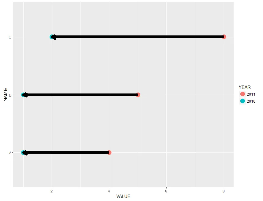
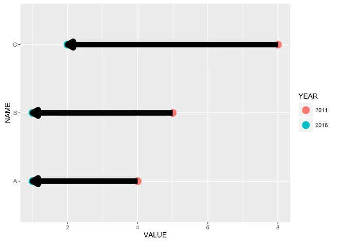
现在我尝试“加粗”箭头...
ggplot(DATA, aes(x=VALUE, y=NAME)) +
  geom_point(size=5, aes(colour=YEAR)) +
  geom_line(arrow = arrow(length=unit(0.30,"cm"), ends="first", type = "closed"), size = 3)
这是此处显示的结果:
我的问题是:有没有办法绘制一些“漂亮”的粗箭头?

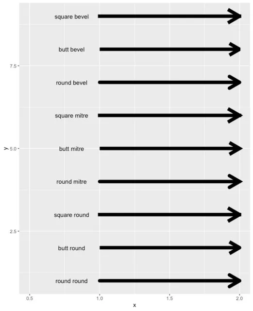
linetype(可以使线条成为点状或虚线等),arrow length等。 - rar