使用Material UI,如何构建具有可展开菜单项的抽屉,就像material-ui.com网站上的那个一样?
所以我想要这样的东西: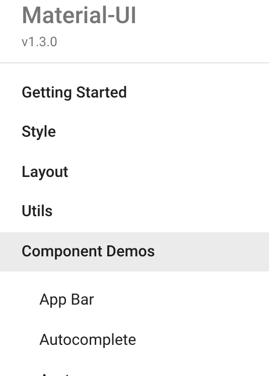 每个菜单项(加粗)可以展开以显示子菜单项。
如何使用Material UI实现这一点?
所以我想要这样的东西:
每个菜单项(加粗)可以展开以显示子菜单项。如何使用Material UI实现这一点?
每个菜单项(加粗)可以展开以显示子菜单项。const [openCollapse, setOpenCollapse] = React.useState(false);
function handleOpenSettings(){
setOpenCollapse(!openCollapse);
}
return(
<Drawer>
<ListItem button onClick={handleOpenSettings}>
<ListItemIcon>
<Settings />
</ListItemIcon>
<ListItemText primary="Settings" />
{openCollapse ? <ExpandLess /> : <ExpandMore />}
</ListItem>
<Collapse in={openCollapse} timeout="auto" unmountOnExit>
<List component="div" disablePadding>
<ListItem button className={classes.nested}>
<ListItemIcon>
<Settings />
</ListItemIcon>
<ListItemText inset primary="Starred" />
</ListItem>
</List>
</Collapse>
</Drawer>
)
AppDrawerNavItem是自定义组件。您可以在与AppDrawer相同的目录中找到它。抱歉没有实时示例 :( https://github.com/mui-org/material-ui/blob/master/docs/src/modules/components/AppDrawerNavItem.js - REDDY PRASAD