我想在R中创建一个美国地图,根据某一指标以热力图的方式对各州进行着色。我知道可以使用googleVis api来实现这个功能,但是无法使用该代码,并且没有滑动效果,效果不是很好。有什么最快捷的方法可以完成此操作?我熟悉maps包,但是无法让颜色配合。我相信这被称为等值线图。
R中的地理热力图
15
- hawkhandler
5
2请查看“Chloropleth Map Challenge”以获取线索:http://blog.revolutionanalytics.com/2009/11/choropleth-challenge-result.html - mdsumner
1另外,https://github.com/hadley/ggplot2/wiki/plotting-polygon-shapefiles - Ari B. Friedman
不幸的是,所有这些都假定您只有少数不同的“级别”或“因素”。我有每个州的不同价值,我希望色调基于该值进行缩放。 - hawkhandler
不,它们不会。你可以精确控制每个状态的颜色。 - mdsumner
你应该阅读这个SO问题使用R开发地理主题地图和这篇文章非洲的森林砍伐。 - Oscar Perpiñán
4个回答
9
在ggplot2包中有一个完整的示例,参见?map_data。
library(ggplot2)
example(map_data)
- mdsumner
0
在UScensus2000tract包中有一个以人口为驱动的等级色例子。
- IRTFM
0
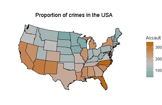
代码
# Transform dataset to correct format
crimes <- data.frame(state = tolower(row.names(USArrests)), USArrests)
crimes

#  Map data
#  install.packages("maps") remember to install these two packages if you
#  install.packages("mapproj") do not have them yet

library(mapproj)
library(maps)

states_map <- map_data("state")
states_map

# Merge datasets together
crime_map <- merge(states_map, crimes, by.x = "region", by.y = "state")

# After merging, the order has changed, which leads to polygons drawn
# in the incorrect order. Let's sort it
crime_map

library(dplyr) # for arrange() function

# Sort by group, then order
crime_map <- arrange(crime_map, group, order)
crime_map

# Now data can be plotted
library(ggplot2)

plot1 <- ggplot(crime_map, aes(x = long, y = lat, group = group, fill = Assault)) +
                    geom_polygon(colour = "black") +
                    coord_map("polyconic")

plot1

# Add title
plot1 <- plot1 +
                ggtitle("                       Proportion of crimes in the USA")

plot1

# Improve on colours
plot1 <- plot1 +
    scale_fill_gradient2(low = "#559999", mid = "grey", high = "#BB650B",
                                                    midpoint = median(crimes$Assault))
plot1

# If you want white transparent backgroud only
plot1 <- plot1 +
         theme_void()

plot1

# Note: if RStudio gives you this error when ploducing plot, then use this and try
# again
devAskNewPage(ask = FALSE)

# Special thanks to Winston Chang and other ggplot developers at RStudio who made made
#  many of these codes
- PsychometStats
网页内容由stack overflow 提供, 点击上面的可以查看英文原文,
原文链接
原文链接