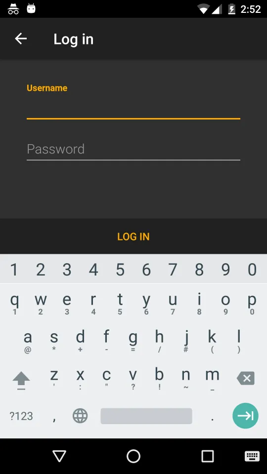
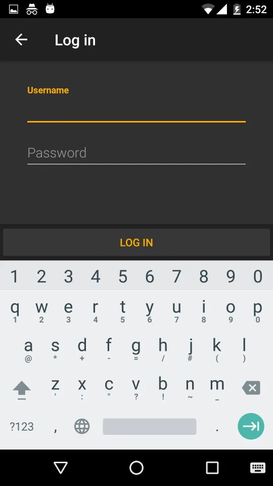
如何正确地在Android中去除按钮周围的填充(或边距)?

30

目前,我有以下底部登录按钮。

按钮未被按下时

enter image description here

按钮被按下时

enter image description here

XML看起来像这样

<LinearLayout
    android:background="?attr/welcomeBottomNavBarBackground"
    android:orientation="horizontal"
    android:id="@+id/sign_in_bottom_nav_bar"
    android:layout_width="fill_parent"
    android:layout_height="wrap_content"
    android:layout_alignParentBottom="true">
    <Button
        style="?android:attr/buttonBarButtonStyle"
        android:id="@+id/sign_in_button"
        android:layout_width="0dp"
        android:width="0dp"
        android:layout_weight="1.0"
        android:layout_height="48dp"
        android:gravity="center"
        android:layout_gravity="center"
        android:enabled="true"
        android:textAllCaps="true"
        android:text="@string/log_in" />
</LinearLayout>

当按钮被按下时,我想去掉周围的填充(或者我应该称之为边距吗?请参考我的最下方的p / s部分)。

我查看了如何在Android中去除按钮周围的填充?

我尝试过:

<Button
    ...
    ...
    android:minHeight="0dp"
    android:minWidth="0dp" />

它无法工作且没有任何效果。


我进一步尝试。

<Button
    ...
    ...
    android:background="@null"
    android:minHeight="0dp"
    android:minWidth="0dp" />

按下按钮时不再有填充效果。然而,材料设计的按下视觉效果也将消失。

请问在按下按钮时,如何去除填充效果,同时保留材料设计的按下视觉效果?

P/S

我真的不知道我应该称其为填充还是边距。我希望实现的目标是,在我们按下底部区域时,按下的视觉效果应该覆盖整个 100% 的底部栏区域(@+id/sign_in_bottom_nav_bar),而不是当前的 95% 底部栏区域。


你是指文本周围的填充还是按钮周围的边距? - DeeV
1
我认为你想要的样式是 style="@style/Widget.AppCompat.Button.Borderless",这是从AppCompat库中获取的。http://www.materialdoc.com/flat-button/ - DeeV
1
@DeeV 我已添加了“p/s”部分,希望能更清楚地解释我的情况。我尝试过 style="@style/Widget.AppCompat.Button.Borderless"。它与 style="?android:attr/buttonBarButtonStyle" 没有区别(除了按钮文本颜色变为白色)。当被按下时,仍然没有完全覆盖 @+id/sign_in_bottom_nav_bar 区域。 - Cheok Yan Cheng
为什么不在style.xml文件中定义样式,并在需要的UI元素处调用它们。例如,在您的按钮中使用style="@style/mybutton",并在style.xml中定义mybutton样式,其中padding为零。 - Akash kumar
请发布您的按钮样式。 - Pavan Tolety
显示剩余2条评论
13个回答

34

由于标准按钮不应该使用完整的宽度,这就是你经历这种情况的原因。

背景

如果您查看 Material Design - 按钮样式,您将看到按钮具有48dp高的点击区域,但将显示为36dp的高度,原因未知。

这就是您看到的背景轮廓,它不会覆盖整个按钮区域。
它具有圆角和一些填充,并且应该可以单独点击,包裹其内容,并且在屏幕底部不跨越整个宽度。

解决方案

如上所述,您需要的是不同的背景。不是标准按钮,而是具有漂亮波纹效果的可选项背景。

对于这种用例,您可以使用?selectableItemBackground主题属性来设置您的背景(特别是在列表中)。
它将添加平台标准的涟漪(或& lt; 21上的一些颜色状态列表),并使用当前的主题颜色。

对于您的用例,您只需要使用以下:

<Button
    android:id="@+id/sign_in_button"
    style="?android:attr/buttonBarButtonStyle"
    android:layout_width="match_parent"
    android:layout_height="wrap_content"
    android:text="Login"
    android:background="?attr/selectableItemBackground" />
                   <!--  /\ that's all -->

如果您的视图是唯一的并占据整个屏幕,则无需添加布局权重

如果您对背景的外观有不同的想法,则需要自己创建自定义可绘制对象,并在其中管理颜色和状态。


感谢您提供android:background="?android:selectableItemBackground"的提示。然而,在Android 6中看起来很好。在Android 4中,它仍然看起来像Holo主题。http://i.imgur.com/6PT09aP.png(预期按下颜色)。http://i.imgur.com/NCgi9yC.png(更改后的外观)。有没有办法让它在Android 4上也能正常工作? - Cheok Yan Cheng
@CheokYanCheng 如所述,这将采用平台默认选择器,我强烈建议使用它以获得一致的外观。如果您想要更改它,则必须将主题属性设置为自定义可绘制对象,如果您想要不同版本的不同可绘制对象,则必须确保处理所有“-v21”等内容。 - David Medenjak
1
在Android 6和Android 4上使用?attr/selectableItemBackground都可以正常工作。也许您想要修改您的答案? - Cheok Yan Cheng

26

如需简单实现,请使用inset属性,例如:

android:insetTop="0dp"
android:insetBottom="0dp"
android:insetRight="0dp"
android:insetLeft="0dp"

4
styles.xml
<style name="MyButtonStyle" parent="Base.Widget.AppCompat.Button">
    <item name="android:background">@drawable/selector</item>
    <item name="android:textColor">@android:color/black</item>
</style>

values/drawable文件夹中: my_drawable.xml
<?xml version="1.0" encoding="utf-8"?>
<shape android:shape="rectangle" xmlns:android="http://schemas.android.com/apk/res/android">
    <corners android:radius="2dp" />
    <!-- specify your desired color here -->
    <solid android:color="#9e9b99" />
</shape>

selector.xml

<?xml version="1.0" encoding="utf-8"?>
<selector xmlns:android="http://schemas.android.com/apk/res/android">
    <item android:state_focused="true" android:drawable="@drawable/my_drawable"/>
    <item android:state_pressed="true" android:drawable="@drawable/my_drawable"/>
    <item android:drawable="@android:color/transparent"/>
</selector>

values/drawable-v21文件夹中: my_drawable.xml
<?xml version="1.0" encoding="utf-8"?>
<shape android:shape="rectangle"
       android:tint="?attr/colorButtonNormal"
       xmlns:android="http://schemas.android.com/apk/res/android">
    <corners android:radius="2dp" />
    <solid android:color="@android:color/white" />
</shape>

selector.xml

<?xml version="1.0" encoding="utf-8"?>
<ripple xmlns:android="http://schemas.android.com/apk/res/android"
        android:color="?attr/colorControlHighlight">
    <item android:id="@android:id/mask"
          android:drawable="@drawable/my_drawable" />
</ripple>

在布局中:
<Button
    android:id="@+id/button"
    style="@style/MyButtonStyle"
    android:layout_width="match_parent"
    android:layout_height="100dp"
    android:text="Test"/>

API 19的结果:

在此输入图片描述

API 21的结果:

在此输入图片描述

源代码


嗨,由于多种原因,那并没有按预期工作。对于v21设备,它看起来像是http://imgur.com/a/zg2j7和http://imgur.com/a/OvpbV。由于我们在应用中使用了不同的颜色主题,我们期望(1)按钮背景是透明的,以便显示其父级(`@+id/sign_in_bottom_nav_bar`)的颜色。 - Cheok Yan Cheng
(2) 按钮文本颜色也不再准确。我们希望它使用 colorAccent - Cheok Yan Cheng
对于Android版本低于21的设备,除了上述两个问题外,它们还会失去所有按压可视效果。 - Cheok Yan Cheng
@CheokYanCheng,确实。已更新答案。 - azizbekian

2

我认为解决这个问题的最佳方案是创建自己的Ripple Effect。当您按下按钮时,填充效果会遵循组件默认的Ripple Effect

<ripple xmlns:android="http://schemas.android.com/apk/res/android"
        android:color="?attr/colorControlHighlight">
    <item android:drawable="?attr/colorPrimary"/>
</ripple>

或者您可以尝试将按钮样式更改为style="?android:textAppearanceSmall"

请记住:此效果仅在Android Lollipop (API 21)或更高版本上显示。


2

我经历过你正在经历的事情。简而言之,仅使用 <Button> 标签是无法保证向后兼容性的。

最简单和最常用的方法是在 <Button> 周围使用一个 <RelativeLayout>

按钮代码:

        <RelativeLayout
            android:id="@+id/myButtonUnderlay"
            android:layout_width="match_parent"
            android:layout_height="wrap_content"
            android:background="@color/colorPrimary"
            android:visibility="visible">

            <Button
                android:id="@+id/myButton"
                android:layout_width="match_parent"
                android:layout_height="wrap_content"
                android:background="?attr/selectableItemBackgroundBorderless"
                android:text="I am as cute as a Button"/>

        </RelativeLayout>

无论何时需要使用按钮,您都可以使用此完整代码。

以下是详细说明:


  1. OnClick事件将钩入myButton
  2. 通过更改myButtonUnderlay的属性控制按钮的尺寸。
  3. myButton中,使用android:background="?attr/selectableItemBackgroundBorderless"。这将使它成为一个只有文本和向后兼容涟漪的透明按钮。
  4. myButtonUnderlay中,您将执行所有其他背景应用程序,例如设置按钮的颜色、边距、填充、边框、渐变和阴影等。
  5. 如果希望操作按钮的可见性(编程或非编程),请在myButtonUnderlay上进行。

注意:为确保向后兼容性,请确保使用

android:background="?attr/selectableItemBackgroundBorderless",而不是

android:background="?android:attr/selectableItemBackgroundBorderless"


1
这些天最好的解决方案就是使用MaterialButton代替Button
注意:MaterialButton在视觉上与Button和AppCompatButton不同。其中一个主要区别是,AppCompatButton在左右两侧有4dp的插入,而MaterialButton没有。要添加插入以匹配AppCompatButton,请在按钮上设置android:insetLeft和android:insetRight为4dp,或更改按钮父布局上的间距。将应用程序中的按钮替换为MaterialButton时,应检查这些更改以获取大小和间距差异。
来源:https://material.io/develop/android/components/material-button/

1
作为@David Medenjak的回答,您可以阅读Google Material设计按钮样式到其开发者网站。像@David Medenjak在他的答案中解释的那样使用按钮样式。您也可以通过以下方式完成 这不是填充或边距,而是实际上是按钮的背景效果。 如果您想要删除它,那么可以按照以下方式进行。

选项1:

步骤1:将以下代码放入styles.xml中

<style name="myColoredButton">
        <item name="android:textColor">#FF3E96</item>
        <item name="android:padding">0dp</item>
        <item name="android:minWidth">88dp</item>
        <item name="android:minHeight">36dp</item>
        <item name="android:elevation">1dp</item>
        <item name="android:translationZ">1dp</item>
        <item name="android:background">#FF0000</item>
    </style>

步骤2:在drawable文件夹下创建一个新的XML文件,并添加以下代码:我将我的XML文件命名为button_prime.xml。
<ripple xmlns:android="http://schemas.android.com/apk/res/android"
    android:color="@color/colorPrimary">
    <item>
        <shape xmlns:android="http://schemas.android.com/apk/res/android">
            <corners android:radius="1dp" />
            <solid android:color="#8B8386" />
        </shape>
    </item>
</ripple>

步骤三:按照以下方式在您的按钮中使用样式和可绘制项。
<Button
        style="@style/myColoredButton"
        android:layout_width="250dp"
        android:layout_height="50dp"
        android:text="Cancel"
        android:gravity="center"
        android:background="@drawable/button_prime"
        android:colorButtonNormal="#3578A9" />

使用支持库v7,所有的样式已经定义好并可以直接使用,对于标准按钮,所有这些样式都是可用的。因此,您可以像这样设置按钮样式。
<Button
    style="@style/Widget.AppCompat.Button.Borderless"
    android:layout_width="match_parent"
    android:layout_height="50dp"
    android:text="BUTTON"
    android:gravity="center"
    android:minHeight="0dp"
    android:minWidth="0dp"
    android:background="@color/colorAccent"/>

如果您想了解更多按钮样式的细节,请查看这个答案。

我认为您也应该查看这个答案。我希望您能得到解决方案。


1

填充和边距可能是按钮中使用的原始资源导致的。

因此,您可以尝试更改使用的资源,使用选择器:

<selector
  xmlns:android="http://schemas.android.com/apk/res/android">
    <item android:state_pressed="true" android:drawable="@drawable/btn_action_hover" />
    <item android:state_selected="true" android:drawable="@drawable/btn_action_hover" />
    <item android:state_focused="true" android:drawable="@drawable/btn_action_hover" />
    <item android:drawable="@drawable/btn_action_normal" />
</selector>

那将更改按钮的默认图像/形状,因此您可以尝试使用可绘制对象,并将每个项目设置为可绘制对象。可绘制对象可以是位图或者 .xml 文件(样式文件),定义按钮在其当前状态下的外观。我假设即使您已经设置了按钮样式,仍然会包含一些本地样式。这可能是因为您没有使用自定义主题。因此,问题也可以通过定义来解决。
theme="@style/myNewTheme"

其中myNewTheme是您的主题,它不应该有任何父级(parent=""不应该被定义)。

以Google/Android设计的任何给定主题(例如Theme.AppCompat.[name]),也都带有buttonStyle。这是Theme.Holo.Light的一部分:

    <!-- Button styles -->
    <item name="buttonStyle">@style/Widget.Holo.Light.Button</item>

    <item name="buttonStyleSmall">@style/Widget.Holo.Light.Button.Small</item>
    <item name="buttonStyleInset">@style/Widget.Holo.Light.Button.Inset</item>

    <item name="buttonStyleToggle">@style/Widget.Holo.Light.Button.Toggle</item>
    <item name="switchStyle">@style/Widget.Holo.Light.CompoundButton.Switch</item>
    <item name="mediaRouteButtonStyle">@style/Widget.Holo.Light.MediaRouteButton</item>

    <item name="selectableItemBackground">@drawable/item_background_holo_light</item>
    <item name="selectableItemBackgroundBorderless">?attr/selectableItemBackground</item>
    <item name="borderlessButtonStyle">@style/Widget.Holo.Light.Button.Borderless</item>
    <item name="homeAsUpIndicator">@drawable/ic_ab_back_holo_light</item>

正如您所见,此主题定义了基本功能中按钮的外观/工作方式。您可以覆盖其中的某些部分,但尚未覆盖重要部分(即buttonStyle等)。因此,如果您创建自己的新主题并将其样式设置为所需,然后设置主题(使用theme =“themename”),并且该主题不继承任何主题,则应能够按照自己的喜好设置按钮样式,而无需担心主题中的默认样式。
基本上:
调用padding/margin =“0dp”将没有帮助。主题定义的默认可绘制对象在按钮可绘制对象中具有此属性,这意味着您无法更改它。因此,您必须更改按钮样式或完全更改主题。请确保该主题没有任何父级,因为许多主题定义了按钮样式。您不希望主题定义按钮样式。

0

在开始之前,我建议你先看看this

如果那个方法不起作用,我建议你使用Android XML可绘制对象和可绘制状态来创建自己的样式(就像Azizbekian建议的那样)。

我认为使用自己的样式可能是最好的选择,因为它可以进一步控制应用程序的显示方式,但使用Android默认主题和样式也允许用户拥有自定义样式,这是一个好主意。然而,你无法测试每个自定义样式,因此无法检查你的应用程序是否在所有自定义样式下正确显示,因此可能会遇到一些问题。


0
经过尝试了许多解决方案,最终我得出的结论是仅使用标签无法实现此目标。为了消除按钮周围的不必要空间,我的解决方案如下:
 <RelativeLayout
    android:id="@+id/myButtonUnderlay"
    android:layout_width="match_parent"
    android:layout_height="wrap_content"
    android:layout_gravity="bottom"
    android:visibility="visible">
<Button
    android:id="@+id/save_button"
    android:layout_width="match_parent"
    android:layout_height="50dp"
    android:layout_marginTop="-5dp" 
    android:layout_marginBottom="-5dp"
    android:layout_above="@+id/content_scrollview"
    android:layout_gravity="bottom"
    android:background="@drawable/ripple_theme"
    android:enabled="true"
    android:text="SetUp Store"
    android:textColor="#fff"
    android:textSize="18sp"
    android:visibility="gone"
    tools:visibility="visible"
    style="@style/MediumFontTextView" />
</RelativeLayout>

网页内容由stack overflow 提供, 点击上面的
可以查看英文原文,
原文链接