自从支持库24.2.0版本以来,ActionBarDrawerToggle的v7版本提供了setDrawerArrowDrawable()方法,以自定义切换图标。 DrawerArrowDrawable是提供默认图标的类,可以对其进行子类化以根据需要进行修改。
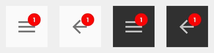
例如,BadgeDrawerArrowDrawable类覆盖draw()方法以在超类绘制自身后添加基本红色和白色徽章。这允许汉堡箭头动画在下面被保留。
import android.content.Context;
import android.graphics.Color;
import android.graphics.Canvas;
import android.graphics.Paint;
import android.graphics.Rect;
import android.graphics.Typeface;
import android.support.v7.graphics.drawable.DrawerArrowDrawable;
import java.util.Objects;
public class BadgeDrawerArrowDrawable extends DrawerArrowDrawable {
private static final float SIZE_FACTOR = .3f;
private static final float HALF_SIZE_FACTOR = SIZE_FACTOR / 2;
private Paint backgroundPaint;
private Paint textPaint;
private String text;
private boolean enabled = true;
public BadgeDrawerArrowDrawable(Context context) {
super(context);
backgroundPaint = new Paint();
backgroundPaint.setColor(Color.RED);
backgroundPaint.setAntiAlias(true);
textPaint = new Paint();
textPaint.setColor(Color.WHITE);
textPaint.setAntiAlias(true);
textPaint.setTypeface(Typeface.DEFAULT_BOLD);
textPaint.setTextAlign(Paint.Align.CENTER);
textPaint.setTextSize(SIZE_FACTOR * getIntrinsicHeight());
}
@Override
public void draw(Canvas canvas) {
super.draw(canvas);
if (!enabled) {
return;
}
final Rect bounds = getBounds();
final float x = (1 - HALF_SIZE_FACTOR) * bounds.width();
final float y = HALF_SIZE_FACTOR * bounds.height();
canvas.drawCircle(x, y, SIZE_FACTOR * bounds.width(), backgroundPaint);
if (text == null || text.length() == 0) {
return;
}
final Rect textBounds = new Rect();
textPaint.getTextBounds(text, 0, text.length(), textBounds);
canvas.drawText(text, x, y + textBounds.height() / 2, textPaint);
}
public void setEnabled(boolean enabled) {
if (this.enabled != enabled) {
this.enabled = enabled;
invalidateSelf();
}
}
public boolean isEnabled() {
return enabled;
}
public void setText(String text) {
if (!Objects.equals(this.text, text)) {
this.text = text;
invalidateSelf();
}
}
public String getText() {
return text;
}
public void setBackgroundColor(int color) {
if (backgroundPaint.getColor() != color) {
backgroundPaint.setColor(color);
invalidateSelf();
}
}
public int getBackgroundColor() {
return backgroundPaint.getColor();
}
public void setTextColor(int color) {
if (textPaint.getColor() != color) {
textPaint.setColor(color);
invalidateSelf();
}
}
public int getTextColor() {
return textPaint.getColor();
}
}
任何时候在切换上设置此实例,可以直接在可绘制对象上设置徽章属性。如下所示,正如下面的 OP 所指出的那样,用于自定义 DrawerArrowDrawable 的 Context 应使用 ActionBar#getThemedContext() 或 Toolbar#getContext() 获取,以确保使用正确的样式值。
private ActionBarDrawerToggle toggle;
private BadgeDrawerArrowDrawable badgeDrawable;
...

toggle = new ActionBarDrawerToggle(this, ...);
badgeDrawable = new BadgeDrawerArrowDrawable(getSupportActionBar().getThemedContext());

toggle.setDrawerArrowDrawable(badgeDrawable);
badgeDrawable.setText("1");
...
为了简化事物,最好也可以通过子类化ActionBarDrawerToggle并通过切换实例处理所有内容。
import android.app.Activity;
import android.content.Context;
import android.support.v4.widget.DrawerLayout;
import android.support.v7.app.ActionBarDrawerToggle;
import android.support.v7.widget.Toolbar;
import java.lang.reflect.Field;
import java.lang.reflect.Method;
public class BadgeDrawerToggle extends ActionBarDrawerToggle {
private BadgeDrawerArrowDrawable badgeDrawable;
public BadgeDrawerToggle(Activity activity, DrawerLayout drawerLayout,
int openDrawerContentDescRes,
int closeDrawerContentDescRes) {
super(activity, drawerLayout, openDrawerContentDescRes,
closeDrawerContentDescRes);
init(activity);
}
public BadgeDrawerToggle(Activity activity, DrawerLayout drawerLayout,
Toolbar toolbar, int openDrawerContentDescRes,
int closeDrawerContentDescRes) {
super(activity, drawerLayout, toolbar, openDrawerContentDescRes,
closeDrawerContentDescRes);
init(activity);
}
private void init(Activity activity) {
Context c = getThemedContext();
if (c == null) {
c = activity;
}
badgeDrawable = new BadgeDrawerArrowDrawable(c);
setDrawerArrowDrawable(badgeDrawable);
}
public void setBadgeEnabled(boolean enabled) {
badgeDrawable.setEnabled(enabled);
}
public boolean isBadgeEnabled() {
return badgeDrawable.isEnabled();
}
public void setBadgeText(String text) {
badgeDrawable.setText(text);
}
public String getBadgeText() {
return badgeDrawable.getText();
}
public void setBadgeColor(int color) {
badgeDrawable.setBackgroundColor(color);
}
public int getBadgeColor() {
return badgeDrawable.getBackgroundColor();
}
public void setBadgeTextColor(int color) {
badgeDrawable.setTextColor(color);
}
public int getBadgeTextColor() {
return badgeDrawable.getTextColor();
}
private Context getThemedContext() {
try {
Field mActivityImplField = ActionBarDrawerToggle.class
.getDeclaredField("mActivityImpl");
mActivityImplField.setAccessible(true);
Object mActivityImpl = mActivityImplField.get(this);
Method getActionBarThemedContextMethod = mActivityImpl.getClass()
.getDeclaredMethod("getActionBarThemedContext");
return (Context) getActionBarThemedContextMethod.invoke(mActivityImpl);
}
catch (Exception e) {
return null;
}
}
}
有了这个,自定义徽章图标将会自动设置,所有与切换相关的内容都可以通过一个对象来管理。
BadgeDrawerToggle 是 ActionBarDrawerToggle 的即插即用替代品,其构造函数完全相同。
private BadgeDrawerToggle badgeToggle;
...

badgeToggle = new BadgeDrawerToggle(this, ...);
badgeToggle.setBadgeText("1");
...

-keep class androidx.appcompat.app.ActionBarDrawerToggle { *; }-keep class androidx.appcompat.app.ActionBarDrawerToggle$Delegate { *; }- Eric SellinonSupportNavigateUp(): Boolean的情况下实现? - AndroidKotlinNoob