Bootstrap侧边栏菜单和侧边栏导航

3
我正在使用bootstrap,因为我想创建一个响应式网站,所以选择了使用bootstrap。
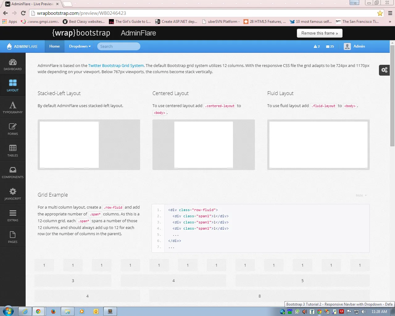
我想做的事情就像照片上的那样。(注意:不是整个页面,而只是带有图标的侧边栏。)这就是我想在我的侧边栏上的东西。我看过很多模板,它们看起来有点像照片上的侧边栏,但没有一个和我想要的完全一样。
请问有人能帮帮我吗? sidebarnav

2
我们不能在这里为你做作业,请展示你的代码,告诉我们你尝试了什么,如果可能的话可以使用jsfiddle。我们可以解决你的疑问,但不会完成作业。 - crafter
嗨@crafter,我还没有尝试过任何东西。我是使用Bootstrap的新手,不知道从哪里开始。我只有我的Bootstrap链接代码。对此很抱歉。谢谢。 - x'tian
首先,学习Bootstrap的基础知识,了解他们的12网格布局。也许这个链接可以解决你的问题:http://tympanus.net/codrops/2013/07/30/google-nexus-website-menu/。 - crafter
3个回答

11

经典版Bootstrap未包含侧边栏组件,您需要自行构建。如果您想更轻松地入手,我将向您展示一个快速代码示例。

因此,请查看CSS:

    #wrapper {
  padding-left: 250px;
  transition: all 0.4s ease 0s;
}

#sidebar-wrapper {
  margin-left: -250px;
  left: 250px;
  width: 250px;
  background: #000;
  position: fixed;
  height: 100%;
  overflow-y: auto;
  z-index: 1000;
  transition: all 0.4s ease 0s;
}

#page-content-wrapper {
  width: 100%;
}

.sidebar-nav {
  position: absolute;
  top: 0;
  width: 250px;
  list-style: none;
  margin: 0;
  padding: 0;
}

.sidebar-nav li {
  line-height: 40px;
  text-indent: 20px;
}

.sidebar-nav li a {
  color: #999999;
  display: block;
  text-decoration: none;
}

.sidebar-nav li a:hover {
  color: #fff;
  background: rgba(255,255,255,0.2);
  text-decoration: none;
}

.sidebar-nav li a:active,
.sidebar-nav li a:focus {
  text-decoration: none;
}

.sidebar-nav > .sidebar-brand {
  height: 65px;
  line-height: 60px;
  font-size: 18px;
}

.sidebar-nav > .sidebar-brand a {
  color: #999999;
}

.sidebar-nav > .sidebar-brand a:hover {
  color: #fff;
  background: none;
}

.content-header {
  height: 65px;
  line-height: 65px;
}

.content-header h1 {
  margin: 0;
  margin-left: 20px;
  line-height: 65px;
  display: inline-block;
}

#menu-toggle {
  display: none;
}

.inset {
  padding: 20px;
}

@media (max-width:767px) {

#wrapper {
  padding-left: 0;
}

#sidebar-wrapper {
  left: 0;
}

#wrapper.active {
  position: relative;
  left: 250px;
}

#wrapper.active #sidebar-wrapper {
  left: 250px;
  width: 250px;
  transition: all 0.4s ease 0s;
}

#menu-toggle {
  display: inline-block;
}

.inset {
  padding: 15px;
}

}

以及侧边栏的 HTML 部分:

<!-- Sidebar -->
    <div id="sidebar-wrapper">
        <ul class="sidebar-nav">
            <li class="sidebar-brand"><a href="#">Start Bootstrap</a>
            </li>
            <li><a href="#">Dashboard</a>
            </li>
            <li><a href="#">Shortcuts</a>
            </li>
            <li><a href="#">Overview</a>
            </li>
            <li><a href="#">Events</a>
            </li>
            <li><a href="#">About</a>
            </li>
            <li><a href="#">Services</a>
            </li>
            <li><a href="#">Contact</a>
            </li>
        </ul>
    </div>

希望这能对您有所帮助!


在 bootstrap.min.css 或 bootstrap.css 的末尾 - dei.andrei98
8
请将其放在一个单独的文件中,不要编辑原始的 bootstrap 文件。 - Ronni Skansing

2

这个HTML将会出现在顶部导航栏下面,也就是您的内容主体开始的位置。

<div class= "row">
  <div class="col-xs-3">
      <!-- this is your sidebar area -->
      <div class= "container">image </div>
      <div class= "container">heading </div>
   </div>
   <div class= "col-xs-9">
      <!-- this is the rest of your content area -->
   </div>
 </div>

1
虽然您尝试通过发布代码示例来帮助OP,但您应该考虑包括更详细的描述,说明您的代码是做什么的。 OP对BootStrap并不了解,因此请考虑解释您给div赋予的类值。 - Daniel

0

Bootstrap确实有一个内置的侧边栏

nav-sidebar

实际上,在 Bootstrap 网站上有一个模板,但如果要使其与上面的样式相似,则需要进行相当多的自定义。

如果你正在寻找类似上面示例中的一些额外图标,可以看看 Font Awesome。


网页内容由stack overflow 提供, 点击上面的
可以查看英文原文,
原文链接