平滑的CSS渐变

20

我正在学习如何使用CSS渐变。

我的问题在于从上到下的颜色渐变中可以清楚地看到“停止点”。

输入图像描述

这是我的CSS代码:

#header { 
   width:1000px; 
   height:250px; 
   background:-moz-linear-gradient(top, #BF7A30 30%, #EDD599); 
   background:-webkit-linear-gradient(top, #BF7A30 30%, #EDD599); 
}

在从上到下的渐变中,是否有一种方法可以平滑过渡?(在从左到右或从右到左的渐变中,我觉得这并不太明显)

4个回答

13
这种弯曲效果的主要原因实际上是颜色的线性混合,这对人眼来说不够和谐。
Andreas Larsen在css-tricks.com(2017)上撰写了一篇相当详细的文章。 https://css-tricks.com/easing-linear-gradients/ 它描述了通过定义多个颜色停止点来近似布条曲线的非线性渐变的概念。
会产生类似于这样的效果(.gradient-clothoid):

.gradient-wrp {
  display: flex;
}

.header {
  width: 100%;
  height: 250px;
  flex: 0 0 none;
}

.gradient-linear {
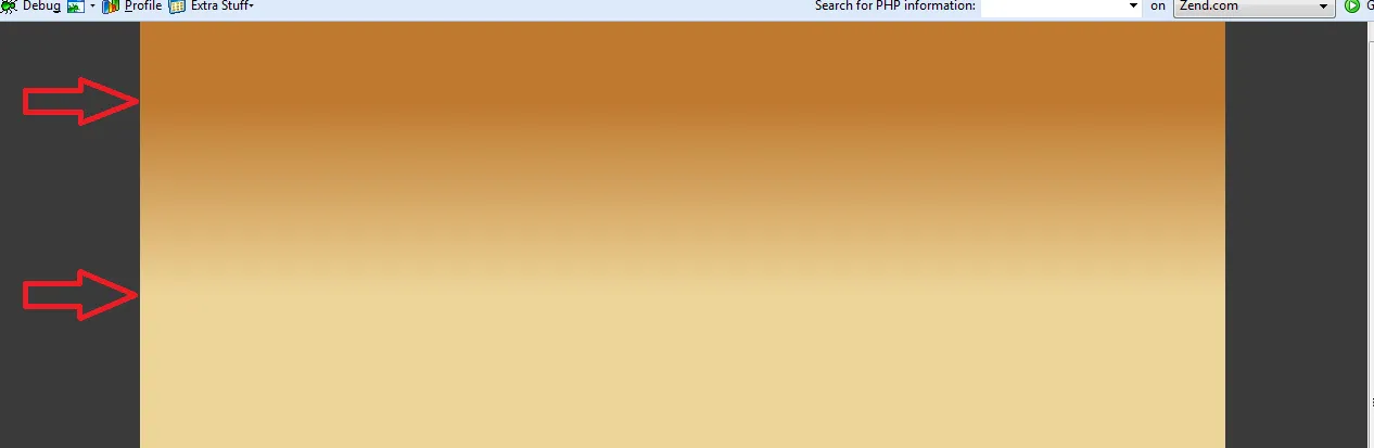
  background-image: linear-gradient(#bf7a30 30%, #edd599);
}

.gradient-smooth {
  background-image: linear-gradient(#bf7a30 25%, 75%, #edd599);
}

.gradient-clothoid {
  background-image: linear-gradient(
    rgba(191, 122, 48, 1) 0%,
    rgba(191, 122, 48, 0.3) 50%,
    rgba(191, 122, 48, 0.15) 65%,
    rgba(191, 122, 48, 0.075) 75.5%,
    rgba(191, 122, 48, 0.037) 82.85%,
    rgba(191, 122, 48, 0.019) 88%,
    rgba(191, 122, 48, 0) 100%
  );
}
<div class="gradient-wrp">
  <div class="header gradient-linear"></div>
  <div class="header gradient-smooth"></div>
  <div class="header gradient-clothoid"></div>
</div>

这个概念也被称为“scrim”。
在我看来,原始示例中不太适合“起始”颜色停止:
- 渐变的前30%应具有100%的颜色强度。可能是为了确保标题的更好可读性。 - 剩下的70%应具有平滑的颜色过渡。
实际上,我更喜欢Amelia Bellamy-Royds的建议(在下面的评论中有文章),使用不带颜色定义的停止点来添加(得到良好支持的)渐变平滑,如下所示:
.gradient-smooth{
   background-image:linear-gradient(#BF7A30 25%, 75%, #EDD599); 
}

这将使25%到75%之间的渐变变得更加平滑,基于底部样条而不是线性。

.gradient-linear{
   background-image:linear-gradient(#BF7A30 30%, #EDD599); 
 }

2
如 @nighthawk2534 所提到的,为渐变添加更多颜色是正确的方法。显然,这些颜色必须是“正确的”。
我不懂颜色理论,但偶然发现了一个很棒的工具: https://mycolor.space/gradient 对于你的例子,它给出的结果如下:
background-image: linear-gradient(to right top, #bf7a30, #ca9148, #d5a861, #e1bf7d, #edd599);

看起来像这样: 图片

(我知道这个帖子很旧了,但可能仍然有用)


1

快来看看:

background-color: #bf7a30;
background-image: linear-gradient(0deg, #bf7a30 0%, #edd599 46%, #bf7a30 100%);

我很容易从www.gradientcss.com生成了它。


2
这并没有回答问题。 - Lisa

-4

以下 CSS 可以满足您的需求。

CSS:

#header {
    width:1000px;
    height:250px;
    /* IE10 Consumer Preview */ 
background-image: -ms-linear-gradient(bottom, #EDD799 0%, #BF7F37 100%);
    /* Mozilla Firefox */ 
background-image: -moz-linear-gradient(bottom, #EDD799 0%, #BF7F37 100%);
    /* Opera */ 
background-image: -o-linear-gradient(bottom, #EDD799 0%, #BF7F37 100%);
    /* Webkit (Safari/Chrome 10) */ 
background-image: -webkit-gradient(linear, left bottom, left top, color-stop(0, #EDD799), color-stop(1, #BF7F37));
    /* Webkit (Chrome 11+) */ 
background-image: -webkit-linear-gradient(bottom, #EDD799 0%, #BF7F37 100%);
    /* W3C Markup, IE10 Release Preview */ 
background-image: linear-gradient(to top, #EDD799 0%, #BF7F37 100%);
}

http://jsfiddle.net/xPLPH/

了解更多关于线性渐变的知识:https://developer.mozilla.org/zh-CN/docs/Web/CSS/linear-gradient


3
这并不是解决有可见颜色点问题的方案。您只是建议不要在渐变中使用颜色点,而是将它们移到边缘:第一个放到 0%,最后一个放到 100%。如果您像问题作者的代码一样移动颜色点,就可以看到这一点:http://jsfiddle.net/zoaporx0/1/ - Даниил Пронин
12
完全不是回答。边缘仍然可见。 - Pavel Vlasov
1
这不是解决问题的方法。 - Ismail El Moudni

网页内容由stack overflow 提供, 点击上面的
可以查看英文原文,
原文链接