当前的答案并不正确。以下是两种正确的方法(截至Plots.jl v1.10.1):
方法1:使用fillrange
plot(x, l, fillrange = u, fillalpha = 0.35, c = 1, label = "Confidence band")
方法二:使用 ribbon
plot(x, (l .+ u) ./ 2, ribbon = (l .- u) ./ 2, fillalpha = 0.35, c = 1, label = "Confidence band")
(在这里,l和u分别表示“下限”和“上限”的y值,x表示它们共同的x值。) 这两种方法之间的关键区别在于fillrange填充了l和u之间的区域,而ribbon参数是一个半径,即缎带的一半宽度(或者换句话说,中点的垂直偏移量)。
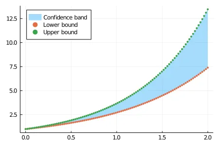
使用fillrange的示例:
x = collect(range(0, 2, length= 100))
y1 = exp.(x)
y2 = exp.(1.3 .* x)

plot(x, y1, fillrange = y2, fillalpha = 0.35, c = 1, label = "Confidence band", legend = :topleft)
让我们在图表上分散y1和y2,以确保我们填充了正确的区域。
plot!(x,y1, line = :scatter, msw = 0, ms = 2.5, label = "Lower bound")
plot!(x,y2, line = :scatter, msw = 0, ms = 2.5, label = "Upper bound")
结果:
使用ribbon的示例:ribbon
mid = (y1 .+ y2) ./ 2
w = (y2 .- y1) ./ 2
plot(x, mid, ribbon = w , fillalpha = 0.35, c = 1, lw = 2, legend = :topleft, label = "Mean")
plot!(x,y1, line = :scatter, msw = 0, ms = 2.5, label = "Lower bound")
plot!(x,y2, line = :scatter, msw = 0, ms = 2.5, label = "Upper bound")
(这里,x,y1和y2与之前相同。)
结果:
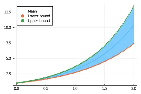
请注意,图例中ribbon和fillrange的标签不同:前者标记中点/均值,而后者标记阴影区域本身。
一些附加说明:
OP的答案plot(y, ribbon=(l,u), lab="estimate")是不正确的(至少对于Plots v1.10.1)。我意识到这个主题已经超过3年了,所以也许在OP当时使用的Plots.jl早期版本中它可以工作。
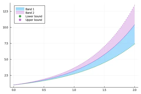
类似于其中一个给出的答案,
plot(x, [mid mid], fillrange=[mid .- w, mid .+ w], fillalpha=0.35, c = [1 4], label = ["Band 1" "Band 2"], legend = :topleft, dpi = 80)
这样做虽然可以实现目标,但会创建两个条带(因此在图例中会出现两个图标),这可能并非OP所要求的。举个例子:
plot(vals, ribbon=errs)就可以了。 - josePereiro