如何在R中绘制预测的子集?

3
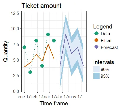
我有一个简单的R脚本,可以根据文件创建预测。数据从2014年开始记录,但我在尝试完成以下两个目标时遇到了困难:
  • 仅绘制预测信息的子集(从11/2017开始)。
  • 以特定格式(即Jun 17)包括月份和年份。
这是数据集的链接,在下面你将找到我迄今为止编写的代码。
# Load required libraries
library(forecast)
library(ggplot2)

# Load dataset
emea <- read.csv(file="C:/Users/nsoria/Downloads/AMS Globales/EMEA_Depuy_Finanzas.csv", header=TRUE, sep=';', dec=",")

# Create time series object
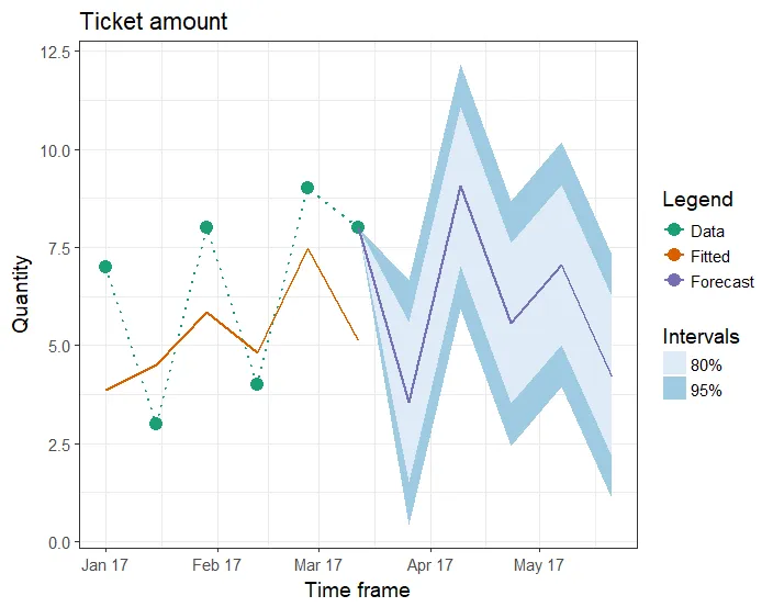
ts_fin <- ts(emea$Value, frequency = 26, start = c(2014,11))

# Pull out the seasonal, trend, and irregular components from the time series 
model <- stl(ts_fin, s.window = "periodic")

# Predict the next 3 bi weeks of tickets
pred <- forecast(model, h = 5)

# Plot the results
plot(pred, include = 5, showgap = FALSE, main = "Ticket amount", xlab = "Timeframe", ylab = "Quantity")

我感激你对我的两个问题和清晰的图表提供任何帮助和建议。

提前致谢。

编辑01/10-问题1: 我添加了建议代码的屏幕截图。 Plot1

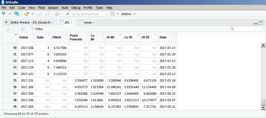
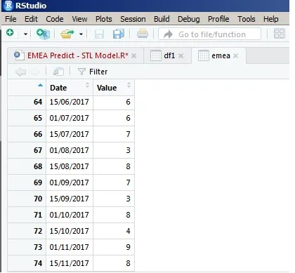
编辑01/10-问题2: 一旦使用下面的代码进行转换,它会不知怎么地错过日期计数并与结果混淆。请查看两个屏幕截图并比较最后一个值。

屏幕截图1 屏幕截图2


创建时间序列对象时出现了问题。请检查 ts_fin 的值。start = c(2014, 11) 中的 11 不是指月份。 - Tung
ts_fin <- ts(emea$Value, deltat = 1/24, start = c(2014, 21)) 给出了与 emea 相当接近的结果。您需要使用 ts 进行调整以获得正确的结果。 - Tung
非常感谢!我将使用TS来获得最佳准确性。 - nariver1
1个回答

3
使用 ggplot2ggfortifytidyverselubridatescales 包进行绘图。
    library(lubridate)
    library(tidyverse)
    library(scales)
    library(ggfortify)

    # Convert pred from list to data frame object
    df1 <- fortify(pred) %>% as_tibble()

    # Convert ts decimal time to Date class
    df1$Date <- as.Date(date_decimal(df1$Index), "%Y-%m-%d")
    str(df1)

    # Remove Index column and rename other columns
    # Select only data pts after 2017
    df1 <- df1 %>% 
      select(-Index) %>% 
      filter(Date >= as.Date("2017-01-01")) %>% 
      rename("Low95" = "Lo 95",
             "Low80" = "Lo 80",
             "High95" = "Hi 95",
             "High80" = "Hi 80",
             "Forecast" = "Point Forecast")
    df1

    ### Updated: To connect the gap between the Data & Forecast, 
    # assign the last non-NA row of Data column to the corresponding row of other columns
    lastNonNAinData <- max(which(complete.cases(df1$Data)))
    df1[lastNonNAinData, !(colnames(df1) %in% c("Data", "Fitted", "Date"))] <- df1$Data[lastNonNAinData]

    # Or: use [geom_segment](http://ggplot2.tidyverse.org/reference/geom_segment.html)

    plt1 <- ggplot(df1, aes(x = Date)) +   
      ggtitle("Ticket amount") +
      xlab("Time frame") + ylab("Quantity") +
      geom_ribbon(aes(ymin = Low95, ymax = High95, fill = "95%")) +
      geom_ribbon(aes(ymin = Low80, ymax = High80, fill = "80%")) +
      geom_point(aes(y = Data, colour = "Data"), size = 4) +
      geom_line(aes(y = Data, group = 1, colour = "Data"), 
                linetype = "dotted", size = 0.75) +
      geom_line(aes(y = Fitted, group = 2, colour = "Fitted"), size = 0.75) +
      geom_line(aes(y = Forecast, group = 3, colour = "Forecast"), size = 0.75) +
      scale_x_date(breaks = scales::pretty_breaks(), date_labels = "%b %y") +
      scale_colour_brewer(name = "Legend", type = "qual", palette = "Dark2") +
      scale_fill_brewer(name = "Intervals") +
      guides(colour = guide_legend(order = 1), fill = guide_legend(order = 2)) +
      theme_bw(base_size = 14)
    plt1

enter image description here


你好,感谢您详细的回复!实际上我在第一步中遇到了问题,尝试将pred从列表转换为数据框对象。由于它是一个预测对象,它会提示错误消息,即ggplot2不知道如何处理这种类型的对象。请问您能否帮助我按照您的建议继续前进吗? - nariver1
抱歉,我想我错过了 ggfortify 包。请查看我的编辑。 - Tung
谢谢,好用了。按照您的步骤尝试绘制图表时,它没有呈现与您发布的完全相同的图像。您是否知道是否有类似于plot函数中showgap = FALSE的命令? - nariver1
我不确定是否有一个。你的图表有什么问题?任何屏幕截图都会有所帮助。 - Tung
谢谢您的回复。我已经添加了适合我的输出。我也尝试了不同于您提出的日期,但遇到了困难。我认为这可能与时区有关,但我需要更多时间来测试它。 - nariver1
谢谢,这真的起作用了。我将更新第一篇帖子,并提出目前正在发生的数据问题。 - nariver1

网页内容由stack overflow 提供, 点击上面的
可以查看英文原文,
原文链接