Select2从输入框开始而不是下拉菜单开始。

39

我使用 JavaScript 库select2。以下是目前的截图:
开始:
enter image description here
点击下拉框:
enter image description here

现在,是否可以使用文本输入框作为起点而不是直接使用下拉列表?我知道这是可能的,因为你可以在 select2 网站上找到它。例如这个例子: enter image description here enter image description here

但文档非常简要。这就是我目前拥有的内容:

<input type="text" name="questions[question1]" id="question1" class="question1" style="width:500px"/>
function createQuestionTags(data, question_number){
  $(".question" + question_number).select2({
    createSearchChoice: function (term, data) {
      if ($(data).filter(function () {
        return this.text.localeCompare(term) === 0;
      }).length === 0) {
        return {
          id: term,
          text: term
        };
      }
    },
    data: data,
    placeholder: "Enter Question",
    allowClear:true
  });
}

(这些数据是从一个ajax调用中接收到的)

12个回答

36
你所看到的实际上是一个多选或多值下拉框的例子。它不是像你在代码中使用的单值下拉框。根据Select2网站的说明,Select2会检测到你想要使用多选框,并自动应用该样式,而不是默认的样式(下拉箭头等)。
如果你确实需要一个单值下拉框,没有直接的方法使其以多选框的格式显示,看起来像一个常规的输入框。也许可以通过添加或删除CSS类来伪装。我尝试了一下,但没有找到合适的方法。
既然你不需要格式化、搜索框或多选功能(我猜测),你可能不需要使用Select2库。
更新:看起来你不是第一个尝试这样做的人。他们计划添加这个功能,但可能需要一段时间: https://github.com/select2/select2/issues/1345

谢谢你的完美解释!你可能知道另一个好的库可以用于自动建议吗? - nielsv
非常欢迎。我不确定您所说的自动建议是什么意思。我认为您指的是类似于自动完成的功能,例如谷歌搜索。如果是这样,jQuery UI具有非常易于使用的特性,可以与ajax一起使用。http://jqueryui.com/autocomplete/ - KyleK

33

7
样式不是最理想的,但这个可以用。该选项的名称已更改为“maximumSelectionLength”(但由于某些原因,在最新版本的文档中未列出)。 - Matt Browne
我也认为这个解决方案不是很理想,但它可以帮助我解决问题。感谢您分享您的评论! - Tung
这是最佳解决方案。多选框的用户体验比带有丑陋双输入字段的单选框要好得多。应该成为单选框的默认选择。 - woens

14

使用新的选择器适配器,Select2 4.0.0 版本可以实现这一点。您可以将 SingleSelection 更换为 MultipleSelection(包括任何相关的修饰符),然后它应该按预期运行。

$.fn.select2.amd.require([
  'select2/selection/multiple',
  'select2/selection/search',
  'select2/dropdown',
  'select2/dropdown/attachBody',
  'select2/dropdown/closeOnSelect',
  'select2/compat/containerCss',
  'select2/utils'
], function (MultipleSelection, Search, Dropdown, AttachBody, CloseOnSelect, ContainerCss, Utils) {
  var SelectionAdapter = Utils.Decorate(
    MultipleSelection,
    Search
  );
  
  var DropdownAdapter = Utils.Decorate(
    Utils.Decorate(
      Dropdown,
      CloseOnSelect
    ),
    AttachBody
  );
  
  $('.inline-search').select2({
    dropdownAdapter: DropdownAdapter,
    selectionAdapter: SelectionAdapter
  });
  
  $('.dropdown-search').select2({
    selectionAdapter: MultipleSelection
  });
  
  $('.autocomplete').select2({
    dropdownAdapter: DropdownAdapter,
    selectionAdapter: Utils.Decorate(SelectionAdapter, ContainerCss),
    containerCssClass: 'select2-autocomplete'
  });
});
.select2-selection__choice__remove {
  display: none !important;
}

.select2-container--focus .select2-autocomplete .select2-selection__choice {
  display: none;
}
<link href="//cdnjs.cloudflare.com/ajax/libs/select2/4.0.0/css/select2.css" rel="stylesheet"/>

<script src="//cdnjs.cloudflare.com/ajax/libs/jquery/2.1.3/jquery.js"></script>
<script src="//cdnjs.cloudflare.com/ajax/libs/select2/4.0.0/js/select2.full.js"></script>

<p>With an inline search box</p>

<select style="width: 200px" class="inline-search">
  <option value="AL">Alabama</option>
  <option value="AK">Alaska</option>
  <option value="AZ">Arizona</option>
</select>

<p>With the search box in the dropdown</p>

<select style="width: 200px" class="dropdown-search">
  <option value="AL">Alabama</option>
  <option value="AK">Alaska</option>
  <option value="AZ">Arizona</option>
</select>

<p>With the selection hidden when it is focused</p>

<select style="width: 200px" class="autocomplete">
  <option value="AL">Alabama</option>
  <option value="AK">Alaska</option>
  <option value="AZ">Arizona</option>
</select>

默认情况下,Select2将设置下拉菜单以具有搜索(而不是选择容器),如果您想完美模拟多重选择,则需要覆盖该设置。


谢谢你的回复,Kevin。如果我们想要移除 selection__choice 这个元素以便有更多的输入空间,你会建议我们在打开事件时隐藏这个类(并在关闭事件时显示)吗?这样就更接近自动完成的效果了。 - prograhammer
1
@prograhammer 我刚刚添加了一个示例,展示如何仅使用CSS和containerCssClass以及4.0.1-rc.1中新增的focus状态来实现此功能。 - Kevin Brown-Silva

5

相较于Select2而言,更好的选择是selectize,因为Select2似乎已经停止更新

使用起来很简单:

$('select').selectize(options);

这里有很多使用和自定义selectize的示例。


2
在我的情况下,我希望用户从下拉列表中选择的内容出现在下拉列表下方的列表中,而不是像常规下拉列表那样工作。因此,以下解决方法适用于我:
$('#myselect').select2({
    multiple:true
})
.on('select2:select', function (e) {
    //clear the input box after a selection is made
    $(this).val([]).trigger('change');
});

当然,如果你希望像普通的select2多选列表那样,在select2输入框中保留所选项目,则这种方法不起作用。

1
使用这些属性。
$('#placeSelect').select2({
width: '100%',
allowClear: true,
multiple: true,
maximumSelectionSize: 1,   
});

只需在下拉菜单的onchange事件中调用此函数。
function ResentForMe(){
var _text=$('.select2-selection__rendered li:first-child').attr('title');
$('.select2-selection__rendered li:first-child').remove();
$('.select2-search__field').val(_text);
$('.select2-search__field').css('width','100%');
}

注意:从选择器中删除“Multiple”属性。

1

使用Bootstrap样式的自定义实现,简单但功能强大:

var elements = $(document).find('select.form-control');
for (var i = 0, l = elements.length; i < l; i++) {
  var $select = $(elements[i]), $label = $select.parents('.form-group').find('label');
  
  $select.select2({
    allowClear: false,
    placeholder: $select.data('placeholder'),
    minimumResultsForSearch: 0,
    theme: 'bootstrap',
  width: '100%' // https://github.com/select2/select2/issues/3278
  });
  
  // Trigger focus
  $label.on('click', function (e) {
    $(this).parents('.form-group').find('select').trigger('focus').select2('focus');
  });
  
  // Trigger search
  $select.on('keydown', function (e) {
    var $select = $(this), $select2 = $select.data('select2'), $container = $select2.$container;
    
    // Unprintable keys
    if (typeof e.which === 'undefined' || $.inArray(e.which, [0, 8, 9, 12, 16, 17, 18, 19, 20, 27, 33, 34, 35, 36, 37, 38, 39, 44, 45, 46, 91, 92, 93, 112, 113, 114, 115, 116, 117, 118, 119, 120, 121, 123, 124, 144, 145, 224, 225, 57392, 63289]) >= 0) {
      return true;
    }

    // Already opened
    if ($container.hasClass('select2-container--open')) {
      return true;
    }

    $select.select2('open');

    // Default search value
    var $search = $select2.dropdown.$search || $select2.selection.$search, query = $.inArray(e.which, [13, 40, 108]) < 0 ? String.fromCharCode(e.which) : '';
    if (query !== '') {
      $search.val(query).trigger('keyup');
    }
  });

  // Format, placeholder
  $select.on('select2:open', function (e) {
  var $select = $(this), $select2 = $select.data('select2'), $dropdown = $select2.dropdown.$dropdown || $select2.selection.$dropdown, $search = $select2.dropdown.$search || $select2.selection.$search, data = $select.select2('data');
    
    // Above dropdown
    if ($dropdown.hasClass('select2-dropdown--above')) {
      $dropdown.append($search.parents('.select2-search--dropdown').detach());
    }

    // Placeholder
    $search.attr('placeholder', (data[0].text !== '' ? data[0].text : $select.data('placeholder')));
  });
}
/* !important not needed with less */

.form-group {
  padding: 25px;
}

.form-group.above {
  position: absolute;
  bottom: 0; left: 0; right: 0;
}

.select2-container--open .select2-selection {
    box-shadow: none!important;
}

.select2-container--open .select2-selection .select2-selection__arrow {
    z-index: 9999; /* example */
}

.select2-dropdown {
  /* .box-shadow(@form-control-focus-box-shadow); (from select2-boostrap */
  -webkit-box-shadow: inset 0 1px 1px rgba(0, 0, 0, 0.075), 0 0 8px rgba(102, 175, 233, 0.6);
  box-shadow: inset 0 1px 1px rgba(0, 0, 0, 0.075), 0 0 8px rgba(102, 175, 233, 0.6);
  
  /* border-color: @input-border-focus; */
  border-color: #66afe9;
  border-top-width: 1px!important;
  border-top-style: solid!important;
  /* border-top-left-radius: @input-border-radius; */
  border-top-left-radius: 4px!important;
  /* border-top-right-radius: @input-border-radius; */
  border-top-right-radius: 4px!important;
  
  /* margin-top: -@input-height-base; */
  margin-top: -34px!important;
}

.select2-dropdown .select2-search {
    padding: 0;
}

.select2-dropdown .select2-search .select2-search__field {
  
  /* !important not needed using less */
  border-top: 0!important;
  border-left: 0!important;
  border-right: 0!important;
  border-radius: 0!important;
  
  /* padding: @padding-base-vertical @padding-base-horizontal; */
  padding: 6px 12px;
  
  /* height: calc(@input-height-base - 1px); */
  height: 33px;
}

.select2-dropdown.select2-dropdown--above {
  /* border-bottom: 1px solid @input-border-focus; */
  border-bottom: 1px solid #66afe9!important;
  /* border-bottom-left-radius: @input-border-radius; */
  border-bottom-left-radius: 4px!important;
  /* border-bottom-right-radius: @input-border-radius; */
  border-bottom-right-radius: 4px!important;
  /* margin-top: @input-height-base; */
  margin-top: 34px!important;
}

.select2-dropdown.select2-dropdown--above .select2-search .select2-search__field {
  /* border-top: 1px solid @input-border; */
  border-top: 1px solid #66afe9!important;
  border-bottom: 0!important;
}
<link href="https://maxcdn.bootstrapcdn.com/bootstrap/3.3.5/css/bootstrap.min.css" rel="stylesheet"/>
<link href="https://cdnjs.cloudflare.com/ajax/libs/select2/4.0.1/css/select2.min.css" rel="stylesheet"/>
<link href="https://select2.github.io/select2-bootstrap-theme/css/select2-bootstrap.css" rel="stylesheet"/>
<script src="https://ajax.googleapis.com/ajax/libs/jquery/2.1.1/jquery.min.js"></script>
<script src="https://cdnjs.cloudflare.com/ajax/libs/select2/4.0.1/js/select2.full.min.js"></script>
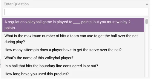
<div class="form-group">
  <label class="control-label">Below example (click label to focus)</label>
  <select class="form-control" id="select2-single-box" name="select2-single-box" data-placeholder="Pick your choice" data-tabindex="1">
    <option></option>
    <option value="1">First choice</option>
    <option value="2">Second choice</option>
    <option value="3">Third choice</option>
    <option value="4">Fourth choice</option>
    <option value="5">Fifth choice</option>
    <option value="6">Sixth choice</option>
    <option value="7">Seventh choice</option>
    <option value="8">Eighth choice</option>
    <option value="9">Ninth choice</option>
  </select>
</div>
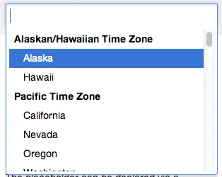
<div class="form-group above">
  <label class="control-label">Above example (click label to focus)</label>
  <select class="form-control" id="select2-single-box" name="select2-single-box" data-placeholder="Pick your choice" data-tabindex="2">
    <option></option>
    <option value="1">First choice</option>
    <option value="2">Second choice</option>
    <option value="3">Third choice</option>
    <option value="4">Fourth choice</option>
    <option value="5">Fifth choice</option>
    <option value="6">Sixth choice</option>
    <option value="7">Seventh choice</option>
    <option value="8">Eighth choice</option>
    <option value="9">Ninth choice</option>
  </select>
</div>

minimumInputLength: 1 选项可以在焦点/打开时隐藏下拉菜单...

更新:清理代码,不要在焦点上打开下拉菜单。


1

伙计们,在任何地方添加一些 CSS:

.select2-dropdown--below {
    margin-top: -33px !important;
    border-radius: 4px !important;
}

尝试一下! ;)


0

Matt,)

这是关于编程的内容

    $('.search-town-flat').select2({
        multiple: true,
        placeholder: "输入数值",
        allowClear: true,
        maximumSelectionLength: 2,
        theme      : "classic"
    }).on('select2:select', function (e) {
        $(this).val([]).trigger('change');
        $(this).val([e.params.data.id]).trigger("change");
    });

0

$.fn.select2.amd.require([
  'select2/selection/multiple',
  'select2/selection/search',
  'select2/dropdown',
  'select2/dropdown/attachBody',
  'select2/dropdown/closeOnSelect',
  'select2/compat/containerCss',
  'select2/utils'
], function (MultipleSelection, Search, Dropdown, AttachBody, CloseOnSelect, ContainerCss, Utils) {
  var SelectionAdapter = Utils.Decorate(
    MultipleSelection,
    Search
  );
  
  var DropdownAdapter = Utils.Decorate(
    Utils.Decorate(
      Dropdown,
      CloseOnSelect
    ),
    AttachBody
  );
  
  $('.inline-search').select2({
    dropdownAdapter: DropdownAdapter,
    selectionAdapter: SelectionAdapter
  });
  
  $('.dropdown-search').select2({
    selectionAdapter: MultipleSelection
  });
  
  $('.autocomplete').select2({
    dropdownAdapter: DropdownAdapter,
    selectionAdapter: Utils.Decorate(SelectionAdapter, ContainerCss),
    containerCssClass: 'select2-autocomplete'
  });
});
.select2-selection__choice__remove {
  display: none !important;
}

.select2-container--focus .select2-autocomplete .select2-selection__choice {
  display: none;
}
<link href="//cdnjs.cloudflare.com/ajax/libs/select2/4.0.0/css/select2.css" rel="stylesheet"/>

<script src="//cdnjs.cloudflare.com/ajax/libs/jquery/2.1.3/jquery.js"></script>
<script src="//cdnjs.cloudflare.com/ajax/libs/select2/4.0.0/js/select2.full.js"></script>

<p>With an inline search box</p>

<select style="width: 200px" class="inline-search">
  <option value="AL">Alabama</option>
  <option value="AK">Alaska</option>
  <option value="AZ">Arizona</option>
</select>

<p>With the search box in the dropdown</p>

<select style="width: 200px" class="dropdown-search">
  <option value="AL">Alabama</option>
  <option value="AK">Alaska</option>
  <option value="AZ">Arizona</option>
</select>

<p>With the selection hidden when it is focused</p>

<select style="width: 200px" class="autocomplete">
  <option value="AL">Alabama</option>
  <option value="AK">Alaska</option>
  <option value="AZ">Arizona</option>
</select>


这是一个仅包含代码的答案。虽然它可能是正确和有用的,但您可以通过添加一些文本和解释来改进您的帖子,使其更加有用。 - ruud

网页内容由stack overflow 提供, 点击上面的
可以查看英文原文,
原文链接