我是Android开发新手,也对Android主题/定制方面感兴趣,这似乎是一个广泛的话题...
我想给我的Switch组件一个特殊的外观和感觉,但我无法实现我想要的效果,即使在互联网上查找了许多资源。
这让我疯狂!!
感谢您提前帮助,Android大师们!
背景
我正在开发一个已有的Android应用程序(v1),它的minSdkVersion="8"。
因此,该应用程序使用第三方库来获取ActionBar (ActionBar Sherlock) 和 switches (SwitchCompatLibrary):
现在,我们正在制作v2版本,minSdkVersion="14"。
我们的客户还要求我们更改默认的switch外观和感觉。
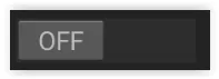
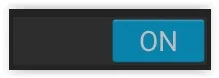
目标是拥有这些开关:


这看起来非常像最新的Material Design开关,但使用橙色而不是“绿蓝”色,如此处。
约束条件
由于我们现在是minSdk 14,因此可以删除两个库“ActionBarSherlock”和“SwitchCompatLibrary”,但这不是一个选项。实际上,我们没有时间...
事实上,我尝试在项目的gradle文件中添加依赖项appcompat-v7,以尝试使用带有材料主题的本机开关组件(请参见此处),但由于与上述2个库重复属性定义而导致错误。因此我不能使用它,也不确定这应该工作...
dependencies {
(...)

compile project(':actionbarsherlock')
compile project(':switchCompatLibrary')
compile files('libs/android-support-v4.jar')

// incompatible avec actionbarsherlock and SwitchCompatLibrary...
// compile "com.android.support:appcompat-v7:22.0.+"

(...)
}
现有代码
以下是实际代码。
在我的layout.xml文件中,我使用了SwitchCompatLibrary开关:
        <de.ankri.views.Switch
            android:id="@+id/switchButtonNotification"
            android:layout_width="wrap_content"
            android:layout_height="wrap_content"
            android:layout_alignParentRight="true" />
<style name="Theme.Orange" parent="@style/Theme.Sherlock">
    ...
    <!-- Theme switch with SwitchCompatLibrary -->
    <item name="switchStyle">@style/switch_light</item>
    <item name="textAppearance">@style/TextAppearance</item>
</style>
使用SwitchCompatLibrary自身定义的样式信息,如下所示:
styles.xml :
<resources xmlns:android="http://schemas.android.com/apk/res/android">

    <style name="switch_light">
        <item name="track">@drawable/switch_track_holo_light</item>
        <item name="thumb">@drawable/switch_inner_holo_light</item>
        <item name="textOn">@string/textOn</item>
        <item name="textOff">@string/textOff</item>
        <item name="thumbTextPadding">12dip</item>
        <item name="switchMinWidth">96dip</item>
        <item name="switchPadding">16dip</item>
        <item name="switchTextAppearance">@style/TextAppearance</item>
    </style>

    <style name="TextAppearance">
        <item name="textColor">?android:attr/textColorPrimary</item>
        <item name="textColorHighlight">?android:attr/textColorHighlight</item>
        <item name="textColorHint">?android:attr/textColorHint</item>
        <item name="textColorLink">?android:attr/textColorLink</item>
        <item name="textSize">16sp</item>
    </style>
</resources>
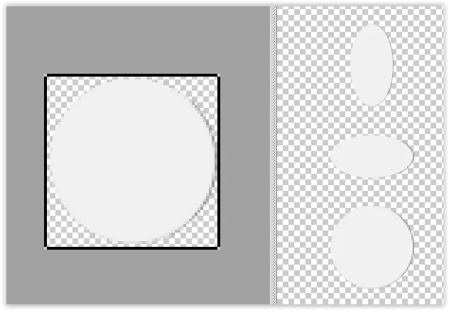
switch_inner_holo_light.xml
=>开关内部霍洛浅色主题xml文件
<selector xmlns:android="http://schemas.android.com/apk/res/android">
    <item android:state_enabled="false" android:drawable="@drawable/switch_thumb_disabled_holo_light" />
    <item android:state_pressed="true"  android:drawable="@drawable/switch_thumb_pressed_holo_light" />
    <item android:state_checked="true"  android:drawable="@drawable/switch_thumb_activated_holo_light" />
    <item                               android:drawable="@drawable/switch_thumb_holo_light" />
</selector>
开关轨迹_holo_light.xml
<selector xmlns:android="http://schemas.android.com/apk/res/android">
    <item android:state_focused="true"  android:drawable="@drawable/switch_bg_focused_holo_light" />
    <item                               android:drawable="@drawable/switch_bg_holo_light" />
</selector>
结果如下:


尝试过的方法
使用原生开关组件
由于我现在的 API 最低是 14,所以我首先尝试将布局文件中的 "de.ankri.views.Switch" 替换为 "android.widget.Switch",但样式不再应用(蓝色激活的开关变成了橙色)...
然而,在每个开关中直接定义主题 (如此描述) 似乎更好一些,因为我重新得到了橙色开关背景:
    <Switch
        android:id="@+id/switchButtonNotification"
        android:layout_width="wrap_content"
        android:layout_height="wrap_content"
        tools:checked="true"
        android:thumb="@drawable/switch_inner_holo_light"
        android:track="@drawable/switch_track_holo_light"
        android:layout_alignParentRight="true" />
奇怪……我不知道为什么,所以我不会这样做,并保留“de.ankri.views.Switch”组件。
使用SwitchCompatLibrary开关并进行自己的样式设置
然后,我尝试保留“de.ankri.views.Switch”组件,并执行与SwitchCompatLibrary相同的操作,但是使用自己的样式覆盖“@style/switch_light”样式,使用新的轨迹和拇指绘制。
themes.xml:
<style name="Theme.Orange" parent="@style/Theme.Sherlock">
    ...
    <!-- Theme switch with SwitchCompatLibrary -->
    <item name="switchStyle">@style/Switch.Orange</item>
    <item name="textAppearance">@style/TextAppearance</item>
</style>
styles.xml:
<style name="Switch.Orange" parent="@style/switch_light">
    <item name="track">@drawable/switch_track_orange</item>
    <item name="thumb">@drawable/switch_thumb_orange</item>
    <item name="textOn">@string/textOn</item>
    <item name="textOff">@string/textOff</item>
    <item name="thumbTextPadding">12dip</item>
    <item name="switchMinWidth">96dip</item>
    <item name="switchPadding">16dip</item>
    <item name="switchTextAppearance">@style/TextAppearance</item>
</style>
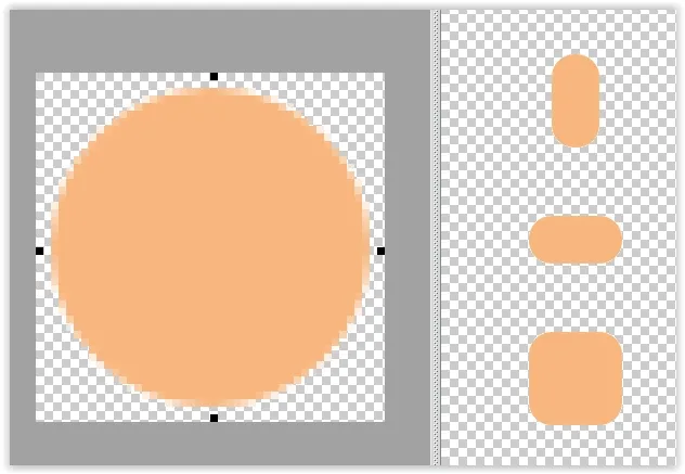
switch_thumb_orange.xml
<selector xmlns:android="http://schemas.android.com/apk/res/android">
    <item android:state_enabled="false" android:drawable="@drawable/switch_thumb_normal_orange" />
    <item android:state_pressed="true"  android:drawable="@drawable/switch_thumb_activated_orange" />
    <item android:state_checked="true"  android:drawable="@drawable/switch_thumb_activated_orange" />
    <item                               android:drawable="@drawable/switch_thumb_normal_orange" />
</selector>
 switch_thumb_normal_orange.9.png
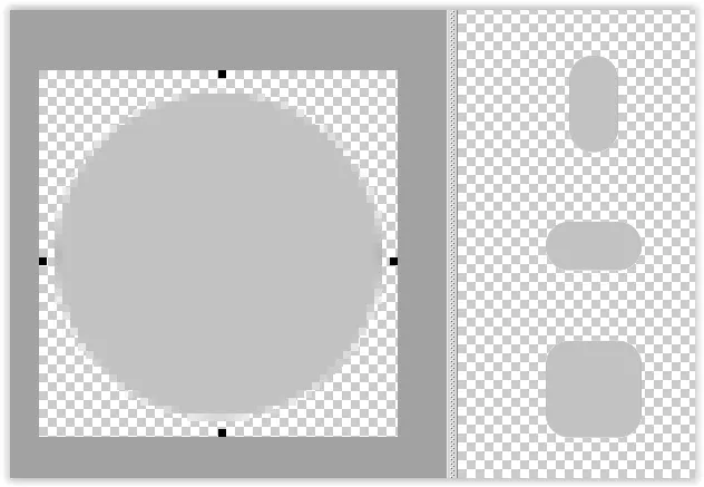
 switch_track_orange.xml
<selector xmlns:android="http://schemas.android.com/apk/res/android">
    <item android:state_enabled="false" android:drawable="@drawable/switch_track_normal_orange" />
    <item android:state_checked="true" android:drawable="@drawable/switch_track_activated_orange" />
    <item android:state_focused="true"  android:drawable="@drawable/switch_track_activated_orange" />
    <item                               android:drawable="@drawable/switch_track_normal_orange" />
</selector>
switch_track_activated_orange.9.png 和 switch_track_normal_orange.9.png
结果:
结果非常糟糕!:
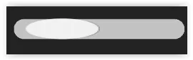

我哪里错了? 我试图在 styles.xml 中更改 "thumbTextPadding"、"switchMinWidth" 和 "switchPadding",但效果不佳。
也许我的 9-patch 文件有问题?