我正在使用ICS应用程序中的holo.light主题和标准的Switch控件。
我想要将开关按钮的高亮或打开状态颜色从标准的浅蓝色更改为绿色。
这应该很容易,但我似乎无法弄清如何实现。
我正在使用ICS应用程序中的holo.light主题和标准的Switch控件。
我想要将开关按钮的高亮或打开状态颜色从标准的浅蓝色更改为绿色。
这应该很容易,但我似乎无法弄清如何实现。
我晚到了派对,但这就是我所做的。
风格
<style name="SCBSwitch" parent="Theme.AppCompat.Light">
<!-- active thumb & track color (30% transparency) -->
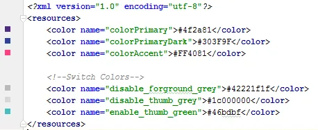
<item name="colorControlActivated">#46bdbf</item>
<!-- inactive thumb color -->
<item name="colorSwitchThumbNormal">#f1f1f1
</item>
<!-- inactive track color (30% transparency) -->
<item name="android:colorForeground">#42221f1f
</item>
</style>
颜色
布局
<android.support.v7.widget.SwitchCompat
    android:layout_width="wrap_content"
    android:layout_height="wrap_content"
    android:layout_alignParentRight="true"
    android:checked="false"
    android:theme="@style/SCBSwitch" />
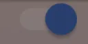
结果
查看启用和禁用开关的颜色变化

目前最好使用来自AppCompat.v7库的SwitchCompat。您可以使用简单的样式更改组件的颜色。
values/themes.xml:

<style name="Theme.MyTheme" parent="Theme.AppCompat.Light">
    <!-- colorPrimary is used for the default action bar background -->
    <item name="colorPrimary">@color/my_awesome_color</item>

    <!-- colorPrimaryDark is used for the status bar -->
    <item name="colorPrimaryDark">@color/my_awesome_darker_color</item>

    <!-- colorAccent is used as the default value for colorControlActivated,
         which is used to tint widgets -->
    <item name="colorAccent">@color/accent</item>

    <!-- You can also set colorControlNormal, colorControlActivated
         colorControlHighlight, and colorSwitchThumbNormal. -->

</style>
参考:Android开发者博客
编辑:
正确应用的方式是通过 android:theme="@style/Theme.MyTheme",并且这也可以应用于父样式,例如EditTexts、RadioButtons、Switches、CheckBoxes和ProgressBars:
<style name="My.Widget.ProgressBar" parent="Widget.AppCompat.ProgressBar">

<style name="My.Widget.Checkbox" parent="Widget.AppCompat.CompoundButton.CheckBox">
AppCompat主题,则需要使用SwitchCompat而不是Switch。如果使用SDK 23+,则可以使用具有ColorStateList的android:thumbTint和android:thumbTintMode。其中“on”为colorAccent,“off”为colorSwitchThumbNormal。 - Tom作为对现有答案的补充:您可以使用res/color文件夹中的选择器自定义拇指和轨道,例如:
switch_track_selector
<?xml version="1.0" encoding="utf-8"?>
<selector
    xmlns:android="http://schemas.android.com/apk/res/android">
    <item android:color="@color/lightBlue"
        android:state_checked="true" />
    <item android:color="@color/grey"/>
</selector>
switch_thumb_selector
<selector
    xmlns:android="http://schemas.android.com/apk/res/android">
    <item android:color="@color/darkBlue"
        android:state_checked="true" />
    <item android:color="@color/white"/>
</selector>
使用这些选择器来自定义轨道和滑块的色调:
<androidx.appcompat.widget.SwitchCompat
    android:layout_width="wrap_content"
    android:layout_height="wrap_content"
    app:trackTint="@color/switch_track_selector"
    app:thumbTint="@color/switch_thumb_selector"/>
Switch和android命名空间来设置这些属性,它只适用于API 23及更高版本,因此请使用SwitchCompat与app命名空间xmlns:app="http://schemas.android.com/apk/res-auto"作为通用解决方案。{{注意保留原文中的代码格式}}

这对我有效(需要Android 4.1):
Switch switchInput = new Switch(this);
int colorOn = 0xFF323E46;
int colorOff = 0xFF666666;
int colorDisabled = 0xFF333333;
StateListDrawable thumbStates = new StateListDrawable();
thumbStates.addState(new int[]{android.R.attr.state_checked}, new ColorDrawable(colorOn));
thumbStates.addState(new int[]{-android.R.attr.state_enabled}, new ColorDrawable(colorDisabled));
thumbStates.addState(new int[]{}, new ColorDrawable(colorOff)); // this one has to come last
switchInput.setThumbDrawable(thumbStates);
ColorStateList buttonStates = new ColorStateList(
        new int[][]{
                new int[]{-android.R.attr.state_enabled},
                new int[]{android.R.attr.state_checked},
                new int[]{}
        },
        new int[]{
                Color.BLUE,
                Color.RED,
                Color.GREEN
        }
);
switchInput.getThumbDrawable().setTintList(buttonStates);
switchInput.getTrackDrawable().setTintList(buttonStates);
Android 6-7 更新
正如 Cheruby 在评论中所述,我们可以使用新的 setThumbTintList 方法,这对我来说起作用了。我们也可以使用 setTrackTintList,但是它会将颜色混合,导致在深色主题中比预期更暗,在浅色主题中比预期更亮,有时甚至看不见。在 Android 7 中,我能够通过覆盖轨迹tint mode来最小化这种变化,但在 Android 6 中我无法获得良好的结果。您可能需要定义额外的颜色来补偿混合。(你是否有一种感觉,谷歌不想让我们自定义应用程序的外观?)
ColorStateList thumbStates = new ColorStateList(
        new int[][]{
                new int[]{-android.R.attr.state_enabled},
                new int[]{android.R.attr.state_checked},
                new int[]{}
        },
        new int[]{
                Color.BLUE,
                Color.RED,
                Color.GREEN
        }
);
switchInput.setThumbTintList(thumbStates);
if (Build.VERSION.SDK_INT >= 24) {
    ColorStateList trackStates = new ColorStateList(
            new int[][]{
                    new int[]{-android.R.attr.state_enabled},
                    new int[]{}
            },
            new int[]{
                    Color.GRAY,
                    Color.LTGRAY
            }
    );
    switchInput.setTrackTintList(trackStates);
    switchInput.setTrackTintMode(PorterDuff.Mode.OVERLAY);
}
switchInput.setThumbTintList(buttonStates); 在Nougat上也适用。API 21-22:使用DrawableCompat,如@Alexey所建议的。switchInput.setButtonTintList(buttonStates); 对我无效,它没有为我的Switch着色。API低于21:switchInput.getThumbDrawable().setColorFilter(someColor, PorterDuff.Mode.SrcIn);这些对我有用。我还使用了Xamarin,如果您使用Xamarin.Forms,请在Android渲染器中将其转换为C#。 - Tiffany如果不使用style.xml或Java代码来更改Switch样式,您可以将其自定义为布局XML:
<Switch
        android:id="@+id/checkbox"
        android:layout_width="wrap_content"
        android:thumbTint="@color/blue"
        android:trackTint="@color/white"
        android:checked="true"
        android:layout_height="wrap_content" />
属性android:thumbTint和android:trackTint允许您自定义颜色。
这是XML的可视化结果:
app:thumbTint,而不是android:thumbTint并将switch更改为SwitchCompat。 - Kavita Patil制作可绘制文件 "newthumb.xml"
<selector xmlns:android="http://schemas.android.com/apk/res/android">
  <item android:color="@color/Green" android:state_checked="true"/>
  <item android:color="@color/Red" android:state_checked="false"/>
</selector>
制作可绘制文件 "newtrack.xml"
<selector xmlns:android="http://schemas.android.com/apk/res/android">
  <item android:color="@color/black" android:state_checked="true"/>
  <item android:color="@color/white" android:state_checked="false"/>
</selector>
并在 Switch 中添加它:
<Switch
  android:trackTint="@drawable/newtrack"
  android:thumbTint="@drawable/newthumb"
/>
请使用app:trackTint和app:thumbTint代替开关兼容androidx中的switch - 请参见@Ehsan Rosdi的评论。
而且,只创建一个可绘制文件("switchcolors.xml"),并将其用于trackTint和thumbTint也完全没有问题。
trackTint 或 thumbTint 建议 @drawable 资源。你需要手动编写它,这样就可以使用它了。 - Benjamin Basmaci创建自定义开关并覆盖 setChecked 方法以更改颜色:
  public class SwitchPlus extends Switch {

    public SwitchPlus(Context context) {
        super(context);
    }

    public SwitchPlus(Context context, AttributeSet attrs) {
        super(context, attrs);
    }

    public SwitchPlus(Context context, AttributeSet attrs, int defStyleAttr) {
        super(context, attrs, defStyleAttr);
    }

    @Override
    public void setChecked(boolean checked) {
        super.setChecked(checked);
        changeColor(checked);
    }

    private void changeColor(boolean isChecked) {
        if (Build.VERSION.SDK_INT >= Build.VERSION_CODES.JELLY_BEAN) {
            int thumbColor;
            int trackColor;

            if(isChecked) {
                thumbColor = Color.argb(255, 253, 153, 0);
                trackColor = thumbColor;
            } else {
                thumbColor = Color.argb(255, 236, 236, 236);
                trackColor = Color.argb(255, 0, 0, 0);
            }

            try {
                getThumbDrawable().setColorFilter(thumbColor, PorterDuff.Mode.MULTIPLY);
                getTrackDrawable().setColorFilter(trackColor, PorterDuff.Mode.MULTIPLY);
            }
            catch (NullPointerException e) {
                e.printStackTrace();
            }
        }
    }
}
<androidx.appcompat.widget.SwitchCompat
                android:layout_width="wrap_content"
                android:layout_height="wrap_content"
                app:thumbTint="@color/white"
                app:trackTint="@drawable/checker_track"/>
在 checker_track.xml 文件内:
<selector xmlns:android="http://schemas.android.com/apk/res/android">
    <item android:color="@color/lightish_blue" android:state_checked="true"/>
    <item android:color="@color/hint" android:state_checked="false"/>
</selector>
thumbTint 只适用于 Android API 21 及以上版本。如果我想在 Android 21 以下更改颜色怎么办? - Giovanka Bisano虽然 SubChord 的答案是正确的,但它没有真正回答如何设置“on”颜色而不影响其他小部件的问题。要做到这一点,请在 styles.xml 中使用 ThemeOverlay:
<style name="ToggleSwitchTheme" parent="ThemeOverlay.AppCompat.Light">
    <item name="colorAccent">@color/green_bright</item>
</style>
并在您的开关语句中引用它:
<android.support.v7.widget.SwitchCompat
  android:theme="@style/ToggleSwitchTheme" ... />
这样做只会影响您想要应用它的视图的颜色。
当开关状态改变时,我通过更新颜色过滤器来解决了它...
public void bind(DetailItem item) {
    switchColor(item.toggle);
    listSwitch.setOnCheckedChangeListener(new CompoundButton.OnCheckedChangeListener() {
        @Override
        public void onCheckedChanged(CompoundButton compoundButton, boolean b) {
                switchColor(b);
        }
    });
}

private void switchColor(boolean checked) {
    if (Build.VERSION.SDK_INT >= Build.VERSION_CODES.JELLY_BEAN) {
        listSwitch.getThumbDrawable().setColorFilter(checked ? Color.BLACK : Color.WHITE, PorterDuff.Mode.MULTIPLY);
        listSwitch.getTrackDrawable().setColorFilter(!checked ? Color.BLACK : Color.WHITE, PorterDuff.Mode.MULTIPLY);
    }
}
Switch指向这个自定义选择器。 - MH.