Matplotlib 3D:如何去除坐标轴刻度并绘制上边界边框?

7
似乎对于matplotlib 2D有效的一些方法在matplotlib 3D中可能无法工作。我不确定。
我想从所有轴中移除刻度线,并将边缘颜色从底部和侧面延伸到顶部。 我能做到的最远的是将刻度线绘制为白色,但看起来很糟糕,因为它们被渲染在边缘线的上方。
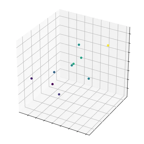
下面是一大块自包含代码,生成以下图像。非常感谢您的任何帮助!
import numpy as np
import matplotlib as mpl
from matplotlib import pyplot as plt
from matplotlib import animation
from mpl_toolkits.mplot3d import Axes3D

mpl.rcParams['ytick.color'] = 'white'
#mpl.rcParams['ytick.left'] = False

sample = np.random.random_integers(low=1,high=5, size=(10,3))

# Create a figure and a 3D Axes
fig = plt.figure(figsize=(5,5))

ax = Axes3D(fig)

#ax.w_xaxis.set_tick_params(color='white')

#ax.axes.tick_params
ax.axes.tick_params(bottom=False, color='blue')
##['size', 'width', 'color', 'tickdir', 'pad', 'labelsize', 
##'labelcolor', 'zorder', 'gridOn', 'tick1On', 'tick2On', 
##'label1On', 'label2On', 'length', 'direction', 'left', 'bottom', 
##'right', 'top', 'labelleft', 'labelbottom', 
##'labelright', 'labeltop', 'labelrotation']

colors = np.mean(sample[:, :], axis=1)

ax.scatter(sample[:,0], sample[:,1], sample[:,2],

           marker='o', s=20, c=colors, alpha=1)

ax.tick_params(color='red')

frame1 = plt.gca()
frame1.axes.xaxis.set_ticklabels([])
frame1.axes.yaxis.set_ticklabels([])
frame1.axes.zaxis.set_ticklabels([])
#frame1.axes.yaxis.set_tick_params(color='white')

enter image description here

3个回答

6
要回答关于去除“tick”的问题,最简单的方法可能就是禁用“tick”线:
for line in ax.xaxis.get_ticklines():
    line.set_visible(False)
for line in ax.yaxis.get_ticklines():
    line.set_visible(False)
for line in ax.zaxis.get_ticklines():
    line.set_visible(False)

E.g.:

import numpy as np
import matplotlib as mpl
from matplotlib import pyplot as plt
from matplotlib import animation
from mpl_toolkits.mplot3d import Axes3D


sample = np.random.random_integers(low=1,high=5, size=(10,3))

# Create a figure and a 3D Axes
fig = plt.figure(figsize=(5,5))

ax = Axes3D(fig)

colors = np.mean(sample[:, :], axis=1)

ax.scatter(sample[:,0], sample[:,1], sample[:,2],

           marker='o', s=20, c=colors, alpha=1)


ax = plt.gca()
ax.xaxis.set_ticklabels([])
ax.yaxis.set_ticklabels([])
ax.zaxis.set_ticklabels([])

for line in ax.xaxis.get_ticklines():
    line.set_visible(False)
for line in ax.yaxis.get_ticklines():
    line.set_visible(False)
for line in ax.zaxis.get_ticklines():
    line.set_visible(False)

enter image description here


4

对于较新版本(例如matplotlib 3.5.1),可以通过mpl_toolkits.mplot3d.axis3d._axinfo进行大量格式化:

import numpy as np
from matplotlib import pyplot as plt

sample = np.random.randint(low=1,high=5, size=(10,3))
# Create a figure and a 3D Axes
fig = plt.figure(figsize=(5,5))
ax = fig.add_subplot(projection='3d')

colors = np.mean(sample[:, :], axis=1)

ax.scatter(sample[:,0], sample[:,1], sample[:,2],
           marker='o', s=20, c=colors, alpha=1)

for axis in [ax.xaxis, ax.yaxis, ax.zaxis]:
    axis.set_ticklabels([])
    axis._axinfo['axisline']['linewidth'] = 1
    axis._axinfo['axisline']['color'] = (0, 0, 0)
    axis._axinfo['grid']['linewidth'] = 0.5
    axis._axinfo['grid']['linestyle'] = "-"
    axis._axinfo['grid']['color'] = (0, 0, 0)
    axis._axinfo['tick']['inward_factor'] = 0.0
    axis._axinfo['tick']['outward_factor'] = 0.0
    axis.set_pane_color((0.95, 0.95, 0.95))

plt.show()

enter image description here


1
这是在即将发布的matplotlib 3.8.0中新增的一个功能。请参阅:https://github.com/matplotlib/matplotlib/pull/25830
import matplotlib.pyplot as plt

positions = ['lower', 'upper', 'default', 'both', 'none']
fig, axs = plt.subplots(2, 3, figsize=(12, 8),
                        subplot_kw={'projection': '3d'})
for ax, pos in zip(axs.flatten(), positions):
    for axis in ax.xaxis, ax.yaxis, ax.zaxis:
        axis.set_label_position(pos)
        axis.set_ticks_position(pos)
    title = f'position="{pos}"'
    ax.set(xlabel='x', ylabel='y', zlabel='z', title=title)
axs[1, 2].axis('off')

enter image description here


网页内容由stack overflow 提供, 点击上面的
可以查看英文原文,
原文链接