如何在R的箱线图中增加轴标签和轴标题之间的间距

39

我在R中使用以下代码创建箱线图:

boxplot(perc.OM.y ~ Depth, axes = F, ylim = c(-0.6, 0.2), xlim = c(3.5, 5.5),
        lwd = 0.1, col = 8, 
        ylab = "Loss of Percent Organic Matter per Year", cex.lab = 1.5)
axis(1, at = c(3.5, 4, 5, 5.5), labels = c(" ", "Shallow", "Deep", " "), 
     cex.axis = 1.5)
axis(2, cex.axis = 1.5)

问题在于y轴上的数字标签与轴标题重叠。是否有办法在轴标题和轴数字标签之间增加更多间距?

谢谢


3
如果您发布可以让他人运行的代码,那将是很有帮助的。 例如,您可以创建具有类似范围的虚拟数据,如此:d <- data.frame(y=rnorm(50,-.2,.1), x=gl(5,5)) ,然后使用 boxplot(y~x, data=d, ...) 进行绘图。 - Aaron left Stack Overflow
3个回答

52
## dummy data
dat <- data.frame(Depth = sample(c(3:6), 20, replace = TRUE), OM = 5 * runif(20))

通过在绘图的左侧增加较大的边距(side = 2),为 y 轴标签和注释留出一些空间:

## margin for side 2 is 7 lines in size
op <- par(mar = c(5,7,4,2) + 0.1) ## default is c(5,4,4,2) + 0.1

现在绘制:

## draw the plot but without annotation
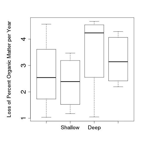
boxplot(OM ~ Depth, data = dat, axes = FALSE, ann = FALSE)
## add axes
axis(1, at = 1:4, labels = c(" ", "Shallow", "Deep", " "), cex.axis = 1.5)
axis(2, cex.axis = 2)
## now draw the y-axis annotation on a different line out from the plot
## using the extra margin space:
title(ylab = "Loss of Percent Organic Matter per Year", cex.lab = 1.5,
      line = 4.5)
## draw the box to finish off
box()

然后重置绘图边距:

par(op)

这将得到:

boxplot

因此,我们在第二个方向上为图形的边距创建了更多的空间,然后分别绘制了轴和注释(ylab)以控制图形的间距。

因此,这个关键的一行是:

op <- par(mar = c(5,7,4,2) + 0.1) ## default is c(5,4,4,2) + 0.1
我们所做的是将原始图形参数保存在对象op中,并将边距大小(以行数计)更改为底部、左侧、顶部、右侧分别为5、7、4、2 + 0.1行。上面的行显示默认值,因此该代码在左边缘提供比默认较多的2行。
然后,在使用title()绘制y轴标签时,我们指定要在哪一行(共7行)上绘制标签:
title(ylab = "Loss of Percent Organic Matter per Year", cex.lab = 1.5,
      line = 4.5)

这里我使用了线条4.5,但5也可以。 'line'的值越大,标签离图表的距离就越远。

诀窍在于找到左边距离的值'line'的值,在title()中调用,从而使轴刻度标记和轴标签不重叠。对于使用基础图形需要尝试多次才能找到所需值的解决方案可能是最好的选择。


非常感谢。那个完美地运作了,并且解释得很清楚。 - DQdlM
@KennyPeanuts,如果是这样,请接受答案,这样大家就知道你的问题已经解决了。 - Gavin Simpson
抱歉,我不知道那个,谢谢你提醒我。 - DQdlM

26

尝试将mgp的第一个值设得更大。还需要使用mar来增加边距。

par(mgp=c(5,1,0))
par(mar=c(5,6,4,2)+0.1)

7

我发现这个解决方案非常直接和有用,当我想要缩小图表周围的白色空间(考虑会议论文中的尺寸限制!)时,同时又想要避免Y轴标题和大数字重叠作为刻度。

我通常将标题设置为文本并手动设置边距后放置它们:

首先,将边距设置为任意值:

par( mar=c(m1, m2, m3, m4) ) 

m1到m4是指四个边缘的边距(1=底部,2=左侧,3=顶部,4=右侧)。

例如:

par( mar=c(3.1, 4.7, 2.3, 0)) 

然后,在绘图时,设置main = "",xlab = ""和ylab = ""(否则它们的文本将与此新文本重叠)。

最后,使用mtext()手动设置轴标题和图表标题:

mtext(side=1, text="X axes title", line=0.5)
mtext(side=2, text="Y axes title", line=3)
mtext(side=3, text="Diagram title", line=1.5)

line参数是离图表的距离(小值会使它更靠近图表)。


网页内容由stack overflow 提供, 点击上面的
可以查看英文原文,
原文链接