根据按钮是否被禁用,在SwiftUI中更改按钮的颜色

49

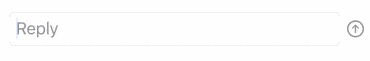
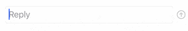
我有一个带有发送按钮的文本框,它是系统图像箭头。我想让图像的前景色根据文本框是否为空而更改。(例如,如果文本框为空,则按钮为灰色且被禁用。如果文本框文本的数量>1,则为蓝色)。

我有一个不完美的解决方法:


if chatMessageIsValid {
    Spacer()
    HStack {
        TextField($chatMessage, placeholder: Text("Reply"))
            .padding(.leading, 10)
            .textFieldStyle(.roundedBorder)
        Button(action: sendMessage) {
            Image(systemName: "arrow.up.circle")
                .foregroundColor(Color.blue)
                .padding(.trailing, 10)
        }.disabled(!chatMessageIsValid)
    }
} else {
    Spacer()
    HStack {
        TextField($chatMessage, placeholder: Text("Reply"))
            .padding(.leading, 10)
            .textFieldStyle(.roundedBorder)
        Button(action: sendMessage) {
            Image(systemName: "arrow.up.circle")
                .foregroundColor(Color.gray)
                .padding(.trailing, 10)
        }.disabled(!chatMessageIsValid)
    }
}

这个方法几乎可行,并且如果文本长度> 1,则可以更改图像的颜色。但是,由于状态的变化,您将在输入一个字符后退出编辑文本字段,并且需要重新选择文本字段才能继续输入。是否有更好的方法使用`.disabled`修饰符来完成此操作?


1
将按钮移动到自己的类型中(这样当状态改变时,文本字段不会被重绘),并使用@State绑定模式。 - matt
5个回答

75

我猜您想要这个:

演示

您可以添加一个计算属性来确定按钮的颜色,并将该属性传递给按钮的foregroundColor修改器。您还可以在HStack周围使用单个padding修改器,而不是在其子视图上分别使用padding

struct ContentView : View {
    @State var chatMessage: String = ""

    var body: some View {
        HStack {
            TextField($chatMessage, placeholder: Text("Reply"))
                .textFieldStyle(.roundedBorder)
            Button(action: sendMessage) {
                Image(systemName: "arrow.up.circle")
                    .foregroundColor(buttonColor)
            }
                .disabled(!chatMessageIsValid)
        }
            .padding([.leading, .trailing], 10)
    }

    var chatMessageIsValid: Bool {
        return !chatMessage.isEmpty
    }

    var buttonColor: Color {
        return chatMessageIsValid ? .accentColor : .gray
    }

    func sendMessage() {
        chatMessage = ""
    }
}

但是,在这里你不应该使用foregroundColor修饰符。你应该使用accentColor修饰符。使用accentColor有两个好处:

  • Image将在Button启用时自动使用环境的accentColor,并在Button禁用时变为灰色。您根本不需要计算颜色。

  • 您可以在View层次结构的高层级中设置accentColor,它将向下传递给所有后代。这使得为整个界面设置统一的accent颜色变得容易。

在下面的示例中,我将accentColor修饰符放在了HStack上。在实际应用中,您可能会将其设置在整个应用程序的根视图上:

struct ContentView : View {
    @State var chatMessage: String = ""

    var body: some View {
        HStack {
            TextField($chatMessage, placeholder: Text("Reply"))
                .textFieldStyle(.roundedBorder)
            Button(action: sendMessage) {
                Image(systemName: "arrow.up.circle")
            }
                .disabled(!chatMessageIsValid)
        }
            .padding([.leading, .trailing], 10)
            .accentColor(.orange)
    }

    var chatMessageIsValid: Bool {
        return !chatMessage.isEmpty
    }

    func sendMessage() {
        chatMessage = ""
    }
}

此外,Matt将发送按钮提取为独立的类型的想法可能很明智。这样可以轻松地做一些有趣的事情,比如在用户单击它时进行动画处理:

button animation demo

以下是代码:

struct ContentView : View {
    @State var chatMessage: String = ""

    var body: some View {
        HStack {
            TextField($chatMessage, placeholder: Text("Reply"))
                .textFieldStyle(.roundedBorder)
            SendButton(action: sendMessage, isDisabled: chatMessage.isEmpty)
        }
            .padding([.leading, .trailing], 10)
            .accentColor(.orange)
    }

    func sendMessage() {
        chatMessage = ""
    }
}

struct SendButton: View {
    let action: () -> ()
    let isDisabled: Bool

    var body: some View {
            Button(action: {
                withAnimation {
                    self.action()
                    self.clickCount += 1
                }
            }) {
                Image(systemName: "arrow.up.circle")
                    .rotationEffect(.radians(2 * Double.pi * clickCount))
                    .animation(.basic(curve: .easeOut))
            }
                .disabled(isDisabled)
    }

    @State private var clickCount: Double = 0
}

1
太棒了。我真的很喜欢将SendButton作为自己的类型的想法。感谢您的帮助! - mg_berk
5
太棒了!accentColor修饰符是个好提示! - gnarlybracket
不错!但如果我还设置前景颜色,那个颜色将覆盖accentColor。那么,我如何将accentColor(.orange)与foregroundColor(.secondary)组合在普通文本上? - ragnarius

33

通过这些不同的解决方案,你可以使用\.isEnabled环境属性,而不需要创建自定义按钮样式或手动传递禁用布尔值。

@Environment(\.isEnabled) private var isEnabled

15

如果您想使用禁用(或任何其他)状态进一步自定义按钮,您可以向自定义ButtonStyle结构添加变量。

Swift 5.1

struct CustomButtonStyle: ButtonStyle {
    var disabled = false
    func makeBody(configuration: Self.Configuration) -> some View {
        configuration.label
        .background(disabled ? .red : .blue)
    }
}

// SwiftUI
@State var isDisabled = true
var body: some View {
    Button().buttonStyle(CustomButtonStyle(disabled: self.isDisabled))
}

很好的回答!你还可以为该按钮样式添加一个点语法扩展,以执行Button().buttonStyle(.disabled(self.isDisabled)) - undefined

6

试试这个

Spacer()
HStack {
    TextField($chatMessage, placeholder: Text("Reply"))
        .padding(.leading, 10)
        .textFieldStyle(.roundedBorder)
    Button(action: sendMessage) {
        Image(systemName: "arrow.up.circle")
            .foregroundColor(chatMessageIsValid ? Color.blue : Color.gray)
            .padding(.trailing, 10)
        }.disabled(!chatMessageIsValid)
}

我猜想,TextField失去焦点的原因在于您的代码根据chatMessageIsValid的值更改了整个视图层次结构。 SwiftUI无法理解then块中的视图层次结构与else块中的几乎相同,因此会完全重建它。

在这个修改后的代码中,它应该看到唯一变化的是图像的foregroundColor和按钮的disabled状态,而TextField保持不变。我相信Apple在WWDC视频中有类似的例子。


4

所有修改器参数都可以是条件性的:


.foregroundColor(condition ? .red : .yellow)

条件可以是任何true/false

var condition: Bool { chatMessage.isEmpty } // can be used inline

您可以使用任何其他您需要的条件


网页内容由stack overflow 提供, 点击上面的
可以查看英文原文,
原文链接