如何在Flutter中移除TextField底部的空白?

23

对话框

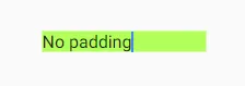
我无法确定为什么在TextField的文本和蓝色线之间存在空白。
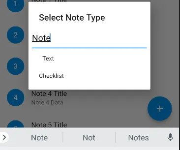
这是我的代码:

Future<Null> _selectNoteType (BuildContext context) async {

  switch (await showDialog<Null>(

      context: context,
      builder: (BuildContext context) {

        return new SimpleDialog(

          title: const Text('Select Note Type'),
          children: <Widget>[

            Padding(
              padding: const EdgeInsets.only(left: 8.0, right: 8.0),
              child: new TextField(
                keyboardType: TextInputType.text,
                maxLines: 1,
                style: new TextStyle(
                  color: Colors.black,
                  fontSize: 20.0
                ),
              ),
            ),

            new SimpleDialogOption(
                onPressed: () {},
                child: const Text('Text')
              ),

            new SimpleDialogOption(
              onPressed: () {},
              child: const Text('Checklist')
            ),
          ],
        );
      }
  )) {}
}
3个回答

36
在我的情况下,即使使用InputDecoration.collapsed()TextField仍不会收缩。

我的版本根本没有填充,并且占用最小空间:


TextField(
  decoration: InputDecoration(
    contentPadding: EdgeInsets.all(0.0),
    isDense: true,
    border: InputBorder.none,
  ),
  minLines: 1,
  maxLines: 1,
);

示例预览

实时预览: https://dartpad.dev/3f9149a1c8f5eec352c796e7585e233c


对我来说完美运行 :) - Elnatan Derech
3
如果你有一个后缀或前缀图标,那么这种情况下它将无法正常工作。 - Mahesh Jamdade
1
@maheshmnj 你的意思是什么?只需将“the”添加到行小部件即可。 - vovahost
1
我相信这是更合适的解决方案,应该被接受为答案! - Darren Cole
如果你也在针对Web进行开发,请注意这个bug:https://github.com/flutter/flutter/issues/86093 - undefined

11
您可以在TextFielddecoration:属性中使用折叠的InputDecoration
  Future<Null> _selectNoteType(BuildContext context) async {

    InputDecoration decoration = const InputDecoration.collapsed()
      ..applyDefaults(Theme.of(context).inputDecorationTheme);

    switch (await showDialog<Null>(
        context: context,
        builder: (BuildContext context) {
          return new SimpleDialog(
            title: const Text('Select Note Type'),
            children: <Widget>[
              Padding(
                padding: const EdgeInsets.only(left: 8.0, right: 8.0),
                child: new TextField(
                  decoration: decoration,
                  keyboardType: TextInputType.text,
                  maxLines: 1,
                  style: new TextStyle(color: Colors.black, fontSize: 20.0),
                ),
              ),
              new SimpleDialogOption(
                  onPressed: () {}, child: const Text('Text')),
              new SimpleDialogOption(
                  onPressed: () {}, child: const Text('Checklist')),
            ],
          );
        })) {
    }
  }

但是你必须知道使用折叠的InputDecoration可能会产生的后果。从文档中可以看到:

  /// Whether the decoration is the same size as the input field.
  ///
  /// A collapsed decoration cannot have [labelText], [errorText], an [icon].
  ///
  /// To create a collapsed input decoration, use [InputDecoration..collapsed].
  final bool isCollapsed;

而对于InputDecoration.collapse()构造函数:

  /// Defines an [InputDecorator] that is the same size as the input field.
  ///
  /// This type of input decoration does not include a border by default.
  ///
  /// Sets the [isCollapsed] property to true.
  const InputDecoration.collapsed({

5

isDense是个不错的选择,它可以使用更少的垂直空间。

TextField(
  decoration: InputDecoration(
    isDense: true,
  ),
);

网页内容由stack overflow 提供, 点击上面的
可以查看英文原文,
原文链接