只用CSS创建一个三角形

6
我正在开发一款响应式网页应用程序,需要创建以下两个独立的内容区域:
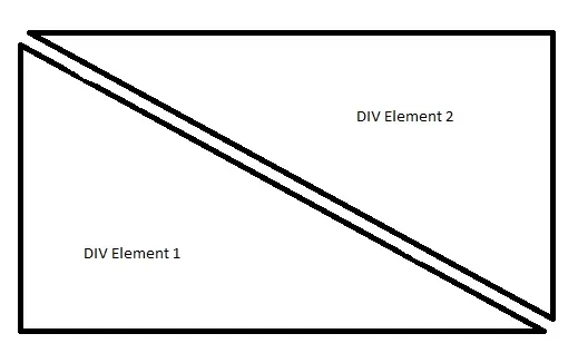
 参考图像 目前为止,我尝试了:
border-right: 30px solid transparent;
border-bottom: 30px solid #4c4c4c; 
height: 100%;
width: 100%;
position: fixed;

但是,不幸的是无法创建一个三角形。

除了使用边框属性之外,是否有其他方法可以使用CSS创建一个三角形,并完全将内容包裹在div内?

非常感谢您的帮助。


3
这个问题可能更适合在 Stack Overflow 上提问。 - 5gon12eder
4个回答

4
我相信您正在寻找具有边框和透明间隔的三角形(没有一个现有的答案似乎能解决这个问题),因此这里提供一个示例。使用CSS变换可以轻松实现,但需要进行大量的操作。
使用CSS变换:
以下代码片段使用伪元素和变换来产生三角效果。输出是响应式的,但使用倾斜变换意味着如果容器的形状变成矩形,则需要修改倾斜角度以及更多的位置属性调整等。

.container {
  position: relative;
  overflow: hidden;
  height: 200px;
  width: 200px;
}
.div-1,
.div-2 {
  position: absolute;
  top: 0px;
  left: 0px;
  height: 100%;
  width: 100%;
  overflow: hidden;
}
.div-1 {
  top: calc(-100% - 5px);
  transform: skewY(45deg);
  transform-origin: left top;
  border-bottom: 2px solid;
}
.div-1:after {
  position: absolute;
  content: '';
  height: calc(100% - 2px);
  width: calc(100% - 2px);
  top: calc(100% + 7px);
  left: 0px;
  transform: skewY(-45deg);
  transform-origin: left top;
  border: 1px solid;
}
.div-2 {
  top: 5px;
  transform: skewY(45deg);
  transform-origin: left bottom;
  border-top: 1px solid;
}
.div-2:after {
  position: absolute;
  content: '';
  height: calc(100% - 7px);
  width: calc(100% - 7px);
  top: 0px;
  left: 0px;
  transform: skewY(-45deg);
  transform-origin: left bottom;
  border: 1px solid;
}
* {
  box-sizing: border-box;
}

/* just for demo */
.container{
  transition: all 1s;
}
.container:hover{
  width: 400px;
  height: 400px;
}
body{
  background: radial-gradient(circle at center, aliceblue, mediumslateblue);
  min-height: 100vh;
}
<script src="https://cdnjs.cloudflare.com/ajax/libs/prefixfree/1.0.7/prefixfree.min.js"></script>
<div class='container'>
  <div class='div-1'></div>
  <div class='div-2'></div>
</div>


使用渐变色:

另一种方法是像下面的代码片段一样使用一些线性渐变作为背景图片。但这里也有很多缺点:(1) 目前浏览器对渐变色的支持非常差。(2) 角度渐变往往会产生锯齿状的线条,需要进行平滑处理。(3) 你在问题中明确提到了两个 div 元素,我假设你想在它们内部放置内容,那么这需要额外的工作。

.container {
  position: relative;
  overflow: hidden;
  height: 200px;
  width: 300px;
  background: linear-gradient(to top right, transparent calc(50% + 2px), black calc(50% + 2px), black calc(50% + 4px), transparent calc(50% + 4px)), linear-gradient(to bottom left, transparent calc(50% + 2px), black calc(50% + 2px), black calc(50% + 4px), transparent calc(50% + 4px)) ;
    }
.container:before{
  position: absolute;
  content: '';
  height: calc(100% - 6px);
  width: calc(100% - 6px);
  left: 4px;
  border-top: 2px solid black;
  border-right: 2px solid black;
}
.container:after{
  position: absolute;
  content: '';
  height: calc(100% - 6px);
  width: calc(100% - 6px);
  top: 4px;
  border-left: 2px solid black;
  border-bottom: 2px solid black;
}
/* just for demo */
.container{
  transition: all 1s;
}
.container:hover{
  width: 700px;
  height: 400px;
}
body{
  background: radial-gradient(circle at center, aliceblue, mediumslateblue);
  min-height: 100vh;
}
<script src="https://cdnjs.cloudflare.com/ajax/libs/prefixfree/1.0.7/prefixfree.min.js"></script>
<div class='container'>
</div>


使用SVG:

所有这些都使我建议,即使用SVG来创建这样的形状。它们只需使用path元素就可以很容易地创建,易于维护,并且天生具有响应性。

.container {
  position: relative;
  height: 300px;
  width: 200px;
}
svg {
  position: absolute;
  top: 0px;
  left: 0px;
  height: 100%;
  width: 100%;
}
svg path {
  fill: transparent;
  stroke: black;
}
/* just for demo */

.container {
  transition: all 1s;
}
.container:hover {
  height: 400px;
  width: 700px;
}
body {
  background: radial-gradient(circle at center, aliceblue, mediumslateblue);
  min-height: 100vh;
}
<script src="https://cdnjs.cloudflare.com/ajax/libs/prefixfree/1.0.7/prefixfree.min.js"></script>
<div class='container'>
  <svg viewBox='0 0 100 100' preserveAspectRatio='none'>
    <path d='M4,2 L98,2 98,96 4,2z M2,4 L2,98 96,98 2,4z' vector-effect='non-scaling-stroke' />
  </svg>
</div>

注意:使用上述任何方法(或其他答案中提供的方法),都无法使内容保持在这些三角形的边界内。文本可以放置在它们上面,但是除非完全实现CSS Shapes模块的shape-inside属性,否则文本不能被包含在这些边界内。

1
非常感谢。我使用了SVG三角形的“shape-inside”功能,它起作用了... :) - Snazzy Sanoj
1
太好了!很高兴它有帮助 :) 请检查shape-inside的浏览器支持,并确保它在您需要支持的所有浏览器中正常工作。 - Harry
1
是的,我刚刚几分钟前检查过了。由于SVG自适应,'shape-inside'也自适应了,并且在我的所有设备上都可以正常工作.. :) - Snazzy Sanoj

3

如果不指定宽度和高度,将会生成三角形。

.triangle1 {
    border-right: 30px solid transparent;
   border-bottom: 30px solid #4c4c4c; 
   position: fixed;
}

可运行代码

根据您的图片,我已经创建了两个反向三角形。

.triangle1 {
    border-right: 100px solid transparent;
    border-bottom: 100px solid #4c4c4c; 
    position: fixed;
}
.triangle2 {
    border-left: 100px solid transparent;
    border-top: 100px solid #4c4c4c; 
    position: fixed;
    margin-left: 3px;
}
<div class="triangle1">
</div>

<div class="triangle2">
</div>

编辑:

这里有一种方法可以在三角形内添加文本。

在三角形内添加另一个文本div并设置其位置即可。

演示


谢谢,我已经能够创建三角形了,但是我仍然无法将内容插入其中,而且内容直接出现在三角形上方。有没有办法让内容完全包含在div中? - Snazzy Sanoj

1
.triangle1 {
    width: 0; 
    height: 0; 
    border-left: 0px solid transparent;
    border-right: 200px solid transparent;
    border-bottom: 150px solid black;
}
对于第一个 DIV 元素。对于第二个,只需制作一个正方形,并在正方形顶部呈现三角形。

1
"Html code:" (这是英文,没有翻译成中文)
<div id="DIV-Element1"></div>
<div id="DIV-Element2"></div>

CSS(层叠样式表):
#DIV-Element1 { width: 0; height: 0; border-bottom: 100px solid black; border-right: 100px solid transparent; }
#DIV-Element2 { width: 0; height: 0; margin-left: 15px;border-top: 100px solid black; border-left: 100px solid transparent; }

你可以通过更改边框来调整三角形

我希望这个能够起作用


网页内容由stack overflow 提供, 点击上面的
可以查看英文原文,
原文链接