内容从100%高度的DIV溢出

3
我希望制作一个
如下:
  1. 它能够在浏览器窗口中自适应并且撑满整个屏幕,
  2. 使得内部所有内容水平垂直居中,
  3. 其最小高度为所有内容的高度加上顶部和底部padding高度的10%。
我已经编写了一些代码:

html {
  height: 100%;
}
body {
  height: 100%;
}
.blah {
  display: flex;
  flex-direction: column;
  width: 100%;
  height: 100%;
  justify-content: center;
  text-align: center;
  padding: 10% 0 10% 0;
  background: #ffb3b3;
}
<div class="blah">
  <p>Here goes some content</p>
</div>

jsfiddle上同样的效果。

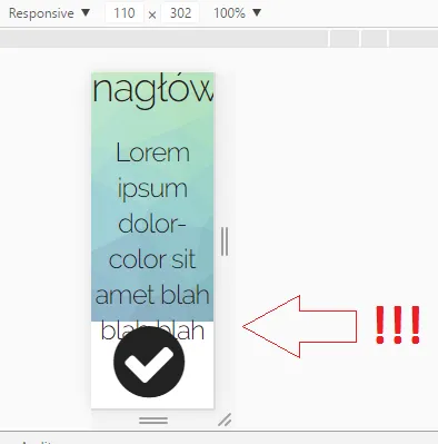
正如您所看到的,它的工作很好,除了第三点 - 当缩小比例时,内容会溢出周围的div屏幕截图

我已经尝试为.blah设置:

height: auto;
min-height: 100% !important;
position: relative;

但是在更大的分辨率下就无法正常工作 - div 比浏览器的 height 大。

这个解决方案不起作用。

我将非常感激任何想法。

1个回答

2

你只需要使用 box-sizing:border-box

html,
body {
  height: 100%;
  margin: 0
}
.blah {
  display: flex;
  flex-direction: column;
  justify-content: center;
  text-align: center;
  background: #ffb3b3;
  min-height: 100%;
  padding: 10% 0;
  box-sizing: border-box;
}
<div class="blah">
Lorem ipsum dolor sit amet, consectetur adipiscing elit. Sed maximus rhoncus erat sit amet ullamcorper. Cras quis vulputate ex, ut sollicitudin massa. Vivamus vitae ipsum posuere, eleifend quam quis, pulvinar tellus. Cras semper, lectus sit amet molestie
  
</div>


解释一下为什么这样修复会非常有用。 - Zach Saucier

网页内容由stack overflow 提供, 点击上面的
可以查看英文原文,
原文链接