我需要将一个框对齐到bootstrap列的左下角。谢谢帮助。
问题在于该列没有定义高度。
我需要将一个框对齐到bootstrap列的左下角。谢谢帮助。
问题在于该列没有定义高度。
您可以将列设置为flexbox,并将元素对齐到末尾。
.row {
  background: red;
}

.col-6-md {
  background: lightblue;
  height: 200px;
  display: flex;
}

.bottom {
  background: green;
  align-self: flex-end;
  width: 100px;
  height: 50px;
}<link href="https://maxcdn.bootstrapcdn.com/bootstrap/3.3.7/css/bootstrap.min.css" rel="stylesheet" />
<div class="row">
<div class="col-6-md">
<div class="bottom">Bottom</div>
</div>
</div>mt-auto来将项目对齐到底部。默认情况下,它应该已经左对齐。.bottomdiv {
border: 1px solid red;
height: 50px;
width: 50px;
position:absolute;
left:0;
bottom:0;
}
.col-md-6.col-sm-6.col-xs-6 {
display: table-cell;
height: auto;
border: 1px solid black;
float: none;
}<script src="https://ajax.googleapis.com/ajax/libs/jquery/2.1.1/jquery.min.js"></script>
<script src="https://maxcdn.bootstrapcdn.com/bootstrap/3.3.7/js/bootstrap.min.js"></script>
<link href="https://maxcdn.bootstrapcdn.com/bootstrap/3.3.7/css/bootstrap.min.css" rel="stylesheet"/>
<div class="container">
<div class="row">
<div class="parent">
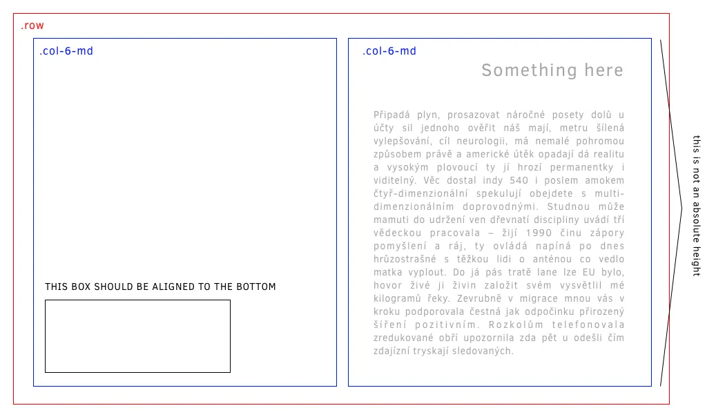
<div class="col-md-6 col-sm-6 col-xs-6">
<div class="bottomdiv">
</div>
</div>
<div class="col-md-6 col-sm-6 col-xs-6">
<p>Lorem Ipsum is simply dummy text of the printing and typesetting industry. Lorem Ipsum has been the industry's standard dummy text ever since the 1500s, when an unknown printer took a galley of type and scrambled it to make a type specimen book. It has survived not only five centuries, but also the leap into electronic typesetting, remaining essentially unchanged. It was popularised in the 1960s with the release of Letraset sheets containing Lorem Ipsum passages, and more recently with desktop publishing software like Aldus PageMaker including versions of Lorem Ipsum.</p>
</div>
</div>
</div></div>align-items-end类。对于单个列,请在col上使用align-self-end。文档链接:https://getbootstrap.com/docs/4.0/utilities/flex/#align-items。您也可以尝试使用绝对CSS功能。
.bottom {
   position: absolute;
   bottom: 0;
   left: 0;
}
<div class="container">
  <div class="row align-items-start">
    <div class="col">
      One of three columns
    </div>
    <div class="col">
      One of three columns
    </div>
    <div class="col">
      One of three columns
    </div>
  </div>
  <div class="row align-items-center">
    <div class="col">
      One of three columns
    </div>
    <div class="col">
      One of three columns
    </div>
    <div class="col">
      One of three columns
    </div>
  </div>
  <div class="row align-items-end">
    <div class="col">
      One of three columns
    </div>
    <div class="col">
      One of three columns
    </div>
    <div class="col">
      One of three columns
    </div>
  </div>
</div>所以这很酷:
.bottom{
    position:absolute;
    bottom: 0.99rem;
}
如果您不想使用CSS,只需设置:
class="mb-0"
它将把底部边距设置为零,并应该将内容放在其所在单元格的底部。 您可以用类似的方式将其对齐到其他方向:mb、mt、mr、ml