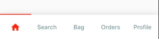
有没有办法像这张图片一样在BottomNavigatorBarItem中添加指示器?

这个包应该能帮助您实现它。
_buildItemWidget函数,使其始终同时显示两者。它非常好用。 - Nguyen Minh Binh你可以使用自定义装饰的 TabBar 替代 BottomNavigationBar:
class TopIndicator extends Decoration {
  @override
  BoxPainter createBoxPainter([VoidCallback? onChanged]) {
    return _TopIndicatorBox();
  }
}

class _TopIndicatorBox extends BoxPainter {
  @override
  void paint(Canvas canvas, Offset offset, ImageConfiguration cfg) {
    Paint _paint = Paint()
      ..color = Colors.lightblue
      ..strokeWidth = 5
      ..isAntiAlias = true;

    canvas.drawLine(offset, Offset(cfg.size!.width + offset.dx, 0), _paint);
  }
}
然后使用TapBar(indicator: TopIndicator ...)将装饰传递给TapBar。
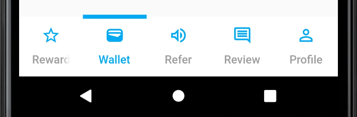
如果要将TabBar用作Scaffold.bottomNavigationBar,您很可能需要将其包装在Material中以应用背景颜色:
Scaffold(
  bottomNavigationBar: Material(
    color: Colors.white,
    child: TabBar(
      indicator: TopIndicator(),
      tabs: const <Widget>[
        Tab(icon: Icon(Icons.home_outlined), text: 'Reward'),
        ...
      ],
    ),
  ),
  ...
)
感谢Ara Kurghinyan提供的原始想法。
我曾经遇到过同样的问题,而且我找到的所有包似乎都需要原始的 IconData,这使得无法使用小部件功能,例如数字徽章(例如未读聊天消息的数量)。
我想出了自己的小解决方案;首先,我制作了一个小部件来显示实际的指示器:
class TabIndicators extends StatelessWidget {
  final int _numTabs;
  final int _activeIdx;
  final Color _activeColor;
  final Color _inactiveColor;
  final double _padding;
  final double _height;

  const TabIndicators({
    required int numTabs,
    required int activeIdx,
    required Color activeColor,
    required double padding,
    required double height,
    Color inactiveColor = const Color(0x00FFFFFF),
    Key? key }) :
    _numTabs = numTabs,
    _activeIdx = activeIdx,
    _activeColor = activeColor,
    _inactiveColor = inactiveColor,
    _padding = padding,
    _height = height,
    super(key: key);

  @override
  Widget build(BuildContext context) {

    final elements = <Widget>[];

    for(var i = 0; i < _numTabs; ++i) {
      elements.add(
        Expanded(child:
          Padding(
            padding: EdgeInsets.symmetric(horizontal: _padding),
            child: Container(color: i == _activeIdx ? _activeColor : _inactiveColor),
          )
        )
      );
    }

    return
      SizedBox(
        height: _height,
        child: Row(
          mainAxisSize: MainAxisSize.max,
          children: elements,
    ),
      );
  }
}
可以像这样将其添加到实际的BottomNavigationBar之前:
bottomNavigationBuilder: (context, tabsRouter) {
  return Padding(
    padding: const EdgeInsets.only(top: 4.0),
    child: Column(
      mainAxisSize: MainAxisSize.min,
      children: [
        TabIndicators(
          activeIdx: tabsRouter.activeIndex,
          activeColor: Theme.of(context).primaryColor,
          numTabs: 4,
          padding: 25,
          height: 4,
        ),
        BottomNavigationBar(...