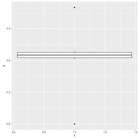
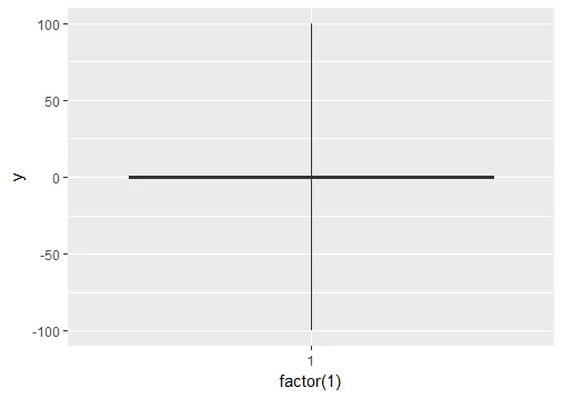
我该如何在ggplot2的箱线图中忽略异常值?我不仅仅希望它们消失(即outlier.size=0),而是希望它们被忽略,使得Y轴刻度显示第1/3百分位数。我的异常值导致“箱子”缩小到几乎成为一条线。有没有一些技巧来处理这个问题?
编辑
这里有一个例子:
y = c(.01, .02, .03, .04, .05, .06, .07, .08, .09, .5, -.6)
qplot(1, y, geom="boxplot")
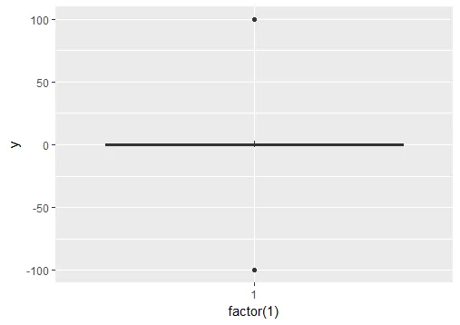
fivenum()以提取箱线图上使用的上下限,并将该输出用于@Ritchie所示的scale_y_continuous()调用中。使用R和ggplot提供的工具可以轻松自动化此过程。如果您还需要包括whiskers,请考虑使用boxplot.stats()获取whiskers的上限和下限,并在scale_y_continuous()中使用它们。 - Gavin Simpson