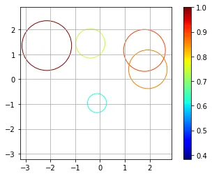
使用散点图绘制无填充圆形,颜色和大小取决于变量

13

我要在图表上显示的信息有两个坐标:大小和颜色(不填充)。颜色很重要,因为我需要一种色图类型的图形来根据颜色值显示信息。

我尝试了两种不同的方法:

  1. 创建特定的圆并添加各个圆。

  2. circle1 = plt.Circle(x, y, size, color='black', fill=False)
            ax.add_artist(circle1)
    
    这种方法的问题在于我找不到一种方法来根据颜色值设置颜色。例如,对于0-1范围的值,我希望0完全是蓝色,而1完全是红色,因此中间的颜色是不同的紫色,其红/蓝程度取决于颜色值的高低。

  3. 之后我尝试使用散点图功能:

  4. size.append(float(Info[i][8]))
    plt.scatter(x, y, c=color, cmap='jet', s=size, facecolors='none')
    

这种方法的问题在于大小似乎没有变化,可能是我创建数组大小的方式导致的。因此,如果我用一个大数替换大小,图表会显示为彩色圆圈。 facecolours = 'none' 的作用是只绘制周长。

2个回答

10

我认为采用这两种方法可能会达到你想要的目的。首先绘制未填充的圆,然后使用相同的点进行散点图绘制。对于散点图,将大小设置为0,但用它来设置颜色条。

考虑以下示例:

import numpy as np
from matplotlib import pyplot as plt
import matplotlib.cm as cm

%matplotlib inline

# generate some random data
npoints = 5
x = np.random.randn(npoints)
y = np.random.randn(npoints)

# make the size proportional to the distance from the origin
s = [0.1*np.linalg.norm([a, b]) for a, b in zip(x, y)]
s = [a / max(s) for a in s]  # scale

# set color based on size
c = s
colors = [cm.jet(color) for color in c]  # gets the RGBA values from a float

# create a new figure
plt.figure()
ax = plt.gca()
for a, b, color, size in zip(x, y, colors, s):
    # plot circles using the RGBA colors
    circle = plt.Circle((a, b), size, color=color, fill=False)
    ax.add_artist(circle)

# you may need to adjust the lims based on your data
minxy = 1.5*min(min(x), min(y))
maxxy = 1.5*max(max(x), max(y))
plt.xlim([minxy, maxxy])
plt.ylim([minxy, maxxy])
ax.set_aspect(1.0)  # make aspect ratio square

# plot the scatter plot
plt.scatter(x,y,s=0, c=c, cmap='jet', facecolors='none')
plt.grid()
plt.colorbar()  # this works because of the scatter
plt.show()

以下是我运行的示例图:

示例图输出


“[cm.jet(color) for color in c]” 这段代码会取哪些数值范围呢?因为我在0.22-0.25的范围内只得到了一种颜色。 - Raket Makhim
尝试将您的颜色缩放到0到1的范围内。可能有自动缩放的选项,但我不是颜色映射方面的专家。 - pault
有没有其他方法可以获得颜色映射而不使用“scatter”技巧? - Tanasis

2

@Raket Makhim写道:

"I'm only getting one colour"

& @pault 回复:

"Try scaling your colors to the range 0 to 1." 

我已经实现了这个功能:

在此输入图片描述

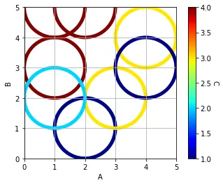
(但是,颜色条的最小值目前为1;我想将其设置为0。我会提出一个新问题)
import pandas            as pd
import matplotlib.pyplot as plt
import matplotlib.cm     as cm
from sklearn import preprocessing

df = pd.DataFrame({'A':[1,2,1,2,3,4,2,1,4], 
                   'B':[3,1,5,1,2,4,5,2,3], 
                   'C':[4,2,4,1,3,3,4,2,1]})

# set the Colour
x              = df.values
min_max_scaler = preprocessing.MinMaxScaler()
x_scaled       = min_max_scaler.fit_transform(x)
df_S           = pd.DataFrame(x_scaled)
c1             = df['C']
c2             = df_S[2]
colors         = [cm.jet(color) for color in c2]

# Graph
plt.figure()
ax = plt.gca()
for a, b, color in zip(df['A'], df['B'], colors):
    circle = plt.Circle((a, 
                         b), 
                         1, # Size
                         color=color, 
                         lw=5, 
                         fill=False)
    ax.add_artist(circle)

plt.xlim([0,5])
plt.ylim([0,5])
plt.xlabel('A')
plt.ylabel('B')
ax.set_aspect(1.0)

sc = plt.scatter(df['A'], 
                 df['B'], 
                 s=0, 
                 c=c1, 
                 cmap='jet', 
                 facecolors='none')
plt.grid()

cbar = plt.colorbar(sc)
cbar.set_label('C', rotation=270, labelpad=10)

plt.show()

https://dev59.com/-6zka4cB1Zd3GeqP8Gge - R. Cox

网页内容由stack overflow 提供, 点击上面的
可以查看英文原文,
原文链接