如何在文本框上创建一个角落的角度?

3
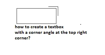
我想要在文本框的右上角创建一个像下面图片中的那样的角落。 enter image description here 请问我该如何使用CSS实现?
我有以下文本框,需要在其右上角应用这个角落。
.up {
width: 0;
height: 0;
border-style: solid;
border-width: 25px 25px 0 0;
border-color: #489af2 transparent transparent transparent;
position:relative;
}


.textbox{
 width:43px;
 height:23px;
 text-align:right;
 padding-bottom:0px;
 padding-top:4px;
 position:absolute;
}

.up p {

top: -35px;
left: 2px;
position: relative;
z-index:1;
color:#FFF;
font-size:11px;
font-weight:bold;
//transform: rotate(-45deg);
}

<input type="number" class="textbox"/>
<div class="up">
<p>3.9</p>
</div>

JsFiddle for the above code

5个回答

6
你可以使用::after元素来避免添加额外的标记。

.wrap {
  position: relative;
  padding: 5px;
  display: inline-block;
}
.wrap textarea {
  height: 120px;
}
.wrap::after {
  content: '';
  height: 40px;
  width: 40px;
  position: absolute;
  top: 0;
  right: 0;
  border-top: solid 1px #ff9000;
  border-right: solid 1px #ff9000;
}
<div class="wrap">
  <textarea></textarea>
</div>


尝试应用代码到我的文本框,但有点搞砸了,已经更新了问题并添加了我的自定义文本框。 - Chetan
所以你只是想让它在右边吗?它有什么问题吗? - Josh Sanger

1
使用绝对定位的元素,将其定位在右上角,并添加右侧和顶部的边框。

.wrapper {
  position: relative;
  display:inline-block;
  margin-top: 50px;
}
.wrapper .shape {
  width: 40px;
  height: 40px;
  border-right: 1px solid black;
  border-top: 1px solid black;
  position: absolute;
  right: -10px;
  top: -10px;
}
<div class="wrapper">
  <textarea></textarea>
  <div class="shape"></div>
</div>


0

目前为止所有的答案都很好,但是既然我已经在打我的版本,我还是会在这里发布它。

.myText{
 width: 200px;
 position: relative; 
 padding: 5px 10px 0 0;
}
.myText input{
 width: 100%; 
}
.myText:after{
 content: "";
 display: block; 
 width: 15px;
 height: 15px;
 border-top: 1px solid black;
 border-right: 1px solid black;
 position: absolute;
 top: 0;
 right: 0;
}
<div class="myText">
 <input type="text">
</div>


0

.corner{
  border-right: 1px solid black;
  border-top: 1px solid black;
  width:20px;
  height:10px;
  margin-left:160px;
  }
<div class="corner">
</div>
  <input type="text">


0

只需将文本框放入容器中,并添加2个伪元素(:before:after)。

.container {
position: relative;
padding: 5px;
}

.container:before,
.container:after {
content: "";
position: absolute;
top: 0;
right: 0;
background: #000;
}

.container:before {
width: 30px;
height: 1px;
}

.container:after {
width: 1px;
height: 30px;
}

网页内容由stack overflow 提供, 点击上面的
可以查看英文原文,
原文链接