我该如何在ggplot中绘制一个y值向量?

6
我该如何在
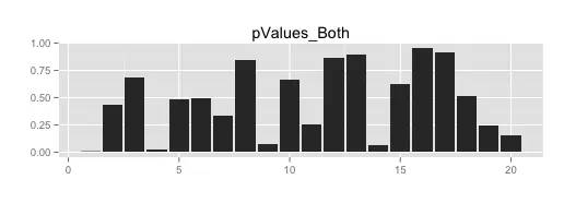
ggplot2中绘制一个y值向量的图形?
 pValues_Both <- c(0.004079,0.4392,0.6882,0.02053,0.4849,0.4938,0.3379,0.8408,0.07067,0.6603,0.2547,0.8692,0.8946,0.0696,0.6206,0.9559,0.9119,0.5162,0.2469,0.1582)

我已经尝试了以下方法:
pValues_Both.m <- melt(pValues_Both)

ggplot(pValues_Both.m, aes(y=value)) + geom_bar(stat="identity")

Error in exists(name, envir = env, mode = mode) : 
argument "env" is missing, with no default
3个回答

5

geom_bar()需要提供x值以制作条形图。一个解决方法是提供与value长度相同的数字序列。

ggplot(pValues_Both.m, aes(x=seq_along(value),y=value)) + 
    geom_bar(stat="identity")

3

这也是一个ggplot的qplot一行代码,无需先制作数据框(它会自动为您完成),但与Didzis的基本原理相同:

qplot(x=1:length(pValues_Both), y=pValues_Both, geom="bar", 
    stat="identity", xlab="", ylab="", main="pValues_Both")

enter image description here


1
收到此错误信息:错误:stat_count()不得与y美学一起使用。 另外:警告消息: 'stat'已过时 - John
警告:qplot() 在 ggplot2 3.4.0 中已被弃用。 - maarten

0

qplot 如果没有提供数据框,将为您创建一个。在 ggplot 中,您想要的图称为 col plot,因此:

pVals = c(.0041,.4392,.6882,.02053,.4849,.4938,.3379,.8408,.07067,.6603,.2547,.8692,.8946,.0696,.6206,.9559,.9119,.5162,.2469,.1582)

qplot(x = 1:20, y = pVals, geom = "col")


警告:qplot()在ggplot2 3.4.0中已被弃用。 - maarten

网页内容由stack overflow 提供, 点击上面的
可以查看英文原文,
原文链接