ggplot - 比例堆叠区域图

3
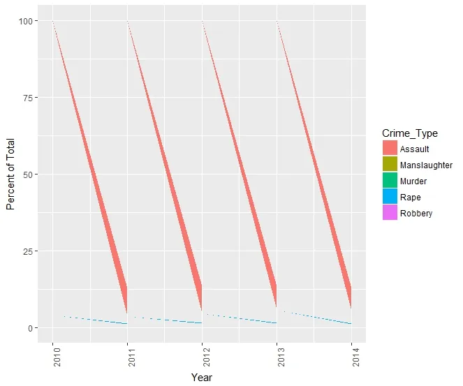
我不明白为什么我的比例堆积面积图无法正常工作。当我使用以下代码时,我得到这个奇怪的倾斜视觉效果:
ViolentCrimes <- ddply(ViolentCrimes, "Year", transform, PercentofTotal = Number_of_Crimes/sum(Number_of_Crimes) * 100)

ggplot(ViolentCrimes, (aes(x = Year, y = PercentofTotal, fill = Crime_Type)) +
  geom_area() +
  theme(axis.text.x = element_text(angle = 90, hjust = 1)) +
  ylab("Percent of Total")`

比例堆积面积图失败

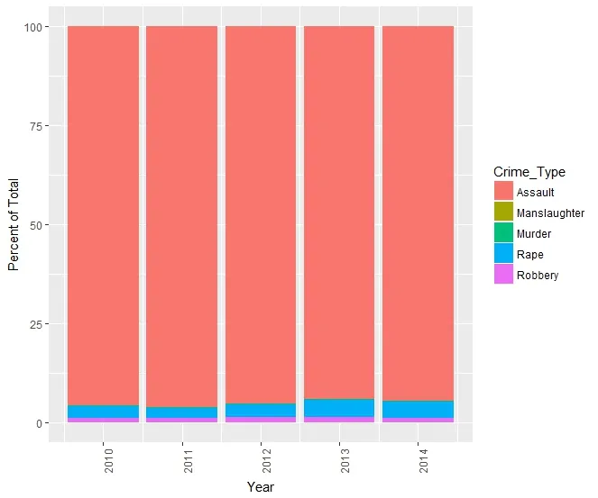
但是当我将geom_area更改为geom_bar,并添加stat =“identity”时,条形图似乎可以正常工作,尽管很难阅读(这就是我想要比例面积图的原因):

堆积条形图

完整数据集链接: https://docs.google.com/spreadsheets/d/1Be4rhySLUGUXkNke8zirwxVpKCZw3uSmW4Hkku0Uc9E/edit?usp=sharing

任何帮助都将不胜感激 - 非常感谢。


最好使用dput提供您的数据,这样其他人可以直接复制。 - Dan
抱歉,我是第一次提问者... dput 的输出有点混乱,所以我包含了完整数据的链接。 - Lantz McGinnis-Brown
2个回答

3

你只需要准备好数据,按照年份和犯罪类型进行分组。我使用 dplyr

library(dplyr)
ViolentCrimes <- df  %>%
  group_by(Year, Crime_Type) %>%
  summarise(n = sum(Number_of_Crimes)) %>%
  mutate(percentage = n / sum(n))

ggplot(ViolentCrimes, (aes(x = Year,  y = percentage, fill = Crime_Type))) +
  geom_area() 

enter image description here


哇,我需要在管道方面变得更好。这非常有帮助。 - Lantz McGinnis-Brown
@LantzMcGinnis-Brown 很高兴能帮忙。谢谢。 - mpalanco

3
稍微改进一下答案的方法是让ggplot来完成将y轴转换为百分比的繁重工作。可以通过在geom_area()中添加position = fill参数来实现。
ViolentCrimes <- df  %>%
    group_by(Year, Crime_Type) %>%
    summarise(n = sum(Number_of_Crimes))

ggplot(ViolentCrimes, (aes(x = Year,  y = n, fill = Crime_Type))) +
    geom_area(position = "fill") +
    scale_y_continuous(labels = scales::percent)

网页内容由stack overflow 提供, 点击上面的
可以查看英文原文,
原文链接