在WPF中,如何自定义ScrollViewer中ScrollBar的样式?

5
我可以将滚动条样式作为全局样式添加。但是这也会更改除ScrollViewer之外的所有ScrollBar。 
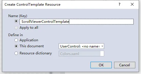
我该如何仅更改ScrollViewer中的ScrollBar样式?或许添加一个带有Key的样式并在ControlTemplate等地方指定它。
以下是完整的ScrollBar样式:
<Style x:Key="ScrollBarThumb" TargetType="{x:Type Thumb}">
    <Setter Property="OverridesDefaultStyle" Value="true"/>
    <Setter Property="IsTabStop" Value="false"/>
    <Setter Property="Template">
        <Setter.Value>
            <ControlTemplate TargetType="{x:Type Thumb}">
                <Border x:Name="rectangle"
                            SnapsToDevicePixels="True"
                            Background="{StaticResource WordBlueBrush}"
                            Opacity="0.3"
                            CornerRadius="4"
                            Height="{TemplateBinding Height}"
                            Width="{TemplateBinding Width}"/>   
                <ControlTemplate.Triggers>
                    <Trigger Property="IsMouseOver" Value="true">
                        <Setter TargetName="rectangle" Property="Opacity" Value="1" />
                    </Trigger>
                </ControlTemplate.Triggers>
            </ControlTemplate>
        </Setter.Value>
    </Setter>
</Style>

<Style TargetType="{x:Type ScrollBar}">
    <Setter Property="Stylus.IsPressAndHoldEnabled" Value="false"/>
    <Setter Property="Stylus.IsFlicksEnabled" Value="false"/>

    <Setter Property="Width" Value="14"/>
    <Setter Property="Margin" Value="-14 0 0 0" />
    <Setter Property="MinWidth" Value="{Binding Height, RelativeSource={RelativeSource Self}}"/>
    <Setter Property="Template">
        <Setter.Value>
            <ControlTemplate TargetType="{x:Type ScrollBar}">
                <Grid x:Name="Bg" SnapsToDevicePixels="true">

                    <Border Padding="0 4">
                        <Track x:Name="PART_Track"
                        IsDirectionReversed="true"
                        IsEnabled="{TemplateBinding IsMouseOver}"
                        Width="8"
                        HorizontalAlignment="Center"
                           >
                            <Track.DecreaseRepeatButton>
                                <RepeatButton Opacity="0" Command="{x:Static ScrollBar.PageUpCommand}" />
                            </Track.DecreaseRepeatButton>
                            <Track.IncreaseRepeatButton>
                                <RepeatButton Opacity="0" Command="{x:Static ScrollBar.PageDownCommand}" />
                            </Track.IncreaseRepeatButton>
                            <Track.Thumb>
                                <Thumb Style="{StaticResource ScrollBarThumb  }" />
                            </Track.Thumb>
                        </Track>
                    </Border>
                </Grid>
            </ControlTemplate>
        </Setter.Value>
    </Setter>
</Style>

ScrollViewer 添加样式。请参阅 ScrollViewer 样式和模板 - Hamid Reza Mohammadi
我已经添加了ScrollBar样式。 - lilillliliil
我测试了它,对我有效。我只是将 <RepeatButton Opacity="0" Command="{x:Static ScrollBar.PageDownCommand}" /> 更改为 <RepeatButton Command="{x:Static ScrollBar.PageDownCommand}" /> 并删除了 Opacity(我不知道你为什么要设置它,反正它是你的)。但在 ScrollViewer 中,滚动条仅在需要时才会出现。例如当 ScrollViewer 的内容不完全可见时,ScrollViewer 会显示滚动条。因此,如果您不需要自定义它,则不需要为您的 ScrollViewer 创建样式。 - Hamid Reza Mohammadi
1
似乎我没有清楚地表达我的问题。我知道ScrollBar样式会起作用。但它不仅在ScrollViewer中起作用。例如,该样式也会影响TextBox的ScrollBar,而我不希望发生这种情况。我只想改变ScrollViewer内部的ScrollBar样式。PS:我将RepeatButton的不透明度设置为0,因为我想隐藏它的外观并保持其可点击功能。 - lilillliliil
那一定是解决它的唯一方法。非常感谢你。现在是我所在地区的午夜。感谢您的耐心等待。 - lilillliliil
显示剩余5条评论
1个回答

8

最终,我找到了解决方案。

首先,在滚动条样式中添加一个键:

<Style x:Key="ViewerScrollBar" TargetType="{x:Type ScrollBar}">

第二步,在 Visual Studio XAML 设计器中右键单击 ScrollViewer。选择“编辑模板” -> “复制进行编辑”:

为 ScrollViewer 添加 ControlTemplate

第三步,在“创建样式资源”对话框中,指定 ScrollViewer 样式的键并单击“确定”:

创建样式资源对话框

第四步,Visual Studio 将自动为我的 ScrollViewer 创建 ControlTemplate。现在,为水平滚动条和垂直滚动条添加 Style="{StaticResource ViewerScrollBar}":

    <ControlTemplate x:Key="ScrollViewerControlTemplate" TargetType="{x:Type ScrollViewer}">
        <Grid x:Name="Grid" Background="{TemplateBinding Background}">
            <Grid.ColumnDefinitions>
                <ColumnDefinition Width="*"/>
                <ColumnDefinition Width="Auto"/>
            </Grid.ColumnDefinitions>
            <Grid.RowDefinitions>
                <RowDefinition Height="*"/>
                <RowDefinition Height="Auto"/>
            </Grid.RowDefinitions>
            <Rectangle x:Name="Corner" Grid.Column="1" Fill="{DynamicResource {x:Static SystemColors.ControlBrushKey}}" Grid.Row="1"/>
            <ScrollContentPresenter x:Name="PART_ScrollContentPresenter" CanContentScroll="{TemplateBinding CanContentScroll}" CanHorizontallyScroll="False" CanVerticallyScroll="False" ContentTemplate="{TemplateBinding ContentTemplate}" Content="{TemplateBinding Content}" Grid.Column="0" Margin="{TemplateBinding Padding}" Grid.Row="0"/>
            <ScrollBar Style="{StaticResource ViewerScrollBar}" x:Name="PART_VerticalScrollBar" AutomationProperties.AutomationId="VerticalScrollBar" Cursor="Arrow" Grid.Column="1" Maximum="{TemplateBinding ScrollableHeight}" Minimum="0" Grid.Row="0" Visibility="{TemplateBinding ComputedVerticalScrollBarVisibility}" Value="{Binding VerticalOffset, Mode=OneWay, RelativeSource={RelativeSource TemplatedParent}}" ViewportSize="{TemplateBinding ViewportHeight}"/>
            <ScrollBar Style="{StaticResource ViewerScrollBar}" x:Name="PART_HorizontalScrollBar" AutomationProperties.AutomationId="HorizontalScrollBar" Cursor="Arrow" Grid.Column="0" Maximum="{TemplateBinding ScrollableWidth}" Minimum="0" Orientation="Horizontal" Grid.Row="1" Visibility="{TemplateBinding ComputedHorizontalScrollBarVisibility}" Value="{Binding HorizontalOffset, Mode=OneWay, RelativeSource={RelativeSource TemplatedParent}}" ViewportSize="{TemplateBinding ViewportWidth}"/>
        </Grid>
    </ControlTemplate>

网页内容由stack overflow 提供, 点击上面的
可以查看英文原文,
原文链接