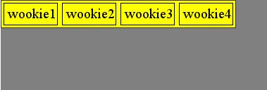
重新阅读你的问题...由于你不会承诺任何事情(如最大宽度:80%,500像素等),我按照你的示例破坏了第四个子元素。
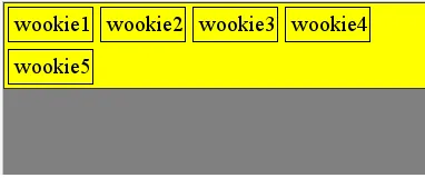
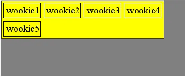
CSS
.main_container, .sub_container, .floating { outline:1px solid black }
.sub_container { background-color:yellow; display:table; padding-left:5px }
.floating {
    float:left;
    padding:5px;
    margin:5px 5px 5px 0;
}
.floating:nth-child(4n+5) {
    clear:left;
    float:left;
}
HTML
<div class="main_container">
    <div class="sub_container">
        <div class="floating">wookie1</div>
        <div class="floating">wookie2</div>
        <div class="floating">wookie3</div>
        <div class="floating">wookie4</div>
        <div class="floating">wookie5</div>
        <div class="floating">wookie6</div>
        <div class="floating">wookie7</div>
        <div class="floating">wookie8</div>
        <div class="floating">wookie9</div>
    </div>
</div>
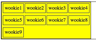
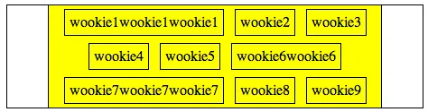
编辑(选项2)
我不认为仅通过HTML/CSS就可以完成你想做的事情。我提供另一种解决方案,基于我的猜测...以及你的“图库评论”。
CSS
.main_container, .sub_container, .floating { outline:1px solid black }
.main_container {
    text-align:center
}
.sub_container { background-color:yellow; display:inline-block; max-width:80%; }
.floating {
    display:inline-block;
    padding:5px;
    margin:5px;
}
HTML
<div class="main_container">
    <div class="sub_container">
        <div class="floating">wookie1wookie1wookie1</div>
        <div class="floating">wookie2</div>
        <div class="floating">wookie3</div>
        <div class="floating">wookie4</div>
        <div class="floating">wookie5</div>
        <div class="floating">wookie6wookie6</div>
        <div class="floating">wookie7wookie7wookie7</div>
        <div class="floating">wookie8</div>
        <div class="floating">wookie9</div>
    </div>
</div>
它不会使.subcontainer贴合内容; 然而,(使用max-width) 它允许您为其提供一些与主容器的间距,其子元素可以是各种尺寸。