弹性容器破坏了边框半径,如何解决?

6

我的定位已经恰好达到了我想要的效果,但是58周围的圆圈应该是一个完美的圆形,而不是根据容器中的内容进行调整。我该如何解决这个问题?

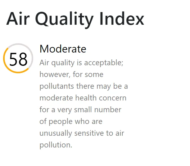
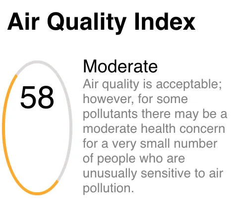
以下是它的样子:https://istack.dev59.com/Tb75A.webp 这是我需要它看起来像的样子:https://istack.dev59.com/LgQFI.webp

以下是 JSX 代码:

<div className="second-col-container">
          <h2>Air Quality Index</h2>
             <div className="mod-container">
               <span className="index">58</span>

             <div className="para-mod">
               <span className="mod">Moderate</span>
              <div>
                Air quality is acceptable; however, for some pollutants there
                may be a moderate health concern for a very small number of
                people who are unusually sensitive to air pollution.
              </div>
            </div>
          </div>
        </div>

CSS

.second-col-container {
  background-color: white;

  width: 250px;
  grid-area: air-index;
  margin-top: 20px;
  border-radius: 10px;
}

.second-col-container h2 {
  margin-bottom: 20px;
  margin-left: 10px;
}

.para-mod {
  font-size: small;
  width: 60%;
  color: grey;
  display: flex;
  flex-direction: column;
  margin-left: 10px;
}

.index {
  margin: 5px 0 0 5px;
  color: black;
  font-size: xx-large;
  border: 3px solid rgb(223, 217, 217);
  border-left-color: rgb(255, 170, 11);
  border-bottom-color: rgb(255, 170, 11);
  padding: 15px;
  border-radius: 100%;
}

.mod-container {
  display: flex;
}

.mod {
  font-size: large;

  color: black;
}

1
没关系,我没有注意到JSX。是我的错。我又投了一票。 :) - BobRodes
1
@BobRodes 他们将标记发布为JSX。类语法是驼峰式的。 - Tanner Dolby
2个回答

5

我会首先给圆形一个固定的高度和宽度,然后设置 border-radius 为50%。这将解决第一个问题(把它变成一个完美的圆形)。

第二个问题是居中文本。给元素添加 display: flex,然后使用 align-items: center;justify-content: center; 即可。

.index {
    margin: 5px 0 0 5px;
    color: black;
    height: 50px;
    width: 50px;
    position: relative;
    align-items: center;
    justify-content: center;
    display: flex;
    font-size: xx-large;
    border: 3px solid rgb(223, 217, 217);
    border-left-color: rgb(255, 170, 11);
    border-bottom-color: rgb(255, 170, 11);
    /* padding: 15px; */
    border-radius: 50%;
}

enter image description here


2
使用display: flex属性应用于父级div .mod-container.后,包含2位数字的<span class="index">元素将会根据其父容器的内容进行调整大小。
接下来,我使用justify-content: center 属性使.mod-container中的flexbox内容居中,并使用align-items: flex-start属性进行对齐。这似乎与您所需的图像相匹配。(如果需要,我可以更新类语法为JSX)

.second-col-container {
  background-color: white;
  width: 250px;
  grid-area: air-index;
  margin-top: 20px;
  border-radius: 10px;
}

.second-col-container h2 {
  margin-bottom: 20px;
  margin-left: 10px;
}

.para-mod {
  font-size: small;
  color: grey;
  display: flex;
  flex-direction: column;
  margin-left: 10px;
}

.index {
  margin: 5px 0 0 5px;
  color: black;
  font-size: xx-large;
  border-radius: 50%;
  border: 3px solid rgb(223, 217, 217);
  border-left-color: rgb(255, 170, 11);
  border-bottom-color: rgb(255, 170, 11);
  padding: 15px;
}

.mod-container {
  display: flex;
  justify-content: center;
  align-items: flex-start;
}
<div class="second-col-container">
  <h2>Air Quality Index</h2>
     <div class="mod-container">
       <span class="index">58</span>

     <div class="para-mod">
       <span class="mod">Moderate</span>
      <div>
        Air quality is acceptable; however, for some pollutants there
        may be a moderate health concern for a very small number of
        people who are unusually sensitive to air pollution.
      </div>
    </div>
  </div>
</div>


网页内容由stack overflow 提供, 点击上面的
可以查看英文原文,
原文链接