CSS变换后应用于位置div的边距

4
可能需要比 CSS 更多的数学知识,但我正在尝试确定一种方法来调整一个经过 CSS skewY 转换后的 div 的位置。
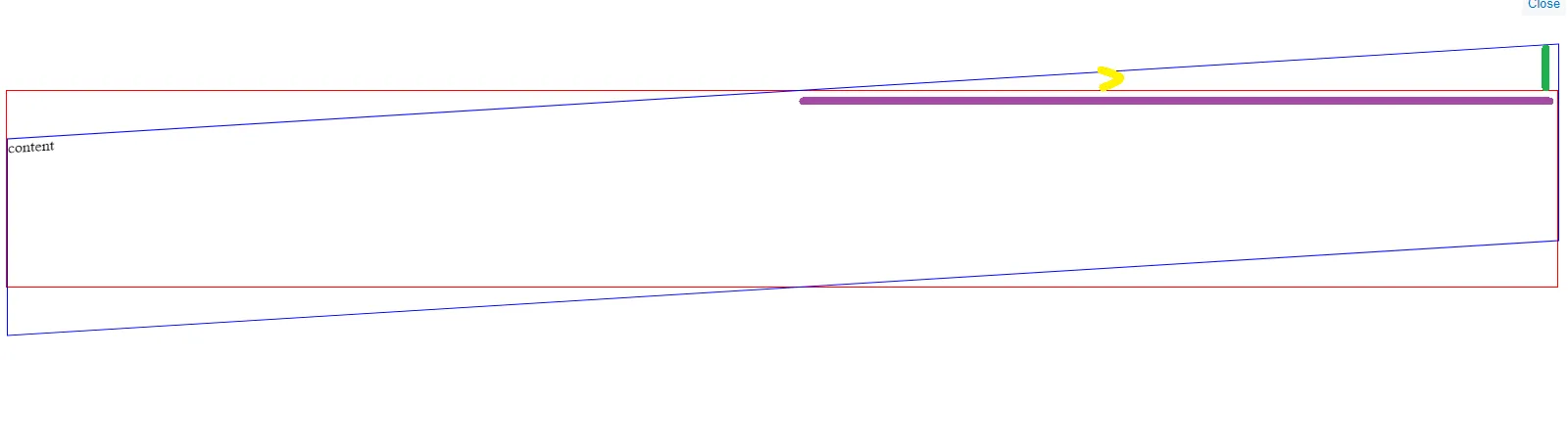
在下面的代码段中,带有蓝色边框的 div 应用了一个 3.5deg 的 skewY,我想知道是否有一种数学方法来确定应该为蓝色 div 应用多少 top 属性,以使其右上角始终与带有红色边框的 div 的右上角完美对齐,而不管两个 div 的宽度如何。
我已经使用 % 和 vw 进行了一些数字实验,但我正在寻找一种基于数学的解决方案。

.parent {
  border: 1px solid red;
  position: relative;
  margin-top: 100px;
  height: 200px;
}

.child {
  border: 1px solid blue;
  position: absolute;
  width: 100%;
  height: 100%;
  transform: skewY(-3.5deg);
}
<div class="parent">
  <div class="child">
    content
  </div>
</div>

1个回答

6

无需数学计算,只需调整transform-origin

.parent {
  border: 1px solid red;
  position: relative;
  margin-top: 100px;
  height: 200px;
}

.child {
  border: 1px solid blue;
  position: absolute;
  width: 100%;
  height: 100%;
  transform: skewY(-3.5deg);
  transform-origin:top right;
}
<div class="parent">
  <div class="child">
    content
  </div>
</div>

但如果你想进行数学计算,确切的公式如下:

top = tan(Xdeg)*(width/2)

enter image description here

绿色代表

上部,紫色代表
宽度的一半,黄色代表倾斜的角度

在本例中,我们有-3.5deg,因此tan(-3.5deg) = -0.061,所以上部 = -0.061 * 宽度的50%但是由于

的参考点是左上角,当应用top属性时,我们需要考虑一个负号,因为我们想调整的是右上角而不是左上角

.parent {
  border: 1px solid red;
  position: relative;
  display:inline-block;
  height: 100px;
  width:var(--w); /*Used fixed width to make calculation easy*/
}

.child {
  border: 1px solid blue;
  position: absolute;
  width: 100%;
  height: 100%;
  transform: skewY(-3.5deg);
  top:calc(0.061 * (var(--w) / 2));
}
<div class="parent" style="--w:200px;">
  <div class="child">
    content
  </div>
</div>
<div class="parent" style="--w:100px;">
  <div class="child">
    content
  </div>
</div>


网页内容由stack overflow 提供, 点击上面的
可以查看英文原文,
原文链接