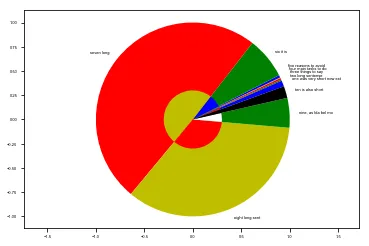
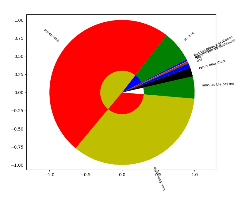
关于饼图绘制中标签重叠的问题,有很多人提出了疑问。然而,除了将它们转换为图例之外,我找不到自动化解决方案。对我来说,这个解决方案行不通,因为我有很多值(大约60个),转换为图例会使图表看起来非常混乱和不清晰。所以我的问题是,如果我想在饼图周围标记饼块,是否有任何MatPlotLib 2.0.2版本的自动化解决方案,可以让标签具有良好的间距(不重叠)?我唯一找到的解决方案是使用annotation()手动完成。请参见下面带有虚拟值的脚本。此外,是否可能用箭头连接饼图的楔形图与相关标签?
我使用Python 2.7和MatPlotLib 2.0.2
谢谢!
示例1(标签重叠)
我使用Python 2.7和MatPlotLib 2.0.2
谢谢!
示例1(标签重叠)
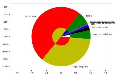
示例2(手动更正)
import pylab
import matplotlib.pyplot as plt
fig, ax = plt.subplots()
l = ax.pie([1,0.2, 0.3,0.1,0.4,7,50,35,5,2],#[0, 0.1, 0, 0.1,0,0.1,0,0.1,0,0.1],
            #labels=("one","two","three made up sentences","four is also ther","five becomes a sentence","six it is","seven long", "eight long sent", "nine, as bla bel mo","ten is also short"),
            labels=("","","","","","six it is","seven long", "eight long sent", "nine, as bla bel mo","ten is also short"),
            colors=("b","g","r","y", "b","g","r","y","g","black"),
            startangle =20,
            radius=1,
            frame=True,   # Plot axes frame with the chart if true.
            labeldistance = 1.1 ) #returns a list of matplotlib.patches.Wedge objects

l2 = ax.pie([1,0.2, 0.3,0.1,0.4,7,50,35,5,2],#[0, 0.1, 0, 0.1,0,0.1,0,0.1,0,0.1],
            colors=("r","g","b","w", "g","b","y","r","w","black"),
            startangle =20,
            radius=1-0.7,
            frame=True)   # Plot axes frame with the chart if true.

coor = [t.get_position() for t in l[1]]

ax.axis('equal')
plt.annotate( 'one was very short now ext', xy= (coor[0][0], coor[0][1]) )      # https://kite.com/docs/python/matplotlib.pyplot.annotate
plt.annotate( 'two long sentense',          xy= (coor[1][0], coor[1][1]) )
plt.annotate('three things to say' ,        xy= (coor[2][0], coor[2][1]+0.02) )
plt.annotate( 'four main tasks to do',      xy= (coor[3][0], coor[3][1]+0.04) )
plt.annotate( 'five reasons to avoid',      xy= (coor[4][0], coor[4][1]+0.06 ))

plt.savefig('test_draft.pdf')
plt.show()
annotate允许使用箭头。也许这个问题对你有帮助:https://dev59.com/X6Dia4cB1Zd3GeqPJtCB。 - ImportanceOfBeingErnest