使用R处理日期时如何格式化直方图x轴

10

我正在使用R创建一条流行病曲线(每天疾病病例数量的直方图),但在格式化x轴方面遇到了一些困难。

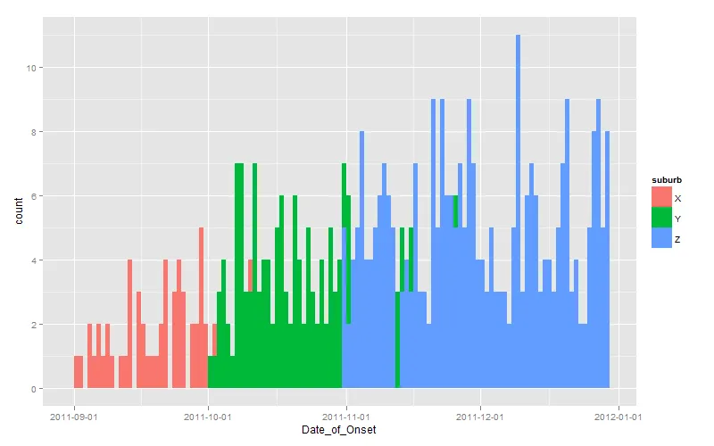
我知道ggplot可以提供非常漂亮的图形和易于操作的坐标轴(了解日期并在R中使用ggplot2绘制直方图),但在这种情况下,我更喜欢使用hist()命令,因为我同时描述了两种不同的模式,如下所示(我认为您无法在ggplot中做类似的事情):

enter image description here

这里的问题在于x轴没有从第一个案例开始,刻度标记太多,我希望能够有系统的日期标记,例如每7天或每个月的第一天。
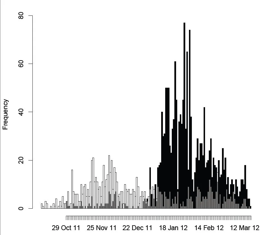
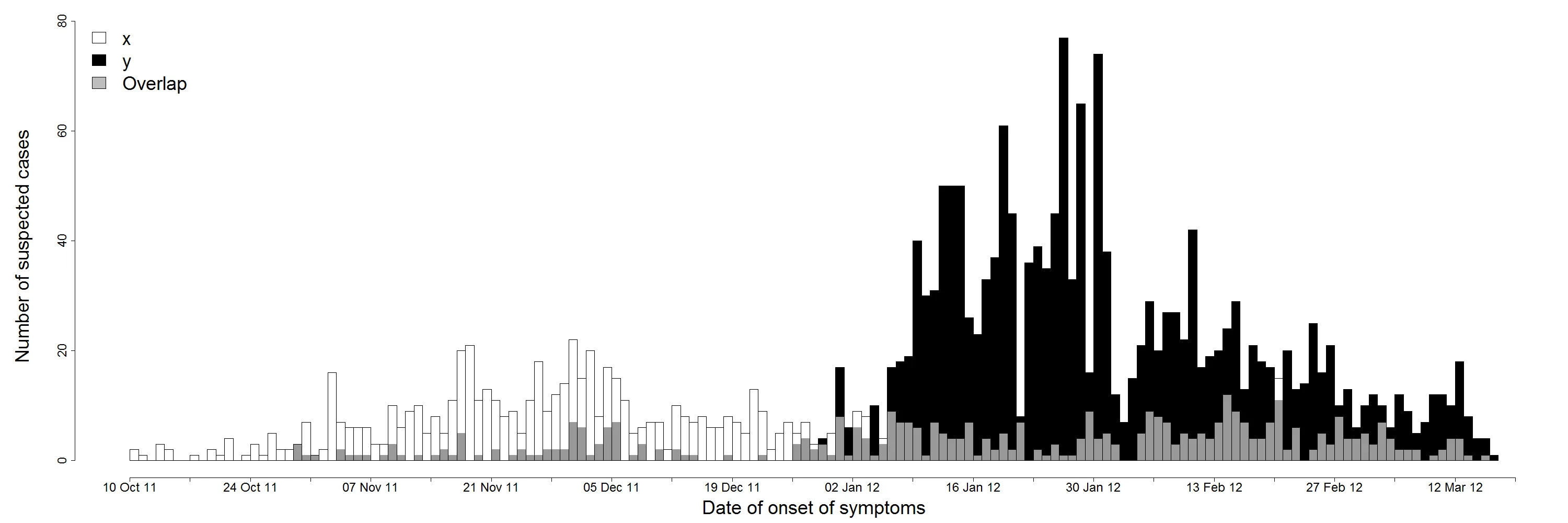
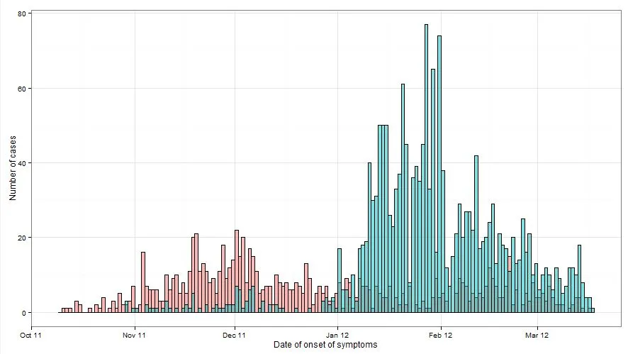
数据以每个疑似病例一行的形式存储在数据库(dat.geo)中,包括发病日期和区域信息(直方图中的黑色或白色)。如下所示:
> head(dat.geo)
  number age sex       suburb Date_of_Onset
1      1  12   F            x    2011-10-11
2      2  28   M            x    2011-10-10
3      3  15   F            x    2011-10-12
4      4  12   M            y    2011-10-25
5      5  10   F            x    2011-10-15
6      6   9   M            y    2011-10-20

这是我的代码:

pdf(file='1.epi.curve.pdf')
hist(dat.geo$Date_of_Onset[(dat.geo$suburb=="x")], "days", 
 format = "%d %b %y", freq=T, col=rgb(0,0,0,1), axes=T, main="", add=T)
hist(dat.geo$Date_of_Onset[(dat.geo$suburb=="y")], "days", 
 format = "%d %b %y", freq=T, main="", col=rgb(1,1,1,.6), add=T, axes=F)
dev.off()

我尝试使用以下代码抑制轴并稍后添加一个操纵轴。
axis(1, labels=T)
axis(2)

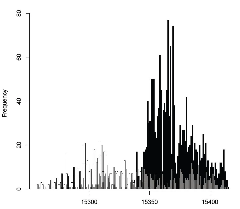
但是我得到的结果是这样的(我也不知道如何操作):

enter image description here

我很感激你的帮助!

谢谢


使用 axis(1, at=x, labels=y),其中 x 是刻度的坐标(数字向量),y 是刻度标签(字符向量)。 - Backlin
你可以在 ggplot 中使用 position="identity" 来叠加条形图。 - James
2个回答

16

既然你对我们提供一个ggplot的解决方案充满挑战性,那么这里就是它:

dates <- seq(as.Date("2011-10-01"), length.out=60, by="+1 day")

set.seed(1)
dat <- data.frame(
  suburb <- rep(LETTERS[24:26], times=c(100, 200, 300)),
  Date_of_Onset <- c(
    sample(dates-30, 100, replace=TRUE),
    sample(dates,    200, replace=TRUE),
    sample(dates+30, 300, replace=TRUE)
  )
)

library(scales)
library(ggplot2)
ggplot(dat, aes(x=Date_of_Onset, fill=suburb)) + 
  stat_bin(binwidth=1, position="identity") + 
  scale_x_date(breaks=date_breaks(width="1 month"))

注意使用position="identity"来强制每个条形图从坐标轴开始,否则默认情况下会得到一个堆叠的图表。

输入图像描述


@jpolonsky,您能否解释一下您所说的“能够完整地看到这两条曲线”的意思?您是建议将柱形图堆叠起来吗?还是分开显示?或者其他什么方法?在ggplot中,这些选项都是可行的。 - Andrie
1
非常抱歉,我刚刚看到通过将alpha=0.5添加到stat_bin命令中,您可以获得透明度,这正是我想要的。感谢您提供的这个优秀解决方案! - Jonny
只有一件事 - 你的代码在最后一行之前都运行良好;
  • scale_x_date(breaks=date_breaks(width="1 month"))
但是当我收到以下错误消息时:Error in ggplot(dat.geo, aes(x = Date_of_Onset, fill = suburb)) + stat_bin(binwidth = 1, : non-numeric argument to binary operator In addition: Warning message: Incompatible methods ("+.ggplot", "Ops.date") for "+" 如果我删除从+开始的所有内容,它可以正常工作,只是x轴不理想。你知道可能是什么原因吗?你也收到这个消息了吗?谢谢
- Jonny
我正在使用版本0.9.1,这似乎是当前的版本。 - Jonny
1
感谢您的建议 - 我已经找到了问题所在; 'dates' 和 'scales' 包之间似乎存在交互作用。当两个包都加载时,scales 无法工作,但是如果不加载 'dates',它就可以正常工作。 - Jonny
显示剩余5条评论

11
有两种可用的解决方案;一种是使用hist(),另一种是使用ggplot():
library(date)
hist(dat.geo$Date_of_Onset[(dat.geo$suburb=="x")], "weeks", 
 format = "%d %b %y", freq=T, col=rgb(0,0,0,1), axes=F, main="")
hist(dat.geo$Date_of_Onset[(dat.geo$suburb=="y")], "weeks", 
 format = "%d %b %y", freq=T, main="", col=rgb(1,1,1,.6), add=T, axes=F)
axis.Date(1, at=seq(as.Date("2011-10-10"), as.Date("2012-03-19"), by="2 weeks"),
 format="%d %b %y")
axis.Date(1, at=seq(as.Date("2011-10-10"), as.Date("2012-03-19"), by="weeks"), 
 labels=F, tcl= -0.5)

这个流行曲线如下所示:

enter image description here

Andrie提出的使用ggplot的解决方案如下:

library(scales)
library(ggplot2)
ggplot(dat.geo,aes(x=Date_of_Onset, group=suburb, fill=suburb))+
 stat_bin(colour="black", binwidth=1, alpha=0.5,
 position="identity") + theme_bw()+
 xlab("Date of onset of symptoms")+
 ylab("Number of cases")+
 scale_x_date(breaks=date_breaks("1 month"), labels=date_format("%b %y"))

which gives an epidemic curve as below:

enter image description here


网页内容由stack overflow 提供, 点击上面的
可以查看英文原文,
原文链接