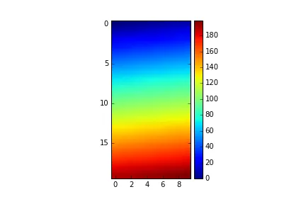
我无法让像这样的imshow图形上的colorbar与图形本身具有相同的高度,除非事后使用Photoshop。如何使它们的高度匹配?
设置Matplotlib颜色条的大小以匹配图形。
271
- Elliot
4
你尝试过从https://dev59.com/2WQn5IYBdhLWcg3wmILY中的建议吗? - lmjohns3
@imjohns3 那篇帖子中似乎没有任何内容能够改变颜色条的大小。无论我设置什么,它都保持不变。然而,如果我设置分数和收缩,图形的大小会发生变化,而颜色条保持不变,直到回到我已经设置的状态,然后它们就不再起作用了。 - Elliot
请查看文档--http://matplotlib.org/api/colorbar_api.html--并使用“fraction”或“shrink”参数。 - BoltzmannBrain
1你能否使用pcolormesh代替imshow? - cssstudent
11个回答
331
这个组合(或接近这些值)似乎在任何显示屏大小下都能“神奇地”使色条与图形按比例缩放。
plt.colorbar(im,fraction=0.046, pad=0.04)
它还不需要共享轴,这可以使图形不成正方形。
- skytaker
10
9在某些情况下,这可能起作用,但通常情况下并不会。例如,尝试绘制类似于原始问题的内容,宽度是高度的两倍。 - Matthias
1在你提到的情况下,如果按比例缩放以匹配绘图的高度,则分数选项似乎仍然有效。(mpl v1.4.3) - skytaker
7这是唯一通用的做法。使用axex_grid1的解决方案无法适用于投影轴,例如GeoAxes。 - Bogdan
14回复 @Matthias 评论。你可以使用以下技巧来纠正图像过宽的情况:
im_ratio = data.shape[0]/data.shape[1]
plt.colorbar(im,fraction=0.046*im_ratio, pad=0.04)
其中,data 是你的图像。 - eindzl1
shrink 关键字参数默认为 1.0,可以用于进一步微调。当我有两个并排的正方形子图时,发现将 shrink=0.9 能够帮助我得到最佳效果。 - vanPelt2显示剩余5条评论
280
您可以使用matplotlib AxisDivider 轻松实现该目标。
来自链接页面的示例也可以在不使用子图的情况下工作:
import matplotlib.pyplot as plt
from mpl_toolkits.axes_grid1 import make_axes_locatable
import numpy as np
plt.figure()
ax = plt.gca()
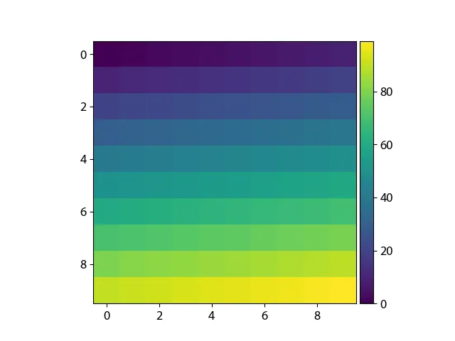
im = ax.imshow(np.arange(100).reshape((10,10)))
# create an axes on the right side of ax. The width of cax will be 5%
# of ax and the padding between cax and ax will be fixed at 0.05 inch.
divider = make_axes_locatable(ax)
cax = divider.append_axes("right", size="5%", pad=0.05)
plt.colorbar(im, cax=cax)
- bogatron
14
3我没有在一个副情节中工作,所以这并不适用。 - Elliot
18这会稍微改变图表的尺寸。我有四个图表,分别放在一个2x2的网格中,但只想让右边的两个有柱状图(按行应用比例尺)。然而这样会使它们的大小不同。我尝试了不使用colorbar调用(使用divider调用),但这样会留下一个空白的白色框和侧边的数字。如何使它们保持一致的大小,而不在所有图表上都添加柱状图呢? - Elliot
1很遗憾,这与投影轴不兼容。 - Bogdan
2@user2820579,您可以在添加色条之前调用
plt.title。这将至少使标题居中于主图上... - S.A.1答案一直很好用,直到我尝试将其适应于子图使用时。现在返回“'AxesSubplot'对象没有属性'get_array'”。有没有办法让它与子图一起工作? - Charles
显示剩余9条评论
78
感谢以上所有的回答。然而,像一些回答和评论指出的那样,axes_grid1模块无法处理GeoAxes,而调整fraction、pad、shrink和其他类似参数也不能确保非常精确的顺序,这真的让我困扰不已。我相信为colorbar单独设置一个axes可能是解决所有提到的问题的更好方法。
代码
import matplotlib.pyplot as plt
import numpy as np

fig=plt.figure()
ax = plt.axes()
im = ax.imshow(np.arange(100).reshape((10,10)))

# Create an axes for colorbar. The position of the axes is calculated based on the position of ax.
# You can change 0.01 to adjust the distance between the main image and the colorbar.
# You can change 0.02 to adjust the width of the colorbar.
# This practice is universal for both subplots and GeoAxes.

cax = fig.add_axes([ax.get_position().x1+0.01,ax.get_position().y0,0.02,ax.get_position().height])
plt.colorbar(im, cax=cax) # Similar to fig.colorbar(im, cax = cax)
结果

后来,我发现matplotlib.pyplot.colorbar的官方文档也提供了ax选项,这是现有轴将为颜色条提供空间。因此,它适用于多个子图,请参阅以下内容。
代码
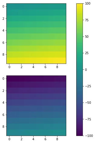
fig, ax = plt.subplots(2,1,figsize=(12,8)) # Caution, figsize will also influence positions.
im1 = ax[0].imshow(np.arange(100).reshape((10,10)), vmin = -100, vmax =100)
im2 = ax[1].imshow(np.arange(-100,0).reshape((10,10)), vmin = -100, vmax =100)
fig.colorbar(im1, ax=ax)
结果
同样,从我个人的角度来看,通过指定cax也可以实现类似的效果。
代码
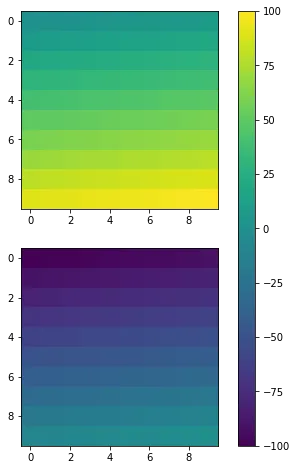
fig, ax = plt.subplots(2,1,figsize=(12,8))
im1 = ax[0].imshow(np.arange(100).reshape((10,10)), vmin = -100, vmax =100)
im2 = ax[1].imshow(np.arange(-100,0).reshape((10,10)), vmin = -100, vmax =100)
cax = fig.add_axes([ax[1].get_position().x1-0.25,ax[1].get_position().y0,0.02,ax[0].get_position().y1-ax[1].get_position().y0])
fig.colorbar(im1, cax=cax)
结果
- Fei Yao
6
1真是一份非常棒的答案。谢谢! - episodeyang
这是我找到的唯一有效的答案!我发现其他所有问题似乎都可以解决颜色条大小的问题,但对我来说都不起作用。在我的情况下,图形太长,颜色条太短。这个方法解决了我的问题。谢谢! - M.O.
对我来说很好用,我只是想知道如何使它能够与全屏图片正常工作。 - AkariYukari
2在我看来,这是正确的答案,因为它完全绕过了Matplotlib的不可配置的轴调整逻辑。让“使色条与
ax=轴高度相同”成为一个功能真的很令人沮丧,并且需要像这样降到低级别的图/轴操作。 - shadowtalkerMatplotlib文档建议使用
ax.inset_axes创建“子轴”,而不是使用fig.add_axes创建独立的轴:https://matplotlib.org/stable/gallery/subplots_axes_and_figures/colorbar_placement.html - shadowtalker如果不同的轴有标题,这会导致出错,对吧?我的意思是,它不会成为一个与绘图高度相同但与轴(绘图+标题)高度相同的色条。 - Manuel Pena
47
@bogatron已经给出了由matplotlib文档建议的答案,它可以产生正确的高度,但它引入了不同的问题。现在colorbar的宽度(以及colorbar和图之间的空间)随着图的宽度而变化。换句话说,colorbar的纵横比不再固定。
要同时获得正确的高度和给定的纵横比,您需要更深入地了解神秘的axes_grid1模块。
import matplotlib.pyplot as plt
from mpl_toolkits.axes_grid1 import make_axes_locatable, axes_size
import numpy as np

aspect = 20
pad_fraction = 0.5

ax = plt.gca()
im = ax.imshow(np.arange(200).reshape((20, 10)))
divider = make_axes_locatable(ax)
width = axes_size.AxesY(ax, aspect=1./aspect)
pad = axes_size.Fraction(pad_fraction, width)
cax = divider.append_axes("right", size=width, pad=pad)
plt.colorbar(im, cax=cax)
现在可以将色条和绘图之间的间距指定为色条宽度的一部分,这是一个比图形宽度的一部分更有意义的数字。
更新:
我创建了关于该主题的IPython笔记本,其中我将上述代码打包成了一个易于重用的函数:
import matplotlib.pyplot as plt
from mpl_toolkits import axes_grid1

def add_colorbar(im, aspect=20, pad_fraction=0.5, **kwargs):
    """Add a vertical color bar to an image plot."""
    divider = axes_grid1.make_axes_locatable(im.axes)
    width = axes_grid1.axes_size.AxesY(im.axes, aspect=1./aspect)
    pad = axes_grid1.axes_size.Fraction(pad_fraction, width)
    current_ax = plt.gca()
    cax = divider.append_axes("right", size=width, pad=pad)
    plt.sca(current_ax)
    return im.axes.figure.colorbar(im, cax=cax, **kwargs)
可以这样使用:
im = plt.imshow(np.arange(200).reshape((20, 10)))
add_colorbar(im)
- Matthias
2
2这是一个非常有用的小函数!需要注意的一点是,当您想要添加多个颜色条时它无法工作,因为它们会出现在彼此之上。 - David Hall
非常棒的答案。关于@DavidHall提到的问题,要使其在多个子图上工作,只需将
current_ax替换为您想要添加颜色条的子图的轴即可。 - lightalchemist15
以上所有解决方案都很好,但我最喜欢@Steve和@bejota的解决方案,因为它们不涉及花哨的调用,并且是通用的。
通用的意思是可以与任何类型的轴一起使用,包括GeoAxes。例如,如果您有用于制图的投影轴:
projection = cartopy.crs.UTM(zone='17N')
ax = plt.axes(projection=projection)
im = ax.imshow(np.arange(200).reshape((20, 10)))
致电
cax = divider.append_axes("right", size=width, pad=pad)
会出现以下错误:KeyException: map_projection
因此,处理所有类型的轴的颜色条大小的唯一通用方法是:
ax.colorbar(im, fraction=0.046, pad=0.04)
使用分数0.035到0.046来得到最佳尺寸。然而,分数和填充值的数值需要进行调整,以获得最适合您图表的最佳匹配,并且取决于色条的方向是垂直还是水平。
- Bogdan
2
1当
fraction和pad不能产生足够的期望结果时,我们还可以添加shrink参数。 - Fei Yao最简洁的答案。 - giammi56
15
当您创建colorbar时,请尝试使用分数和/或收缩参数。
根据文档:
fraction 0.15; 用于colorbar的原始轴的分数
shrink 1.0; colorbar要缩小的比例
- Steve Barnes
3
1如果我将shrink设置为1.0并将fraction设置为任何值,它会缩小图形,但不会影响色条的大小,直到更改fraction使其恰好与我已有的相同,此时更改它们就不再起作用。 - Elliot
你到底在哪里指定它们必须作为
colorbar() 函数或方法的参数? - Steve Barnes谢谢。只需要指定缩小参数,它就像魔术一样工作! - CodingNow
13
另一个选择是
shrink=0.7, aspect=20*0.7
shrink会缩小高度和宽度,但aspect参数会恢复原始宽度。默认的宽高比是20。0.7是经过实证确定的。
- Peter Corke
1
这是我一次性绘图中最快的方法,我很感激! - ryanjdillon
2
我最近遇到了这个问题,我使用ax.twinx()来解决它。例如:
from matplotlib import pyplot as plt

# Some other code you've written
...

# Your data generation goes here
xdata = ...
ydata = ...
colordata = function(xdata, ydata)

# Your plotting stuff begins here
fig, ax = plt.subplots(1)
im = ax.scatterplot(xdata, ydata, c=colordata)

# Create a new axis which will be the parent for the colour bar
# Note that this solution is independent of the 'fig' object
ax2 = ax.twinx()
ax2.tick_params(which="both", right=False, labelright=False)

# Add the colour bar itself
plt.colorbar(im, ax=ax2)

# More of your code
...

plt.show()
在创建需要调用matplotlib的Axes对象作为参数并对其进行绘制并返回该对象的函数时,我发现这特别有用,因为我不需要传入单独从figure对象生成的轴或传递figure对象本身。
- Yaseen
1
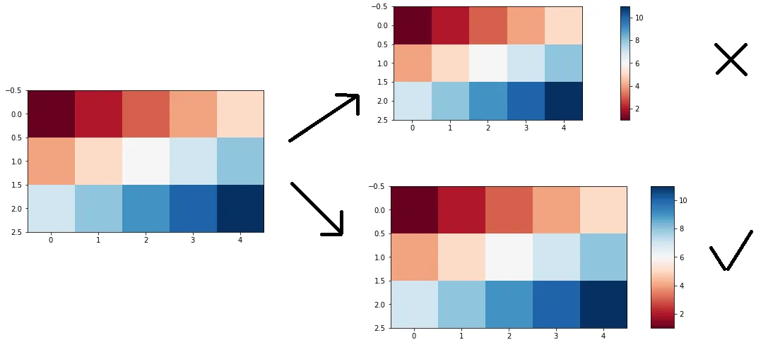
axes_grid1.axes_divider 是此任务的指定方法(甚至在 matplotlib 中有 演示文稿),但通过添加 colorbar,会使图像变小。 如果要保留原始图像大小,那么以下提供了一种方法(基于Fei Yao的答案)。
data = [(1,2,3,4,5),(4,5,6,7,8),(7,8,9,10,11)]

im = plt.imshow(data, cmap='RdBu')
l, b, w, h = plt.gca().get_position().bounds
cax = plt.gcf().add_axes([l + w + 0.03, b, 0.03, h])
plt.colorbar(im, cax=cax)
一个方便的函数包装器。
import matplotlib.pyplot as plt

def add_colorbar(im, width=None, pad=None, **kwargs):

    l, b, w, h = im.axes.get_position().bounds       # get boundaries
    width = width or 0.1 * w                         # get width of the colorbar
    pad = pad or width                               # get pad between im and cbar
    fig = im.axes.figure                             # get figure of image
    cax = fig.add_axes([l + w + pad, b, width, h])   # define cbar Axes
    return fig.colorbar(im, cax=cax, **kwargs)       # draw cbar


data = [(1,2,3,4,5),(4,5,6,7,8),(7,8,9,10,11)]

# an example usage
im = plt.imshow(data, cmap='RdBu')
add_colorbar(im)
- cottontail
0
如果您不想声明另一组坐标轴,我发现最简单的解决方案是使用figsize调用更改图形大小。
在上面的示例中,我会从以下内容开始
fig = plt.figure(figsize = (12,6))
然后只需以不同的比例重新渲染,直到色条不再使主图变得微不足道。
- motionconstant
网页内容由stack overflow 提供, 点击上面的可以查看英文原文,
原文链接
原文链接