是否有可能在转换-CSS动画中查看或调试单个元素所采取的步骤?我正在使用Chrome Dev Tools,但我对它还比较陌生。我谷歌搜索了一些内容,看到了时间轴上的某些东西,但我没有找到逐步进行的步骤。
我的动画从0%开始,到100%,但50%左右似乎有些奇怪,尽管没有声明50%这一步。这就是为什么我想查看发生了什么的原因。
是否有可能在转换-CSS动画中查看或调试单个元素所采取的步骤?我正在使用Chrome Dev Tools,但我对它还比较陌生。我谷歌搜索了一些内容,看到了时间轴上的某些东西,但我没有找到逐步进行的步骤。
我的动画从0%开始,到100%,但50%左右似乎有些奇怪,尽管没有声明50%这一步。这就是为什么我想查看发生了什么的原因。
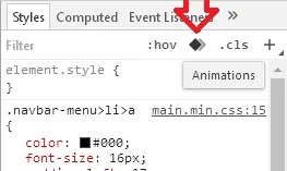
使用Chrome DevTools可以调试转换和CSS动画。只需点击此按钮:
经过一些研究,看起来目前使用Chrome DevTools无法实现此功能。以下是我发现的一些随机信息:
截至2013年3月,Firefox的开发工具中没有这样的功能,尽管Mozilla开发人员已经承认收到了此类请求。就我个人而言,以下是一些建议,尽管我没有测试过这些内容,并且对该主题相当无知:
If possible, pause the animation by way of altering the element's animation-play-state property:
.paused {
    -webkit-animation-play-state:paused;
    -moz-animation-play-state:paused;
    -o-animation-play-state:paused;
    animation-play-state:paused;
}
Drag the animation out over a longer span of time so that the transition behavior is more clear.
There's also the option of using <canvas> animations (which apparently Chrome DevTools has better debugging support for) if it's mission critical to do things like step through the animation.
最后更新于2018年1月11日。
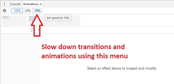
Chrome DevTools动画检查器有两个主要目的。
For e.g. It is not possible to modify the value of CSS 2D transforms' scale method in keyframe. Try running the snippet given below:
.animates {
  animation-timing-function: ease-out;
  animation-duration: 1s;
  animation-iteration-count: infinite;
}
.wrapper {
  position: relative;
  margin-top: 10px;
}
.btn-overlay {
  animation-name:grow;
  -webkit-animation-name:grow;
  position: absolute;
  width: 50%;
  top: 0;
  left: 27%;
}
@keyframes grow {
  0%{
    transform: scale(1.0);
    -moz-transform: scale(1.0);
    -webkit-transform: scale(1.0);
    left: 27%;
  }
  80% {
    transform: scale(1.0);
    -moz-transform: scale(1.0);
    -webkit-transform: scale(1.0);
    left: 27%;
  }
  90% {
    transform: scale(1.04);
    -moz-transform: scale(1.04);
    -webkit-transform: scale(1.04);
    left: 27.5%;
  }
  100%{
    transform: scale(1.0);
    -moz-transform: scale(1.0);
    -webkit-transform: scale(1.0);
    left: 27%;
  }
}
.button{
  background-color: #f49a22!important;/* Old browsers */
  background: -moz-linear-gradient(left, #efaf00 0%, #dd5c00 100%); /* FF3.6-15 */
  background: -webkit-linear-gradient(left, #efaf00 0%,#dd5c00 100%); /* Chrome10-25,Safari5.1-6 */
  background: linear-gradient(to right, #efaf00 0%,#dd5c00 100%); /* W3C, IE10+, FF16+, Chrome26+, Opera12+, Safari7+ */
  filter: progid:DXImageTransform.Microsoft.gradient( startColorstr='#efaf00', endColorstr='#dd5c00',GradientType=1 ); /* IE6-9 */

  box-shadow: 0px 3px 6px rgba(156, 116, 86, 0.4);
  display: inline-block;
  color: white;
  padding: 0 14px;
  height: 30px;
  border-radius: 80px!important;
  font-size: 12px;
}
<!DOCTYPE html>
<html lang="en">
<head>
<meta http-equiv="Content-Type" content="text/html; charset=utf-8">
</head>
<body>
<div class="wrapper">
<div class="animates btn-overlay">
<input type="submit" value="SIGN UP HERE!" name="subscribe" class="button">
</div>
</div>
</body>
</html>requestAnimationFrame动画。